Title: “Long-eared Owl with Oak Foliage (floral map)” Artist: Michael Autumn Medium: Hand-drawing with digital gouache Giclée archival print on fine 100% cotton canvas (matt) Hahnemühle Art Canvas Smooth 370gsm + Hahnemühle UV protection matt varnish Size: 36″ (W) x 50.9″ (H), canvas stretcher 38″ (W) x 53″ (H) Edition: Limited Edition of 101 Authenticity: Hand-signed (front, bottom, far right on white canvas border) with graphite pencil (varnished over with same UV-protective matt varnish as whole) and titled (front, bottom, centre on white canvas border) Date: 04/2024
Just to give an idea of the size the artwork…
TL;DR
This artwork is an homage to visual perception – it’s about how we detect meaning from the millions of individually coloured photons entering our eyes – and how I, as an artist, can trick you into seeing what I want you to see.
Owls, like this one, are incredibly well camouflaged – not so much by their colouring, but by their habit of staying completely still, most often in a tree, during their time of rest and sleep (often during the day). So much so, that you could literally walk within feet of them and you probably wouldn’t even realise they are there. Likewise, in this artwork, you have to really look to see the owl…
And there is a reference to the idiom – “you are what you eat“…
Long-eared Owl with Oak Foliage (floral map) is the simple colouring-in (albeit very carefully selected and juxtaposed colours) of a flat line drawing I did previously of this art puzzle design (see the photo of that artwork below and this post: Long-eared Owl with Oak Foliage (Art Puzzle)).
Long-eared Owl with Oak Foliage (Art Puzzle)
I used this technique to regularly check for line breaks (where there shouldn’t be any), and to get a better view of the shapes of the individual pieces I was designing – amid a sprawling mesh of simple black thin lines on a white background. This got me to thinking about the difference between the dumb mechanical process of colouring a shape (of a flood fill) and true animal (human) understanding…
Title: “Tawny Owl with Egg (floral map)” Artist: Michael Autumn Medium: Hand-drawing with digital gouache Giclée archival print on fine 100% cotton canvas (matt) Hahnemühle Art Canvas Smooth 370gsm + Hahnemühle UV protection matt varnish Size: 36″ (W) x 50.9″ (H), canvas stretcher 38″ (W) x 53″ (H) Edition: Limited Edition of 101 Authenticity: Hand-signed (front, bottom, far right on white canvas border) with graphite pencil (varnished over with same UV-protective matt varnish as whole) and titled (front, bottom, centre on white canvas border) Date: 03/2024
Just to give an idea of the size the artwork…
TL;DR
This artwork is an homage to visual perception – it’s about how we detect meaning from the millions of individually coloured photons entering our eyes – and how I, as an artist, can trick you into seeing what I want you to see.
Tawny Owl with Egg (floral map) is the simple colouring-in (albeit very carefully selected and juxtaposed colours) of a flat line drawing I did previously of this art puzzle design (see the photo of that artwork below and this post: Tawny Owl with Egg (Art Puzzle)).
Tawny Owl with Egg (Art Puzzle)
I used this technique to regularly check for line breaks (where there shouldn’t be any), and to get a better view of the shapes of the individual pieces I was designing – amid a sprawling mesh of simple black thin lines on a white background. This got me to thinking about the difference between the dumb mechanical process of colouring a shape (of a flood fill) and true animal (human) understanding…
Title: “Golden Plover with Egg (Art Puzzle) – Laser” Artist: Michael Autumn Medium: Hand-drawing – laser cut & engraved Giclée archival laser cut & engraved on 6mm AB/AB Italian Panguaneta Poplar plywood (produced responsibly, sustainably, and to the highest of standards), child-safe, moisture-repelling, varnish Size: 39.0cm (W) x 55.1cm (H), framed 69.5cm x 53.2cm Edition: Limited Edition of 101 – individually signed and numbered, and museum-level preserved and bespoke framed; and Unlimited Edition, lasered signature, unframed. Date: 02/2024 N.B.: The cut-outs in the frame above are to draw attention to the fact that the artwork is a wooden puzzle. – otherwise it could be mistaken for a simple drawing…
The art of simply burning wood with light
This is an attempt to create high quality art using the medium of simply burning wood with light – and nothing else. From the concept of a magnifying glass burning paper, technology has progressed enormously to the modern day laser – where a beam of light can be very finely controlled in terms of intensity and speed of movement. Where sophisticated software can very precisely translate vector- and pixel-based drawings into computer-controlled movement of a laserbeam over your chosen material. But there is a real art to doing this successfully…
I was hoping to create a mass-produceable wooden laser cut & engraved version of my 40mm thick solid oak “Golden Plover with Egg (Art Puzzle)”
Golden Plover with Egg (Art Puzzle)
(see https://michaelautumn.wordpress.com/2020/07/30/golden-plover-with-egg-jigsaw-puzzle/) because hand-cutting the latter took far too long and caused serious RSI and/or rheumatoid arthritis in my hands/fingers. But in order to achieve the quality I wanted, it turns out (after considerable effort!) that mass-production is simply not possible. It has been a long journey to get to a standard I’m happy with. Along the road I have researched a great deal about materials, wood, lasers (obviously! – but this is a big topic…), and lasering techniques. I have developed some of my own techniques and built some special tools because there were clear limitations in the best techniques, tools, and materials available. Suffice to say, I haven’t come across any individual or company who can produce my designs to the quality I do. But it comes at a significant cost. I can only produce one per day – so in any definition of the phrase mass production, this definitely is not!
Putting aside the weeks it took me to complete the design (in addition to the weeks it took me to design the original, I spent about another four weeks enhancing it to take advantage of laser capabilities) – and may trials, adjustments, custom tooling, and more trials…
The design uses multiple lasering and layering techniques – cut-throughs, scoring, light scoring, engraving, deep engraving – which all have to be done in a specific sequence. For example, in places in the design, I have score marks on top of some deep engraved areas – so obviously the deep engraving has to be done before the scoring.
Detail showing a mix of cut lines, scoring, light scoring, and different types of engraving.
Also, I use the flattest, smoothest, least porous, best quality plywood I can (and do special preparations to achieve this – see below) – so I can achieve the subtle effects I’m looking for with the minimum of laser power (basically more power equals less precision).
In this artwork I particularly wanted to reproduce, using light-burning alone, what is for me the three important colours of the golden plover in its magnificent summer plumage: the white fringe to their mainly black bellies, and especially the goldentones of their back – from where they get their name. So what is white in terms of lasering wood? It’s the absence of any burning and scorch marks on very pale, smooth, wood. But the crux of the matter is avoiding getting any discolouration/contamination in these areas – especially as they are sandwiched between very dark areas. It’s very hard to control smoke and scorch marks with lasers. It’s like the challenge of white in watercolour painting – where the white areas are usually the colour of the paper itself, the absence of paint – and in detailed areas masking is often used to exclude surrounding colour seeping into where it is not wanted.
These are the steps :-
Spray water on the raw plywood panels to raise the grain, let them dry.
Very fine (400 grit) orbit sand the dry plywood, wipe clean.
The plywood panels are then varnished and left to dry for up to three days (depending on time of year – humidity and temperature). This is to minimise the effects of laser burning and makes it easier to clean specific areas afterwards (see step 8).
The plywood panels are then flattened in a special press for several days.
A single plywood sheet is put in a custom-made flat panel laser bed holder (I designed).
The lasering itself takes a little over five hours on my 130W CO2 laser (for a single artwork). I do it in two steps because I find the results are better. Clean the “white” engraved areas (which I want as pale as possible) after engraving the “golden” areas – and before doing the black areas, scoring, and cuts.
Step 1 – the “golden” areas. The following two images show the “golden” engraved areas before and after cleaning :-
Step 2 – the black engraving, scoring, and cuts.
After lasering, I do a detailed quality check. Wood, being organic with glued layers, varies from sheet to sheet – and some lasered artwork doesn’t make the grade – or needs fixing in some way.
Then very carefully lighten the brightest/whitest, most important areas (that have been darkened by smoke) with cotton swabs and a mild acid – to make them stand out better. This seems very much like an art-restoration process – like removing the old varnish from an old masterpiece – to restore the original colours! (But I only do certain areas to make them stand out – not the whole thing.) This takes me about an hour and a half. The difference is subtle, but vital to me. It is the difference between a mechanically produced piece of art and a true piece of art I’m happy with.
The following two images show before and after selected cleaning (notice how the white margins of the golden plovers stand out better after this second cleaning) :-
The artwork then gets a final varnishing and left to dry for up to three days. This is especially important to protect the newly exposed wood surfaces.
I use pyrography to number each piece in the limited edition.
The special display mounts – with a selection of pieces cut of in order to highlight the work is in fact a puzzle – and not simply a drawing – are individually laser cut out of high quality mount board. This takes my precision laser about 40 minutes.
Finally I frame the artwork to using museum materials and techniques. I use anti-reflective, 99% UV filtering, ultra clear museum-grade glass to provide maximum protection to the piece.
I think the final work shows that lasers can be used to make real art – and are capable of very fine control – as much as lithographic printing, silk-screen printing, wood-block printing, lino-printing. Like any tool, the best results come with experience, knowledge, perseverance, patience, and finding ways around the natural limitations of the medium…
Title: “Guillemot with Egg (Art Puzzle) – Laser” Artist: Michael Autumn Medium: Hand-drawing – laser cut & engraved Giclée archival laser cut & engraved on 6mm AB/AB Italian Panguaneta Poplar plywood (produced responsibly, sustainably, and to the highest of standards), child-safe, moisture-repelling, varnish Size: 39.0cm (W) x 55.1cm (H), framed 69.5cm x 53.2cm Edition: Limited Edition of 101 – individually signed and numbered, and museum-level preserved and bespoke framed; and Unlimited Edition, lasered signature, unframed. Date: 02/2024 N.B.: The cut-outs in the frame above are to draw attention to the fact that the artwork is a wooden puzzle. – otherwise it could be mistaken for a simple drawing…
I was hoping to create a mass-produceable wooden laser cut & engraved version of my “Guillemot with Egg (Art Puzzle)” (see https://michaelautumn.wordpress.com/2020/03/01/guillemot-with-egg-art-puzzle/) because hand-cutting the latter took far too long and caused serious RSI and/or rheumatoid arthritis in my hands/fingers. But in order to achieve the quality I wanted, it turns out (after much effort) that mass-production is simply not possible. It has been a long journey to get to a standard I’m happy with. Along the road I have researched a great deal about materials, wood, lasers (obviously! – but this is a big topic…), and lasering techniques. I have developed some of my own techniques and built some special tools because there were clear limitations in the best techniques, tools, and materials available. Suffice to say, I haven’t come across any individual or company who can produce my designs to the quality I do. But it comes at a significant cost. I can only produce one per day – so in any definition of the phrase mass production, this definitely is not!
Putting aside the weeks it took me to complete the design (in addition to the weeks it took me to design the original, I spent about another four weeks enhancing it to take advantage of laser capabilities) – and may trials, adjustments, custom tooling, and more trials…
The design uses multiple lasering and layering techniques – cut-throughs, scoring, light scoring, engraving, deep engraving – which all have to be done in a specific sequence. For example, in places in the design, I have score marks on top of some deep engraved areas – so obviously the deep engraving has to be done before the scoring.
Detail showing a mix of cut lines, scoring, light scoring, and different types of engraving.
Also, I use the flattest, smoothest, least porous, best quality plywood I can (and do special preparations to achieve this – see below) – so I can achieve the subtle effects I’m looking for with the minimum of laser power (basically more power equals less precision).
These are the steps :-
Spray water on the raw plywood panels to raise the grain, let them dry.
Very fine (400 grit) orbit sand the dry plywood, wipe clean.
The plywood panels are then varnished and left to dry for up to three days (depending on time of year – humidity and temperature). This is to minimise the effects of laser burning and makes it easier to clean specific areas afterwards (see step 8).
The plywood panels are then flattened in a special press for several days.
A single plywood sheet is put in a custom-made flat panel laser bed holder (I designed).
The lasering itself takes a little over seven hours on my 130W CO2 laser (for a single artwork).
After lasering, I do a detailed quality check. Wood, being organic with glued layers, varies from sheet to sheet – and some lasered artwork doesn’t make the grade – or needs fixing in some way.
Then very carefully lighten the brightest/whitest, most important areas (that have been darkened by smoke) with cotton swabs and a mild acid – to make them stand out better. This seems very much like an art-restoration process – like removing the old varnish from an old masterpiece – to restore the original colours! (But I only do certain areas to make them stand out – not the whole thing.) This takes me about an hour and a half. The difference is subtle, but vital to me. It is the difference between a mechanically produced piece of art and a true piece of art I’m happy with.
The following two images show before and after the white masking has been removed (notice how the white bellies of the guillemots stand out better after cleaning, and the eye of the main bird) :-
The following image shows detail of a part-de-masked area (compare the guillemot bellies on the bottom and middle to those on the top row) :-
The artwork then gets a final varnishing and left to dry for up to three days. This is especially important to protect the newly exposed wood surfaces.
I use pyrography to number each piece in the limited edition.
The special display mounts – with a selection of pieces cut of in order to highlight the work is in fact a puzzle – and not simply a drawing – are individually laser cut out of high quality mount board. This takes my precision laser about 40 minutes.
Finally I frame the artwork to using museum materials and techniques. I use anti-reflective, 99% UV filtering, ultra clear museum-grade glass to provide maximum protection to the piece.
I think the final work shows that lasers can be used to make real art – and are capable of very fine control – as much as lithographic printing, silk-screen printing, wood-block printing, lino-printing. Like any tool, the best results come with experience, knowledge, perseverance, patience, and finding ways around the natural limitations of the medium…
Title: “Golden Plover with Egg (floral map)” Artist: Michael Autumn Medium: Hand-drawing with digital gouache Giclée archival print on fine 100% cotton canvas (matt) Hahnemühle Art Canvas Smooth 370gsm + Hahnemühle UV protection matt varnish Size: 51″ (W) x 36″ (H), stretched canvas 38″ (W) x 53″ (H) Edition: Limited Edition of 101 Authenticity: Hand-signed (front, bottom, far right on white canvas border) with graphite pencil (varnished over with same UV-protective matt varnish as whole) and titled (front, bottom, centre on white canvas border) Date: 02/2024
Just to give an idea of the size the artwork…
TL:DR
This artwork is an homage to visual perception – it’s about how we detect meaning from the millions of individually coloured photons entering our eyes – and how I, as an artist, can trick you into seeing what I want you to see.
Golden Plover with Egg (floral map) is the simple colouring-in (albeit very carefully selected and juxtaposed colours) of a flat line drawing I did previously of this art puzzle design (see photo below and this post: Golden Plover with Egg (Art Puzzle)).
Golden Plover with Egg (Art Puzzle)
I used this technique to regularly check for line breaks (where there shouldn’t be any), and to get a better view of the shapes of the individual pieces I was designing – amid a sprawling mesh of simple black thin lines on a white background. This got me to thinking about the difference between the dumb mechanical process of colouring a shape (of a flood fill) and true animal (human) understanding…
Title: “Guillemot with Egg (floral map)” Artist: Michael Autumn Medium: Hand-drawing with digital gouache Giclée archival print on fine 100% cotton canvas (matt) Hahnemühle Art Canvas Smooth 370gsm + Hahnemühle UV protection matt varnish Size: 36″ (W) x 50.9″ (H), canvas stretcher 38″ (W) x 53″ (H) Edition: Limited Edition of 101 Authenticity: Hand-signed (front, bottom, far right on white canvas border) with graphite pencil (varnished over with same UV-protective matt varnish as whole) and titled (front, bottom, centre on white canvas border) Date: 02/2024
Just to give an idea of the size the artwork…
TL;DR
This artwork is an homage to visual perception – it’s about how we detect meaning from the millions of individually coloured photons entering our eyes – and how I, as an artist, can trick you into seeing what I want you to see.
Guillemot with Egg (floral map) is the simple colouring-in (albeit very carefully selected and juxtaposed colours) of a flat line drawing I did previously of this art puzzle design (see photo of that artwork below and this post: Guillemot with Egg (Art Puzzle)).
Guillemot with Egg (Art Puzzle)
I used this technique to regularly check for line breaks (where there shouldn’t be any), and to get a better view of the shapes of the individual pieces I was designing – amid a sprawling mesh of simple black thin lines on a white background. This got me to thinking about the difference between the dumb mechanical process of colouring a shape (of a flood fill) and true animal (human) understanding…
The story behind this artwork is part intentional, part serendipity, and partly the indirect fruits of some non-trivial computer programming I did many, many, moons ago…
I am immensely impressed, and deeply bewildered, by our ability to visually perceive our environment. As you might know, typical adult human beings have about six million cones in our eyes to effectively detect pixels of coloured light (photons) in daylight (rods are used in low-light/dark conditions). Each detected pixel of light is to all intents and purposes completely independent of each other – and the eye’s cones are simple colour detectors of light coming into the eye – not in themselves capable of making any sense of the totality of what the all the other cones are measuring – they simply pass what they individually detect to the brain (via the optic nerve). It takes one of the most impressive and complex machines in the universe – a brain – to interpret these patchworks of colour.
The brain compares all the pixels together, detects edge boundaries, and uses its vast database of previously classified images (and parts thereof) to try to understand the current image. And by understanding the image I mean recognising the individual objects within it. Without the aid of a vast memory and very sophisticated pattern-recognition, reinforcement, and continuous learning – making sense of what we see would be impossible – and we simply wouldn’t survive. Why? Because we wouldn’t be able to find food and water, avoid danger, and move about pursuing our instinctive goals – build and maintain a shelter, avoid various dangers, find a mate, reproduce, etc… That’s not to say that the brain never gets things wrong. In fact, our brain’s insatiable appetite to pattern-match and classify what it “sees” is so strong that it is sometimes fooled into “seeing” things which aren’t there… Anyone ever seen elephant-shaped clouds…?
Since about 2021, I have been exploring the physical and metaphorical world of puzzles – particularly those in Nature: things that are camouflaged, paradoxical, ambiguous, double-entendre, things that are not what they seem. I have been expressing this through the medium of actual visual puzzles – jigsaw puzzles with a twist, and a completely different purpose – the purpose of expressing ideas rather than a challenging pastime. I call them art puzzles.
I start by hand-drawing a full size completely imaginary, but plausible, nature design of a main bird in an appropriate landscape (which takes me a long time – by far the bulk of the total), and then I physically cut out the puzzle (usually in wood). While designing the artwork for these intricate puzzles – with an eye for structurally interlocking pieces (which are often heavily disguised) – I periodically check that the cut lines all work – i.e. that there are no gaps where there shouldn’t be any, and all the pieces cut out cleanly (i.e. not stuck together anywhere).
This checking is important because, while I cut the pieces by hand for the first three years (and could compensate for any imperfections in the drawings), I have an eye on getting them cut by a computer-controlled machine – waterjet, laser, or some other technology – so I have to make the drawings “perfect”. As many of you will know, if you provide instructions to humans, you can get away with some imperfections and inaccuracies because an intelligent human being is likely to still achieve the correct result – compensating for your mistakes and imperfect measurements/instructions – because they can guess at your intentions. But most of you will also know that you can’t get away with anything when a computerised mechanical machine does the work: it will do exactly what it is told – no more, no less – because it has no notion of what it is supposed to do.
Zooming in on a complex detailed drawing and looking for gaps of where lines don’t join where they should – is a very tedious, long-winded, task – and it’s difficult to be certain you’ve properly checked everywhere. So a while back I got the idea of flood-filling the areas to see if there are any leaks. For those of you not familiar with the term, flood-filling is an automated way of filling an area of colour – of any complexity – with a new colour. It is not filling the whole image with colour – that isn’t much use. It fills/puts the new colour everywhere that is the same colour as the original point (pixel) colour – and here is the subtle bit – the colour has to be connected to the original point. To illustrate this, here is a sequence of pictures showing a small detail of my gap-finding process :-
Detail of the drawing with no gapsDetail of the drawing with a small gap – can you see it…?Detail of the drawing with red arrow showing a small gapDetail of the drawing with flood fill going through the gapDetail of the drawing with flood fill confirming gap fixedDetail of the drawing with various flood fills showing good gap integrity
So where does the computer programming part come in – that I mentioned in the introduction? Well, many, many, moons ago – when personal computers were just emerging, I started a career which involved creatively using IT to help people with special needs – recreation, communication, education, etc… One of the most rewarding projects I took on was to design an art program that would enable people who could reliably press one, two, or three buttons with any part of their body – to draw and paint on the computer – and print out their colourful creations. (I was an artist long before I got involved in computing, and so this was particularly interesting to me.) My main customer and inspiration for the program at the time was a very talented mouth-artist, called Mary, whom I was very ambitious for. I wanted to provide for every feature she asked for – in addition to those I thought should be there. One day while doing quite a complex design with the program, Mary asked if it was possible to change the colour of part of her picture. It wasn’t at the time, but I set about designing the feature. To my knowledge it hadn’t been done before, and it turned out to be quite challenging (it took me about a month to crack it). These days it’s common in art programs, and is something most people take for granted. But solving the problem from scratch was very satisfying and gave me insights to its many possibilities (including solving any 2D line-drawn maze of any complexity)…
The serendipitous aspect of this artwork lies in when I realised that the various flood fill tests I was doing during the course of designing the original art puzzle – were actually quite appealing in their own right. While I was only using a few simple random colours for my tests, I thought that with a harmoniously selected floral colour pallet and careful colour juxtapositions, I could make a really attractive design… I parked the idea at the time because I was engrossed with my original intention, but I did come back to it this year. It took quite a long time to arrive at the final design, and printing the colours correctly (i.e. as I envisioned and designed them on my computer) was really tricky (as usual!). Printed on the best available printer with the most archival inks. Best UV protection matt varnish.
I really like it, and it’s like nothing I’ve seen before…
Description: The idea behind this artwork was to have a tactile, life-sized, long-eared owl, and to toy with the idea – “You are what you eat”. Long-eared owls are ferocious predators (as are all owls) – and will basically eat anything that moves that is smaller than them. They often swallow their prey whole, and regurgitate a large pellet of the undigestible parts – such as bones, teeth, hair, feathers. Indeed, examining their pellets is how ornithologists know so much about what they eat.
This is a very high (in the case of the unlimited edition), and extremely high (in the case of the limited edition), quality laser-cut “art” jigsaw puzzle – directly cut (and scored) from an original digital hand-drawing. The design is a specially modified drawing of his original hand-cut thick solid oak artwork entitled “Long-eared Owl (Jigsaw Puzzle) (You are what you eat)” (2022) (see https://michaelautumn.wordpress.com/2023/05/03/long-eared-owl-jigsaw-puzzle-you-are-what-you-eat/ and https://youtu.be/jWsK6TFEevk).
Jigsaw Puzzle?
This is not a jigsaw puzzle in the conventional sense of the word: it is not simply a print stuck on card or wood – and cut into puzzle pieces – where the jigsaw puzzle was never envisioned by the artist (or photographer). Most jigsaw puzzles are a commercial after-design afterthought. However, this artwork was designed from the outset, and from the ground up, as a jigsaw puzzle. This is an artwork where every single line drawn was specifically designed to be cut as interlocking puzzle pieces. This is not a cut-up picture – there are only completely intentional cuts/joints – to make a work of art.
The “art” side of this artwork is where I have designed the owl to show that it is literally made of many of the wide variety of creatures that it eats. I used the simple jigsaw-puzzle you-are-what-you-eat metaphor to illustrate this puzzling (pun intended!) transformation of lots of small animals making up an owl. My hope is that interacting with art like this will make you think more about the message in it than if it was a normal drawing or painting…
This is a line drawing – where the strong lines are cut through the wood (to form the jigsaw puzzle pieces), and the weaker lines are scored and engraved on to the surface of the wood (to add extra detail) – by the use of a very high quality laser.
This laser-cut artwork has considerable extra detail compared to the aforementioned artwork, and has a rich oak foliage background – to take full advantage of the extra cutting and scoring precision achievable with a very high quality laser – compared to hand-cutting and scoring. Also I wanted to produce much more affordable art – compared to my very laborious (and strenuous!), hand-cut, hand-finished, original artworks.
Laser-cut
This is not ordinary laser cutting: this is laser-cutting pushed to its limits. The usual flaws of laser cutting – scorching, burn marks, unsharp, brittle and crumbling edges, poor detail – might be acceptable to most people, but wasn’t acceptable to me – a self-confessed perfectionist with OCD! So over several months I exhaustedly researched the problems, tried various solutions, found some to be too labour intensive, thought outside the box, made a special tool, and eventually came up with a workflow of pre-, and post-, production, specially selected materials, and using special techniques. Now I’m very happy with the results: near perfection and consistency – I think it’s the best you are likely to see – or feel…
Editions: Available in both limited and unlimited editions (see respectively named sections below).
Material: finest quality 3mm hardwood plywood
sustainably produced wood
specially treated (protected against frequent handling, moisture, water spills, saliva, dirt)
non-cracking, non-peeling, non-flaking
(the limited edition has a higher specification – see “Limited Edition” section below)
Number of pieces in puzzle: 156
Jigsaw puzzle size: 297mm (H) x 210mm (W)
Size with extended mat (for unlimited editions): 400mm (H) x 300mm (W)
Custom Frame size (available for unlimited editions): 480mm (H) x 380mm (W) x 47mm (D)
N.B. Not suitable for young children due to the very small size of some of the pieces (the smallest are approximately 10mm x 5mm), however, the varnish meets child safety standards (EN 71.3).
Limited Edition
Details of the edition are hand-written by the artist in pencil on the special mat below the artwork in the following form :-
Edition number (left), title of artwork & year (middle), signature (right).
Edition Size: 101
Edition numbering format: #[space][edition number]/[edition size] – e.g. “# 23/101” (the “#” is to prevent any additional digits being added to the left).
While made from the same wood, the limited edition differ from the unlimited edition in the following important ways :-
Comparing pieces from unlimited (left) and limited (right)
Are lighter in colour (with staining) so that the design stands out more clearly.
The wood is specially treated for maximum UV protection, to minimise colour change, and to virtually eliminate yellowing, darkening, and radiation damage that normally occurs in unprotected wood after many years.
Are cut with a much finer laser to virtually eliminate the gap between pieces and to give even tighter joints than the unlimited edition. The laser cutting takes three times longer than normal – taking over three hours for each artwork.
They come with the outer perimeter wood (known as the “mat”) from which they were cut – with the design bleeding 2mm into it – making a natural-looking border. The mat is intended to be framed, and it provides space for the all-important hand-written edition number, the work title, the year, and the artist’s signature.
Available with the optional special bespoke museum-grade archival frame. Not everyone is concerned about protecting their investment and their art staying in excellent condition for hundreds of years – or they possibly are, but don’t want to spend the extra money on this – which is why the special framing offered is optional. The limited edition art jigsaw puzzle can be purchased unframed (it still comes with the aforementioned mat).
The frame has been specially designed and made by me. I am an experienced framer (and general carpenter/joiner), but I don’t relish framing! I only make special frames because unfortunately some of the types of frames I want can’t be made by most professional framers – they can need special joints, special and very exacting moulding, interlocking double frames with very precise features.
Most art is only for show – it is not meant to be touched at all – and is shielded behind a completely sealed frame and/or covered in layers of varnish. The custom frame made for this artwork is very special because I wanted the ability for the artwork to be hung on the wall – with all the pieces remaining in place(!) – whilst also being easily opened – so that the jigsaw puzzle can actually be solved as often as desired. How to achieve this, whilst at the same time providing the maximum level of protection so that the artwork lasts hundreds of years…? The answer was to make a two- part museum-grade frame – where one part fits snugly inside the other. The front (outer) part has the highest quality, clearest, anti-reflective, museum glass – that virtually eliminates all harmful UV radiation and naturally protects the artwork from dirt, dust, etc. The back (inner) part holds the mat of the artwork jigsaw puzzle completely flat to a museum-grade, acid-neutral, non-VOC, non-staining, 100% cotton rag mount board – which in turn is mounted on a very thick, very rigid, acid-free, non-VOC, non-staining, backing board – all using museum-grade adhesives, hinges, and tapes. The front (outer) frame is made from a customised precision moulding – because the required specifications are such that it is not available off-the-shelf.
The end result is a fabulous frame “sandwich” that can be put on the wall – like normal framed artwork – and can be taken down any time so you can attempt to solve it. The front part can easily be lifted off (by sliding open the clasps at the back), and the jigsaw puzzle pieces can be tipped out – ready to be solved. Afterwards, the front can be replaced, the clasps at the back closed, and the whole frame can be hung back on the wall.
This frame design is museum grade in all but one inevitable respect: it is designed to be opened – and is therefore not completelyand permanentlysealed. This is a very minor concession – that is obviously required for the ability to solve the jigsaw puzzle as often as required. However, obviously it can very easily be sealed at the back (preferably with readily available archival backing tape) if required – needing no special tools or skill. When sealed at the back like this, it would be 100% museum grade. But even without being sealed, it is 99% museum grade – and should last in pristine condition for hundreds of years.
Unlimited Edition
The unlimited edition is a very high quality laser-cut wooden product – probably the highest quality wooden jigsaw puzzle available anywhere – as of 2023 (apart from the limited edition version of course). These are not mass-produced: they are individually produced on a very fine laser – taking over an hour each – and the post-production is individually inspected and counted to guarantee quality control. The unlimited edition is not available framed.
It’s been a really long journey, I got lost in the blackest wilderness for a very long time, but I’m finally back on the right track – heading in my chosen direction… Art is not something where you can say you’ve achieved your goal: it’s the exploratory journey that is the pleasure and ambition. Yes, we may enjoy some wonderful sights and places along the way, but there is no particular destination…
When I left university – after failing in my academic ambitions (principally due to a complete change in interests from economics to philosophy and psychology – but not being allowed to change course) – I tried to make a living from my life-long creative passion – art. But I had no capital or support, and prostituted myself – doing mundane commissions and speculative commercial work – for a full year. I decided this extremely insecure, hand-to-mouth, existence, was no life for me, and I promised myself I would never financially rely on art again – or prostitute my art again – instead I would focus on doing the kind of art I wanted to do – for myself (in the first instance)…
After the brief encounter with “professional art” I stumbled into computing (IT) – something that came very naturally to me (I got engrossed with programming at university), and I thrived on it. In a very real sense computer programming is the complete opposite to art: programming is mostly convergent and objective thinking to solve very specific, precise, objective, mathematical and logical problems – using nothing but a Qwerty keyboard and VDU – and producing computer code – but it has no direct permanent artifacts. Whereas art is mostly divergent and subjective thinking – and a lot of manual dexterity and very skilled manipulation of physical materials – and is not trying to solve any problems at all – it is most often purely for beauty’s sake. And an artifact is always the end result.
During a long career in IT, I continued art (and photography – once I could afford it) on my own terms… (In the early years I took out – what was for me – a huge loan to buy professional photographic equipment – that cost about a year’s average salary.) I started entirely with analogue art and photographic equipment, and later evolved with the digital revolutions in both. My IT background helped considerably in this regard, and I was able to do more and more exciting things –making creative use of the extensive opportunities digital technology offered…
Eighteen years ago (at the time of writing this) I got married, and my wife and I bought a house together – with the main ambition being to develop our art interests and to start earning money from it (on own terms). I built a large studio (from a large barn), a workshop, a framing workshop, and a digital office. I converted a van for the safe transport of large framed glazed artworks. I was able to produce digital art to museum archival standards, and submitted work to the Royal Academy Summer Exhibitions – and sold some limited edition work at a good price. Things started to look up.
But no sooner had I started to get established, and it all collapsed due to a most heinous, psychopathic, sociopathic, attack by my insecure, irrationally and intensely jealous, (ex-)wife… The art-making complex I created, all my artworks, every photograph I have ever taken, every print I have ever made – over decades – have all gone. But that was as nothing compared to the unfathomable pain of not seeing the children, feeling their pain and confusion of not seeing me; a catastrophic breakdown, the utter terror, despair, hopelessness, blackness, I suffered – and suffer still to this day – thirteen years on… Indeed, if it were not for my son – and wanting him to learn the truth of what happened to him (and me) some day (when he becomes an adult?) – I would not be here now…
Some very intelligent women psychopaths (like Cleopatra and Livia Drusilla – and my ex), being physically weaker, are sociopaths as well – and often resort to coldly and completely selfishly manipulating others to achieve their nefarious ends – completely oblivious to the harm and pain they inflict along the way. This can magnify their powers enormously. Indeed, I would go so far as to suggest that such women are invariably very intelligent because they have to be to – to pull the wool over so many people’s eyes – often for years… They lead a web of lies and deceit that has to be very convincingly and consistently acted out – and so they have to be great actresses as well…
Years of depression and PTSD followed (I will never be the person I was, but I struggle on), with no creative output whatsoever for years. Most men suffer trauma like this on their own. For me, talking about it only made me feel worse. So-called “professionals”– who’ve probably never dealt with such cases before – asking naïve questions – is no help whatsoever. They are of the simple-mindedness of thinking that talking about pain helps – when in fact it doesn’t: it makes you feel worse. Re-living trauma is not any help for trauma…!
I could have produced some of the most melancholic and distressing art imaginable, but I hate depressive and dark art, and I chose not to inflict that on the world… Art for me always has been, and always will be, something positive and beautiful – something to bring light and joy into people’s lives, and preferably thought-provoking…
I look back now on those darkest years and wonder where the time went. I frequently see TV programmes, films, music, and sport from this period – but don’t remember anything about them – as if they happened before I was born – or I was in a coma all that time. For example, I recently (this late summer 2023) saw cricket documentaries about England winning the Ashes in 2015 and the world cup in 2019. I am a very keen follower of cricket (and played a huge amount in my youth: played for four different teams each week, and captained the school team), but I have absolutely no recollection of either of these momentous achievements…!
Such trauma, as I have suffered, either kills you – or you very slowly learn to live with it and slowly turn you attention to other things. Very slowly the blackness gives way to light. Very gradually the light started to come back into my life. IT has been good to me (and hopefully I to it), and it has many synergies in art and photography that I have been keen to explore. Among other things, IT has given me the financial opportunity to re-assess my life and prioritise what is important to me. Art is important to me, but I don’t want to be financially dependent on it. So in late 2021 (and largely due to melancholia) I decided to liquidate my assets, downsize, and find a suitable home in Scotland – with good art workshop/studio potential, close to the mountains, sea, and rivers (which I love) – and concentrate on art… Yes, I’d like to get my art “out there”, and sell non-originals – but I don’t want to be financiallydependent on it…
I’m finally getting back unto my stride. I’ve built a reasonably sized workshop and studio (adapted from an empty outbuilding) and fully equipped it. I’ve had the budget to buy and try just about everything I’ve wanted, and have fully resumed my art journey. This time I have seen to it that there will be no disruptions…
Title: “Guillemot with Egg (floral map)” Artist: Michael Autumn Life-sized handmade solid oak jigsaw puzzle (Limited Edition of 7)
Long-eared Owl (Jigsaw Puzzle): Full image 20cm (W) x 30cm (H) x 4cm (depth) @ 1.5kg weight Solid European Oak, hand-cut, hand-engraved, art puzzle.
Long-eared Owl
The story behind this art piece was to have a free-standing, tactile, life-sized long-eared owl, and to toy with the idea – “You are what you eat“. These birds are ferocious predators (as are all owls) – and will basically eat anything that moves that is smaller than them. They often swallow their prey whole, and regurgitate a large pellet of the undigestible parts – such as bones, teeth, hair, feathers. Indeed, examining their pellets is how ornithologists know so much about what they eat.
I often think about predator-prey relationships – perhaps being a veggie has something to do with this… All animals have to get their energy and material they are made of by consuming specific things – protiens, carbohydrates, and fats. Herbivores obviously get this material directly and indirectly from plants – which is often widely available (they don’t usually eat fats directly, but make them from carbohydrates). However, they usually have to eat a lot of plant material in relation to their size because it is a low concentrated source of food – requiring long, slow, complex digestion. Predators usually don’t eat plants – instead they prefer much more concentrated and complex food in the form of other animals.
I have designed the owl to show that it is literally made of many of the wide variety of creatures that it eats. From the moment of conception – where it starts as a single egg – it literally takes parts of smaller animals – and its amazing body chemistry converts them into material to make (and maintain) it’s growing body – and energy. I used the simple jigsaw-puzzle you-are-what-you-eat metaphor to illustrate this puzzling (pun intended!) transformation of lots of small animals making up an owl.
Owls typically eat 2-4 mice-sized animals per day – so about a thousand a year. Without owls, goodness know how many mice, moles, voles, rats, small birds, newts, etc. there would be…!
(I have to confess this was originally intended to be a tawny owl! I haven’t been lucky enough to actually see a wild long-eared owl, and as I got a long way into designing this piece I felt it would look better with ears – and, of course, a tawny owl doesn’t have visible “ears“… So I thought, okay, I’ll change it to a long-eared owl – they have great “ears” (well they look like ears, but they’re actually not – they’re just tufts of feathers!). The two species are quite similar in many respects – so the change was easy!)
The phrase limited edition in this case is a bit of a misnomer. These are all individually handmade by me from my original design. I really wish there was, but there is no mechanical or chemical process I know of by which these can be reproduced – like screen printing, lithographs, card puzzles (using a die and jigsaw press), etc. (for more details please see the aforementioned post).
Life-sized handmade solid oak art puzzle (Limited Edition of 7)
Tawny Owl with Egg (Art Puzzle): Full image 50cm (W) x 82cm (H) x 8cm (depth) @ 20kg weight A single piece of European Oak, hand-cut, hand-engraved, jigsaw puzzle with inset full-size replica tawny owl egg.
First and foremost I want to mention that the eggs used in my work are not real – for obvious ethical reasons (it is also illegal to take wild birds eggs). They are life-size replicas made of a plaster resin composite and hand-painted – not by me, but by a very reputable leading replica birds eggs maker.
Tawny Owl
Following on from Guillemot with Egg (Jigsaw Puzzle) (see https://michaelautumn.wordpress.com/2020/03/01/guillemot-with-egg-art-puzzle/), I thought I would pay homage to another favourite bird of mine – the Tawny Owl (Strix aluco). These, like all owls, are very mysterious – especially the noctornal ones (which tawnies are) – because they do things the opposite to us: they sleep/rest during the daylight, and come out – and hunt – at night. They are supremely designed and adapted to this lifestyle: they have excellent hearing and eyesight, they fly almost silently, and their hunting strategy is to hunt in the darkness – when other small nocturnal animals think it’s safe to come out…!
Mice, voles, shrews, moles – in fact any small rodent up to the size of a rat – are largely nocternal to avoid daylight predators – like kestrels, buzzards, merlin, sparrowhawks. But while rummaging for food and going about their normal lives – in what they think is the relative safety of darkness – a tawny owl – alerted to their presence by their quiet, but inevitable, sounds – can swoop undetected near to the unwitting little creatures. From close by the tawny can watch their prey’s every move – until they decide to pounce, crush and puncture them with their razor-sharp tallons – and then invariably swallow them whole…
Little birds could be roosting or sleeping in trees or bushes, but if they make any sounds in their sleep – even just quietly snooring or sleep-calling/singing – they are easy game for these owls… Frogs, toads, newts – in fact any small reptile – making any kind of sound at night – are likely to court the deadly attention of a tawny owl. Even fish splashing about at the water’s surface, or in the shallows, are fair game for these owls…
Suffice to say that if it is small and it makes a noise, it is on the menu…! So I thought I would play with this idea and illustrate as many of the small creatures tawny owls eat – as jumbled up jigsaw pieces surrounding the main protagonist. The whole design slightly resembles a huge regurgitated pellet of the tawny owl, and the small prey animals are all jumbled up – like fragments in a pellet.
I like art in the form of a jigsaw puzzle because it is interactive, and by careful design of the shapes and carving on the pieces, I can get the puzzle-solver to look at, and think very carefully about, them – in a way that is simply not possible with non-interactive art. Indeed, someone could look at a piece of art like this and not even notice the small creatures surrounding the main owl – let alone have any understanding why they are there – and why these particular animals. However, trying to solve a puzzle like this is a very different matter – they will definitely think more about what it is they are looking at…!
I have deliberately made the jigsaw puzzle very subtle because Nature is very subtle. These creatures are very difficult to see because of their camouflage and because they mainly come out at night – and it is precisely because they are so difficult to see that the owls rely on the noise they make to home in on them… The puzzle metaphor lets me toy with the idea that these small creatures think they are invisible – or out of harm’s way – but to a tawny owl, in the dead calm of night, their sounds makes them highly visible…
Owls typically eat 2-4 mice-sized animals per day – so about a thousand a year. Without owls, goodness know how many mice, moles, voles, rats, small birds, newts, etc. there would be…! If all the creatures a tawny own ate over the course of its lifetime were put into a 30cm diameter (about the width of this jigsaw puzzle) very tall clear tube – I wonder how high the pile of eaten animals would be…
Close-up of the life-sized tawny owl with replica eggSome of the art puzzle pieces laid out
The phrase limited edition in this case is a bit of a misnomer. These are all individually handmade by me from my original design. I really wish there was, but there is no mechanical or chemical process I know of by which these can be reproduced – like screen printing, lithographs, card puzzles (using a die and jigsaw press), etc. (for more details please see the aforementioned post).
Life-sized handmade solid oak art puzzle (Limited Edition of 7) Full image. 60cm (H) x 61cm (W) x 4.4cm (depth) @ 11.8kg weight Solid European Oak, hand-cut, hand-engraved, art puzzle.
It started out as a clock!
I can’t remember why, but this started out as a design for a clock! But after a short while I decided I should make a clock jigsaw puzzle and an oak tree jigsaw puzzle – as completely separate works.
My Favourite Tree
The oak (English Oak – Quercus robur) – is probably my favourite English tree, and I’ve wanted for many years to pay homage to them. I’ve travelled quite a bit over the UK, and often it has been to get somewhere lovely by sunrise – or close to it – and often I’ve driven home at sundown – because I don’t particularly like driving in the dark (for the simple reason I can’t see anything). So I have seen a lot of sun rises and sunsets (sometimes both in the same day) – and the visions that stand out most in my memory are oak trees with the sun rising or setting behind them. Many an oak I have seen with blood red skies, blazing yellow and orange skies, gloomy slate skies, fresh cold blue skies, stiflingly hot blue skies.
A great irony of the massive plunder we have done of the natural oak forests in the UK is that the very few trees that remain really stand out alone in the landscape. Often you will see a solitary great oak forming part of a hedge, or standing proud in the middle of a field. And so we can probably see and appreciate them much better now than if we were to go back a thousand years or more – when the country was blanketed in them – and you literally couldn’t see the tree for the forests.
I particularly like to see oak trees in winter – when you can see their gnarly cauliflower-shaped fractal trunks, branches, and twigs – and the great silhouettes formed by the trees and the ubiquitous chocking parasitic ivy.
How to capture the essence of an Oak Tree?
A 2D photograph doesn’t do an oak tree justice because there is so much to them. But as a starting point, what better way to depict an oak tree than by carving an oak tree from a big chunk oak…?
How to capture an oak tree in all of its many different guises? Among other things, I wanted to try to depict their status as a keystone species. So many species of mammals (like squirrels, mice, bats), insects (like moths, butterflies (and their caterpillars), and flies), most woodland birds (like owls, tree creepers, nuthatches, tits, finches, warblers, pigeons, doves) – depend on the oak as a place to live. Birds and bats live, rest, and/or nest in the branches, holes bored into the wood, or simply cracks in the bark. Insects shelter on, and in, the bark and leaves (often highly camouflaged). Many parasitic plants like ivy and mosses live on it, as do many species of lichens and fungi.
Many species depend on oak trees directly or indirectly for food: fungi have a symbiotic relationship with them, bees and wasps pollenate its flowers in spring, insects eat its leaves, bark, and wood. Moths prey on its flies, bats prey on its moths.
Birds eat the oak tree’s caterpillars (of the butterflies and moths) – indeed many, like tits, specifically time their breeding to coincide with the huge glut of the caterpillars in spring – and most warblers in the UK travel all the way from Africa in early spring specifically to do this. Jays, squirrels, and some wasps and bees feed on the acorns, but it is the Jays and squirrels that actually hugely benefit the oak tree by spreading its acorns (seeds) far from where they fall. Without these, the oak tree would depend on the very poor and unreliable mechanical dispersal of acorns rolling downhill or being washed by rain water away from its canopy – in order to spread far and away, and stand a good chance of survival (often there are no plants on the ground under an oak tree’s canopy because of its very dense leaf cover and the competition for nutrients – so this is a very hostile place for the oak tree’s own seedlings to grow).
The oak tree is a keystone species even when it is dead (or killed). Fungi, lichen, mosses, and insects will eat and/or digest them, many insects will lay their eggs in them (which in turn will eat the dead wood), and homo sapiens have built navies, buildings, used them as firewood and in the smelting of metal ores and in metals for thousands of years.
So in a very small way I have tried to capture some of this ecological complexity…
Fractals
I also wanted to capture something about the oak tree’s fractal appearance. Small branches resemble a whole tree, and so do large branches. If they are pollarded, what look like whole trees grow out of their stump.
Seasonality
I also wanted to capture something about the oak’s seasonal differences – specifically that they have two distinct personalities: one with leaves and one without leaves. Most of the leaf clumps (summer) in the work can be removed – leaving exposed branches (winter).
Oak’s Fruit
I wanted to capture something about the fruit of the tree – the humble acorn – and how that tiny thing can grow into a monster of a plant – with the chance of living five hundred years or more – and it’s dead body – timber – in the right conditions capable of surviving a thousand years or more.
Why a Jigsaw Puzzle?
A jigsaw puzzle seemed a very apt way to represent or capture some the complexity and interconnectedness of the oak tree – which is very interesting because this is proving to be a very fruitful visual communication medium phase I am going through at the moment (I have worked in many art mediums)…
A jigsaw puzzle is, among other things, a metaphor for my appreication of the wonder of Nature and its mysteries. It is my (very feeble) 2D representation of the 4D (3D + time = 4D) complexties and variaties of some of the huge number of spieces’ interconnectedness – where jigsaw pieces and carved lines are symbolic of some of Nature’s species, camouflage, and its mixed uses.
Naturally, with this jigsaw puzzle being made of quite chunky oak, the hard, heavy, wood directly communicates oakness to the viewer. So in some unique, and perhaps mysterious, way, the material and the original whole subject – the oak tree – express each other…
Texture
Finally I wanted to capture the texture of the tree – particularly its very rough bark. I’ve tried to do this by the tactile nature of the puzzle pieces and the engraving on the work.
“Limited Edition” of 7
The phrase limited edition in this case is a bit of a misnomer. These are all individually handmade by me from my original design. I really wish there was, but there is no mechanical or chemical process I know of by which these can be reproduced – like screen printing, lithographs, card puzzles (using a die and jigsaw press), etc.
Life-sized handmade solid oak art puzzle (Limited Edition of 7)
Golden Plover with Egg (Art Puzzle): Full image 59cm (W) x 41.5cm (H) x 4.4cm (depth) @ 9kg weight Solid European Oak, hand-cut, hand-engraved, jigsaw puzzle with inset full-size replica golden plover egg.Golden Plover in artist’s dining room (click on image to see artists’ home studio, workshop, and gallery).
First and foremost I want to mention that the eggs used in my work are not real – for obvious ethical reasons (it is also illegal to take wild birds eggs). They are life-size replicas made of a plaster resin composite and hand-painted – not by me, but by a very reputable leading replica birds eggs maker.
Golden Plover
Following on from Guillemot with Egg (Jigsaw Puzzle) (see https://michaelautumn.wordpress.com/2020/03/01/guillemot-with-egg-art-puzzle/), I thought I would pay homage to another favourite bird of mine – the Golden Plover (Pluvialis apricaria). In winter plumage these birds are lovely, but unremarkable. However, in summer plumage they are absolutely stunning. The males are slightly more outstanding than the females, however, both are very distinctive and eye-catching. The spring transformation of the Golden Plover from winter to summer plumage is one of the most extreme, and beautiful, I know of. The word “dandy” comes to mind. They become the most striking of all the waders I know of.
Golden Plover in summer plumage
In summer their coal black bellies and faces, fringed with a slim cotton white mantle or fringe, and their “golden” upper parts – are a bold, brilliant sight to behold. But golden they are not! They are “buff”, ochre, or sandy brown – like most wading birds – who feed predominantly on mudflats and shorelines – and thus gain good overhead camouflage – so as not to draw attention to predators such as peregrine falcons, marsh harriers, etc.
To highlight this golden misnomer I thought it would be fun to actually make them golden – 24 carat gold gilt to be precise! Gold is an incredibly beautiful and mysterious metal – mysterious both in terms of its physical properties and appearance, and its hold over us. Gold, with its density of 19.3 (over 19 times that of water), is the absolute nemesis of flight! Gold, with it strikingly bright, mirroring, shimmering sheen – is the nemesis of camouflage!
24 carat gold gilded Golden Plover
I hope the metallic gold of the Golden Plover in the above pictures is clear. Being metallic the light reflects differently according to the angle being viewed and the available light.
Migration
In summer Golden Plover breed in the tundra – countries such as Iceland, Greenland, Scandinavia, and northern Russia – where the days are very long indeed – and over-winter in warmer climes – and where there isn’t perpetual winter darkness – such as here in the UK (some go as far south as northern Africa). The migration to and from Iceland is no mean feat for such a small bird. The main bird in the picture is life-sized: they are approximately 20cm tall, and 28cm long. Many bird migrations follow land masses with hops over the shortest water expanses. For example many of our summer visitors, like the warblers, coocoos, hobbys, etc. come from Africa – where the largest stretch of water they have to fly continuously across is the English Channel – a mere 20-odd miles – less than a hour’s flight (the Straights of Gibraltar – the sea hop from Morocco to southern Spain is less than ten miles).
In contrast, the non-stop shortest bird flight distance from Iceland to the UK is 850 miles. Golden Plover can fly at speeds up to 60 mph, but for long distances they are more likely to cruise at speeds more like 40 mph. So the non-stop flight from Iceland to the UK would take them a minimum of 21 hours. To salute this feat I have added an Icelandic reference in the picture – see if you can find it…
The phrase limited edition in this case is a bit of a misnomer. These are all individually handmade by me from my original design. I really wish there was, but there is no mechanical or chemical process I know of by which these can be reproduced – like screen printing, lithographs, card puzzles (using a die and jigsaw press), etc. (for more details please see the aforementioned post).
There are many different types of artist and many types of journeys in creating a work of art. Much art in the last century is what I call utter rubbish – slipshod, slapdash – made within minutes to a few hours or a day or two. And it shows. For example Pollock’s drip “paintings”, or Hirst’s “spin” “paintings”. Most of it is utter contemptible rubbish in my humble opinion. Even many of the Impressionist’s work was done in a day – often outside with a portable easel and done in a single sitting (however, purely aesthetically, I do like a lot of work from that period from that art movement).
I’m certainly not saying that the more time and effort spent on an art work the better it will be – and vice se versa. I’m saying that the more effort an artist puts into their work the more I will respect it and the more I will try to understand and appreciate it – and the better quality it is likely to be. This seems obvious to me…?
Consider a book of a handful of words compared to one of 100,000 words… The latter usually is expressing much more than the former. But a 100,000-word book is not necessarily saying more that a 10,000-word book. The former could be very waffly and poorly structured. Whatever one is trying to express there is usually some minimum or ideal way of expressing it (for the target audience)… My general point is that something expressed very briefly or quickly is usually not expressing very much – compared to something where a lot more time and effort has gone into it…
I’ve been working on a piece called “Golden Plover with Egg” (Jigsaw puzzle) for over ten weeks now, and I’m coming to the final stages – where things are finally starting to take shape – and, at last, I’m beginning to feel good about it. Often through the long arduous hours – many of which have been physically very demanding – I’ve been deeply anxious. Why am I doing this? Why is it taking so long? Am I wasting my time? Will anyone appreciate it?
Not that I am doing it for money (more on this later), but will the work be worth anything? Will it have a value that is reflective of the effort I have put into it ? I’ve worked in I.T. for many years where I was paid quite a high hourly rate. What I would earn in three months (because I have about another two weeks work to go on my current piece) was a not inconsiderable sum. What might my hourly rate be for this piece…? (Not that I will sell it, but I will hopefully sell other editions of it…)
The peculiar thing about art is that some art created in a slapdash fashion sells for thousands, if not tens – or even hundreds – of thousands, of pounds (£) – making the hourly rate absolutely ridiculous. Picasso made about 46,000 works of art in his lifetime – many of which were created well within a day. So his hourly rate was in excess of £100,000!
Some art takes hundreds of hours – and sells for a pittance – making the paid hourly rate utterly pitiful – and puts a contemptible value on the artist’s time/life. Clearly there is no relationship between an art work’s value and the amount of time and effort that went into making it. Yet, for most other goods in society, the more time taken to make them the more expensive they are. It’s a very strange world we live in…?
Why do I do art – I keep asking myself?! I don’t have to. Unlike some artists, there are plenty of other things I could do – and have done – for a living. The simple answer is: I don’t really know! I just know that I like making things and commenting on things that interest me.
Yesterday, while working on “Golden Plover with Egg”, I was thinking why I do art – and this piece in particular? It’s so much work, effort, and cost (the raw materials and special tools are expensive)?! Mahler’s beautiful Symphony No. 4 was playing in the background, and I thought of the effort he must have put into composing that sublime masterpiece – the trials and revisions that it must have gone through. I wonder what emotions and motivation drove him to do it, the frustrations he experienced, the ups and downs he went through, the anxiety he felt of what others might think of it…? He was a fellow artist, so I thought I must share some of his emotions and anxieties…?
Malher didn’t have to compose that symphony. No one asked him to do it (as far as I know). Possibly something inspired him, but, like many great works or inventions, inspiration is one thing, implementing it is quite another… Something in his deep psyche drove him to do it. No one told him how long it must take. He just set about doing it, and didn’t stop until he was satisfied with it. And all through the journey he will have applied his skills as a musician, and his heart and sense of aesthetics to evaluate and refine it. He would have been striving for a level of quality acceptable to him – and only him.
There are no rights and wrongs with art – so there are no objective ways to judge it, or to know if the objective has been achieved. Well that’s not strictly true. In each form of art there are usually a few ground rules. Like music for Mahler, I guess he ruled out discordances, wanted to use (or felt he should use) certain instruments, and he possibly wanted four movements – because that was the standard Western classic symphonic tradition he was raised in?
He had to figure out how to make the sounds he wanted – or at least make sure it was practically possible – i.e. playable and audible. So finding a practical solution to each and every note, phrase, passage – were upmost in his mind. He possibly followed other music rules that we don’t know about (because he didn’t write them down), and those I’m not competent to know or understand.
However, the vast majority of the huge number of decisions that go into the artistic creative process are entirely subjective. Do I like everything? Do all the pieces “go” together? Do they “gel” together and create some form of harmony? If not, what can I change so that they do? Is it good enough? How can I improve it? What am I trying to say or communicate with this? Is what I want to communicate interesting and/or important? Have I achieved my goal/s? Is it finished? (I certainly don’t believe all, or even most, artists think like this – but the best ones do…)
I think Edison’s phrase: “Genius is 1% inspiration and 99% perspiration” is a gross understatement. I think it’s much more like 0.0001% inspiration – or even less – and the rest perspiration!
Back to my thoughts yesterday and Mahler’s Symphony No 4. While listening to all four movements, I thought how each was utterly sublime, perfect, and complete on their own – yet Mahler created a unified whole with them all. A staggering and wonderful achievement that enhances and enriches anyone who listens to it. It occurred to me that possibly only artists fully appreciate other artists – because they will have some insight into, or empathy for, the effort and emotion that has gone into the creative process…
I don’t know what drives artists to create unnecessary, uncalled for, unusable, works of art, but listening to Mahler’s Symphony No 4 I thought: “thank god they do”…
I think back to my last piece – “Guillemot with Egg” (https://michaelautumn.wordpress.com/2020/03/01/guillemot-with-egg-jigsaw-puzzle/) – which took a similar amount of time and effort as my current piece – and I forget all the effort, trials and tribulations that went into designing and making it. It may seem strange, but I love to look it, and I’m just so glad I did it! It’s such a huge sense of achievement – of fulfilling something that was such a tall order. If it was easy many people would do it – and it wouldn’t be such a sense of achievement…?
It’s very nice that other people seem to like it, but that’s not why I did it. And they will have no idea of the amount of work, sacrifice, and emotion that went into it. But hopefully it communicates something to them – about the ideas I was trying to express – that no other form of expression could achieve…
But why, oh why…? And does anybody apart from me really care…?
From henceforth I will sign all my works simply as “Autumn”. There are extremely few “Autumn”s in the world, it’s smaller and easier to sign, and from a marketing perspective – something all artists need to be savvy about – single names seem to have a certain cachet…
Life-sized handmade solid oak jigsaw puzzle (Limited Edition of 6)
Guillemot with Egg (Art Puzzle): Full image 59cm (H) x 42cm (W) x 4.4cm (depth) @ 8kg weight Solid European Oak, hand-cut, hand-engraved, art puzzle with inset full-size replica guillemot egg. Guillemot with Egg in artist’s dining room (click on image to see artists’ home studio, workshop, and gallery).
First and foremost I want to mention that the eggs used in my work are not real – for obvious ethical reasons (it is also illegal to take wild birds eggs). They are life-size replicas made of a plaster resin composite and hand-painted – not by me, but by a very reputable leading replica birds eggs maker.
“Limited Edition” of 6
The phrase limited edition in this case is a bit of a misnomer. These are all individually handmade by me from my original design. I really wish there was, but unfortunately there is no mechanical or chemical process by which these can be reproduced – like screen printing, lithographs, card puzzles (using a die and jigsaw puzzle press), etc.
I never intended to make this jigsaw puzzle myself! I researched for weeks into using CNC (Computer Number Controlled) engineering techniques, laser, and waterjet cutting. For my puzzle design I wanted 1 ½” – 2” (40 – 50mm) thick oak wood, and I wanted the thickness of the wood cut to be less than 1mm – ideally about ½mm. I realised that CNC would not work because the drill bits would be too weak to cut that deep – something less than 1mm to cut through very hard oak nearly 2” deep using side pressure alone – no way.
I don’t like the idea of laser cutting because it burns and leaves the edges of the cuts black – something very unappealing – and very un-puzzle like! Indeed there is a very real risk that a wooden puzzle this thick could catch fire if cut by laser!
For a long time I thought I had found the solution in waterjet cutting. From fairly extensive research I believed it could have a cutting width of about ½mm. So I went ahead and designed the most intricate puzzle drawing – down to about 1mm curves and circles! I thought I could use shallow cut lines to show extra detail – like a drawing or carving on top of a puzzle – and full cut-through lines obviously for the jigsaw puzzle pieces. I, extremely naively, thought all I had to do was to supply the design to a waterjet cutting company and they would do the rest! And I could have hundreds produced. If only…!
What I don’t want is to have just one of these. I want one for myself and I need to make a living… I have invested a considerable amount of time and effort into this and would like to be able to continue to create work of this standard or better.
At the moment I am not famous enough to make and sell just one of these and earn enough money to make it worth my while – so I have to make a few. Six feels like a reasonable compromise – and not so many that I become a sweatshop jigsaw maker…!
Birds
My love of birds dates back to my mid-teens – after a new boy arrived at school whom I befriended and who happened to be a “twitcher” (a fanatical bird ticker-off-er!). I went with him on many trips and continued my interest after we went our separate ways (we went to different universities to study different subjects). As time has gone by, I have become more and more enthralled by bird’s beauty, abilities, resilience, and tenacity. I have photographed birds, filmed them (I built a special camera incorporating a telescope specifically for this purpose and I built a bird hide in my garden!), recorded their sounds with and without film (see my YouTube video channel – https://www.youtube.com/channel/UCcNBRvK_RcVoj6WFm2z8GRg), and have painted some.
As an artist I realise I can’t compete with photography (including film) in terms of capturing the beauty and detail of birds, and I don’t want to even try to compete with the likes of Audubon and other great bird artist and illustrators (Peter Hayman for example). However, I have been hoping to do something different and personal with them – something that I hope will show off some of their majesty, beauty, surroundings, habitat – and hopefully to do them justice.
Chunky Wood JigsawPuzzles
My interest in chunky wooden puzzles (well over an inch thick and that can stand up on their own) arose from a simple tree puzzle I stumbled on in a Swiss airport souvenir shop about twenty years ago. (When I travel I like to buy at least one nice item of art from the country.) I loved it’s smoothness, heaviness, tactileness, simplicity, beauty, and it’s differentness. It was expensive (about an average person’s day’s pay (£200 in today’s money)), but I just had to have it. I still have it to this day. I also just love solving puzzles of any kind. I liked the way the tree puzzle had unexpected shapes – that, when taken out of context, you had no way of knowing what part of the tree they occupied! About two years ago (2018) I had the idea of trying to design and make my own wooden puzzles and started to look into how to make them and to see what others had done…
M.C. Escher Influence
About two years ago I had the idea of trying to design and make my own puzzles. This coincided with my renewed interest in M.C. Escher’s work. As an artist, I don’t want to copy anyone and wondered if I could blend my interest in chunky wooden puzzles with Nature – and include ideas that fascinate me – like camouflage – particularly shape and textural camouflage – and the geometry of the line… I share this interest of the line with Escher, and he has most definitely inspired me.
Lines
For most practical purposes the visual world consists entirely of coloured dots (or pixels). Lines are a fundamental visual unit. They are a two-sided shape. (We can’t see a one-sized shape because it would have no length or depth – and so it is invisible.) Even a dot is a line – albeit a very short one! A triangle is obviously three lines, and all 2 & 3D shapes can be made from triangles. A square is four lines (or two triangles), and a circle is a line that changes direction in a precise and regular way. A circle is also an infinite number of very narrow triangles (I deduced a formula for pi from this simple idea as a mathematical thought experiment/exercise many year ago). 2D becomes 3D by simply adding the height dimension in the form of lines or triangles sticking out from a flat shape. But the central raw material for any shape is always the line.
What have lines got to do with puzzles? Well they are the cuts in the wood and any additional detail in the form of those that appear in the picture the puzzle is printed on, or any carved lines on the puzzle. My main interest is to only use lines – cut or carved – in my puzzles – as opposed to conventional puzzles where an image stuck to wood or board is cut with a puzzle cutter (known as a puzzle dye).
Boundaries
Real things have boundaries. In a sense that is what makes them a thing. An apple is a plump, sphere-like collection of organised cells with an outer red, green, or red and greed outer skin. We can see the apple because we have learned that a tennis-ball sized smooth green, red, or green and red thing is very likely to be an apple. It’s not just its’ colour that is key to our identifying it, it is it’s shape or boundary as well. We would not think that a sheet of apple-coloured paper or item of clothing was an apple – we might say it is apple-coloured – but that is not sufficient to categorised it as an apple. Likewise, we would not think that an outline of an apple was an apple if it didn’t look three-dimensional and wasn’t apple coloured.
Lines and Perception
Lines are the primary means by which we detect or perceive things. In Nature or reality there are very few actual lines – as in a thin strip of different colour or shade compared to the background – i.e. a simple pencil line. From a distance a tree without leaves can look like a series of lines. And the horizon between sea and sky can look like a line. A line can simply be a colour change boundary. A green leaf against a blue sky (or any other colour sky) can be thought to have a line around the edges of the leaf. But green leaves against other green leaves still have a boundary – or lines – because there is a perceptible difference between them. In fact it is fair to say that if there isn’t a perceptible difference between two edges then there is no line. If we were to put a cut-out of a green leaf onto an exact same green piece of paper it would appear to disappear.
Animal senses seem pre-disposed to detecting changes or boundaries. Visually that means detecting colour boundaries and movement (movement is just changes in colour boundaries over time). This is what vital to animals’ survival. The things that matter to them have to be detected and acted on. Changes in the animals’ visual environment can mean a threat – like a predator or dangerous boundary – like a cliff or fire – or simply something to avoid – like not to walk or run into. Other changes in the animal’s environment can be positively sough after – like food, a mate, somewhere to safe shelter and sleep.
Eyes have evolved to convert a vast stream of a narrow spectrum of electromagnetic radiation into a stream of real-time pixelated colour data to the brain from coloured rays of light. Light from the animal’s environment enters through the cornea (lens) and excites the rods and cones in the retina – which in turn transmit electro-chemical signals about the light rays to the visual cortex and beyond into other parts of the brain. But it is the mind that makes sense (pun intended) of all this data. The mind seems predisposed to “see” patterns and forms – especially from boundaries – because these are highly suggestive of something different and potentially important and/or useful.
Visual perception is an amazing feat of form recognition from lines and colours (texture as well – but this is a form of line and/or colour). This incredible capability can sometimes be mistaken but my interest is to highlight this by having some fun with it. We “see” elephants in the sky, horses in the sea, etc. – but of course no such things exist!
The brain is always looking for patterns to match up with its growing database to quickly identify things in the environment.
A line (or boundary) can be represented as something drawn – what I call a positive line (because something has been deliberately added) – or is can be a cut or carved – what I call a negative line. A line is anything that shows a boundary (including simply a colour change).
I decided to have some fun with this puzzle. With just cuts and carved lines I wanted to capture a busy seabird colony with a life-sized guillemot (Uria aalge) as the central focus. I mixed carving and cuts because if everything was a cut the pieces would be too small and would be nearly impossible to make them to join together – as real puzzle pieces – i.e. with interlocking lugs.
Art (Jigsaw) Puzzle
What is a jigsaw puzzle? Classical wooden/cardboard jigsaw puzzles are usually pictures cut up into small interlocking pieces – where the puzzle is more of a challenge or exercise, and the picture is the end goal. So in a sense the puzzle is a journey and the picture is the destination. In my case, in the case of this work, the puzzle is both the journey and the destination. The puzzle is the picture.
Classical wooden/cardboard jigsaw puzzle pieces usually have two to four structurally interlocking lugs to hold it together. The number of lugs usually depends on where the piece is: corner pieces usually interconnect with two other pieces, the side pieces usually interconnect with three other pieces; and the inside pieces usually interconnect with up to four other pieces.
This work is a jigsaw puzzle within a jigsaw puzzle.
Showing some jigsaw puzzle pieces
It is in part a camouflaged jigsaw puzzle. It starts at the right more or less as a conventional puzzle (the “cliff”) – albeit I’m using the size and angle of the pieces as a perspective device – but as the scene progresses to the left I slowly morph the puzzle shapes into natural shapes (animals, fish, waves, etc) to camouflage the lines of the puzzle pieces themselves.
I use a plethora of shapes and sizes of puzzle pieces and lug and devices – and many decoys and deflections – to make a picture-less jigsaw puzzle naturalistic and fun…! :)
All birds are amazing, but guillemots (Uria aalge) are among the most amazing. The Guillemot chick’s first and only time of leaving the “nest” – a few square inches of bare rock(!) where it’s parents incubated it on their feet – could be as much as a 300m plunge off the ragged cliff edge – into the sea (hopefully!). The chick can “fly” on this maiden voyage, but obviously they are not proficient, and it is more of a clumsy glide. Often it is not a straight flight/glide into the sea. If the chick crashes into rocks before it reaches the sea – and if it survives that – it has to navigate over what is often very hostile terrain – and it may encounter predators en route to the sea – where it’s parents will be calling from. A small chick can be quite feisty and hold it’s own against common predators like artic fox (but many do fall prey).
East coast of the UK Guillemot chicks, if and when they reach the sea on their maiden flight, swim with their parents all the way to Norway – a considerable task in and of itself.
Other fascinating facts about guillemots. They are one of the few animals that can inhabit land, air, sea surface, and underwater (a bit of a misnomer?!). They can swim underwater practically as well as they can fly in the air – and that means they can swim as well as most fish! Indeed they swim after fish to catch them – this is their primary source of food. It could be said that they fly underwater. They can dive up to 150m – indeed the deepest known dive by any bird is Brünnich’s guillemot (Uria lomvia) at 210m!
The Life-sized Guillemot
Detail of life-size guillemot
Why life-sized? I have a penchant for life-sized natural history art because it does the subject justice, it is honest, and most people don’t know the size of many animals because they never get close enough to them. Perhaps a better question is: why not life-sized…?
Working journey of the making of the main guillemot jigsaw piece…
The guillemot is not painted. I love oak – and wood in general – and think it sacrilegious to paint it. I only allowed myself to use a light and a dark wood stain to achieve the hopefully realistic coloured effect of the main bird. The whole work has had two coats of Danish oil to bring out the wood grain, give it a warmth, and to give it protection. It should last hundreds, if not thousands, of years…
Another challenge was to try to capture the smoothness and aerodynamism of this most perfect of birds – supremely designed for flight in the air and flight “under” water. I hope that by placing the main guillemot in the centre of the jigsaw puzzle as single smooth life-sized piece among dozens of other smaller pieces – accentuates it’s majestic shape and form…
I had a eureka moment for the eye (albeit after thinking about it for days!). A key visible feature of any animal are it’s eyes. They give so much of the essence of the personality and behaviour of the animal, they give it life and vitality. I thought long and hard how I could bring my guillemot life – and am extremely pleased with the solution I came up with.
Guillemot eye detail
The Embedded Life-size Egg
Birds eggs are extraordinarily beautiful, the shells are extremely strong (relative to the amount of material they consist of), and they are amazingly complex, but highly functional, creations that have their own lifecycle and incredible journey. For example, when the shell-less egg growing inside the parent reaches full size the hard shell is slowly secreted around it from calcium carbonate (CaCO3) crystals from the parent (who has to have enough of this in their diet otherwise the eggs will be soft and break).
Eggs have a complex structure, but obviously the main function is to protect and facilitate the growth and birth of a young bird. All the nutrients the growing foetus requires are contained within the egg, however, the egg has to be strong enough to protect the embryo through all the knocks and bumps – and being stood or sat on by the parents; it has to be porous to allow oxygen in and carbon dioxide (poisonous waste) out; and has to protect from bacterial infection. If the egg is laid, and spends time, on bear rock– as is the case with guillemots – then the shells have to be particularly strong. However, near the time of hatching an amazing metamorphosis takes place: the embryo absorbs some of the calcium of the eggshell to form an egg tooth. This is a double strategy to help the young emerge from the shell: after the shell has fulfilled it’s purpose it is weakened by the young bird absorbing some of it, and at the same time the young bird gains a sharp hard tool by which to chop itself out.
The blunt end of the egg is the weaker part of the egg (that is due to mechanical geometric properties: the shallower the curve the weaker it is). The embryo’s position in the egg seems designed to exploit this weakness when it comes to hatching. The orientation of the developing embryo is such that the legs are usually at the “pointed” end and the head is usually at the “blunt” end – so the head is in the ideal position to start the hatching in what is obviously a very tight space…
With the main interest of this work being a life-sized guillemot in it’s busy natural surroundings, and working with thick oak, it occurred to me from the outset of this long project that I could incorporate a life-size egg into the design somewhere. I bought some eggs to test the idea and after several trials I worked out how I could do it.
Eggs are generally developed in the parent “pointed” side down and are rotated prior to laying so they emerge “blunt” side first. It seems unclear why this is so, but I wanted to highlight this phenomenon in the work.
I wanted to create a mystery of how the egg got into the body of the guillemot – and how it comes out – hence I made the egg opening (front and back) smaller than the egg itself – with no way for the egg to have got in or out… The Guillemots’ eggs are relatively large in proportion to the mother’s size, and I wanted to highlight the fact that the mother has to fly and dive with this huge thing inside her abdomen. I have made a guestimate of where the egg would be in the mother (which, as mentioned above, has to be turned in situ before it is laid).
Full-size egg inside the main Guillemot puzzle piece
Epilogue
It has been an enormous relief to finish this work(!) – so much so that I needed a few days to recuperate. The intense concentration and sheer physical effort in handling this 8kg block of solid oak wood for highly accurate cutting through the most intricate and precise twists and turns – has taken it’s toll on my arms, back, eyes, and brain. (It measures 59cm x 42cm x 4.4cm thick. This work is two pieces of oak I have hopefully invisibly joined. I would have used one piece if I could have sourced such a wide piece of oak.)
Design – 6 weeks (plus many tests, trials and errors!) over a 16 months period; carving the approximately 2mm deep detail black “lines” – four days; cutting the 44mm (1 ¾”) deep oak jigsaw pieces – 4 days – both with a full face mask most of the time and with the noise of an air filter (industrial hoover) running all the time (I used ear plugs); 1 day to carve out the egg opening and incorporate the full-size egg into the body of the main central guillemot (and the stress and strain associated with that!); 1 day finishing – this included rounding off jigsaw pieces (front), sanding (back), and applying finishing oil to all the convoluted surfaces; 1 day framing.
Work in progress
This project started back in September 2018 and finished (under a great deal of time pressure (largely due to the non-arrival of a faster-cutting fret saw ordered on 3rd January)!) on 17th February 2020 – just in time for submission to the 2020 Royal Academy Summer Exhibition…
I’m quite keen on chess, but I’m no expert by any means. Quite randomly I was looking into the history of chess (I often look up stuff just out of curiosity) and stumbled on the beautiful Isle of Lewis Chessmen.
Attribution: National Museums Scotland
I was intrigued by the pieces and thought they looked wonderful, intriguing, and tactile. They conjure up a real mediaeval battle – quite unlike any other chess set I’ve seen, and the detail on them is very impressive – especially considering they’re 12th century – 800 years old – and carved out of walrus ivory! (Ethically I’m not impressed with the material but I am impressed with the craftsmanship.)
I love to have beautiful things in my house, and if they’re functional that’s even better – so I set about seeing how expensive a set would be. I was pleasantly surprised to discover that a full-sized resin set costs under £100 (2018 price). There were more expensive sets but they were out of my budget at the time (and didn’t look much better). The set came with a rather disappointing, unbefitting, cardboard chessboard, but I thought I could get (or make) a better one later…
As chess pieces go they were quite big – about 3½” (9cm) high – and reassuringly heavy (the heaviest piece, the king, was 98g – a little less than the official replica copies from the original National Museum of Scotland’s set @ 126g). The pieces were very nice but there was a plasticky look and feel to them. Nevertheless, I liked them and played a few games on the board that they came with.
Why choose a wall-mounted chess board?
The board that came with my chess set was quite big (about 19″ (47cm) – with the squares about 2″). Devoting a table to a chess match for several days is a bit of a problem in most households, and obviously there is a risk of pieces being accidentally knocked over – with the serious additional problem of not knowing where the pieces were before. An intense chess battle of several days could be obliterated by someone simply bumping into the table – and so I started to think of alternative ideas…
I considered a wall-mounted chessboard – because this would be out of the way, would take up no floor or table space, and in theory would be far less prone to accidents. How often do people bump into wall-mounted pictures…?
I’d never seen a real wall-mounted chessboard before – only pictures – and started looking online to see what was available. Obviously it would have to be quite big because each square would have to be big enough for the tallest of the Isle of Lewis Chessmen pieces – the King (at nearly 3 ½”) – so about 4″ (10cm) squares are required…
I looked high and low but couldn’t fine a nice large enough wall-mounted chessboard. The main thing I disliked about most of the chessboards I found was that the squares weren’t square – they were rectangular – taller than they were wide! I thought this was very strange indeed and really didn’t like the look of them – they grated with my sense of aesthetics! So I parked the idea and thought of making my own some day…
Thoughts about making my own wall chessboard
I wanted to buy a nice wall-mounted chessboard but couldn’t find one I liked. I have to really like something for it to get room in my house…! I didn’t want to design and make my own – that would take a lot of time and money! (I make lots of things and I know that the first time you make anything it takes a lot more time and effort than expected because you usually have to buy and/or make tools and templates to help you make the thing with – as well as research and purchase all the materials – and possibly learn new techniques.)
Months passed. I had some ideas about buying pre-cut square pieces of two different types of wood (in contrasting light and dark shades) – but this didn’t particularly inspire me. Also I didn’t think the chess pieces would stand out very clearly because their colour is quite woody… And I couldn’t think how I could do the shelves – I just felt that they should be transparent/clear…
I decide to try to make a beautiful wall-mounted chessboard
I thought over a period of several weeks about the squares – I felt these were crux of the problem – and the cornerstone of the design. Out of thin air it came to me: ceramic tiles! Black and white square ceramic tiles! It was so obvious! They are naturally square and their colour and texture wonderfully contrasts with the chess pieces. Naturally I had technical challenges: what to mount the tiles on, how to make shelves (or compartments), letters and numbers around the edge, etc. Nevertheless, I felt the urge and inspiration to make a beautiful wall-mounted chessboard – and I had a very inspiring starting point…
I saw symmetry, maths, patterns in the chessboard, and I wanted to incorporate twelfth/thirteenth-century ideas into it – as if the board was designed when the Lewis Chessmen were made…
This is my first attempt :-
First attempt at ceramic tile wall-mounted chessboard
So far so good. It’s nice, functional, but it’s just a chessboard… While there is nothing more that can be done to the squares themselves, somehow it needs to be made special/beautiful…
I feel it should have letters and numbers around the border (A-H & 1-8) – and here I can try to add some nice design… I thought about typefaces, materials, and size/scale around the edge of the board – but also about the structural strength of it – because the board is already quite heavy (about 30kg) – being tiled on some very heavy deep plywood (so it won’t warp) – and the border will be the only practical way of lifting it…
So, while there was a serious practical/structural challenge, thinking about the aesthetics preoccupied me for a long time. I plumped for a solid oak boarder – exactly the width of a chess square – for it’s strength and beauty – with raised letters and numbers made of the same material. The oak I chose is from sustainable sources (as is the deep plywood base) and has (for me at least) a lovely block grain structure that adds a wide variety of tones, and contrasts beautifully with the typeface.
Here is the finished first design :-
Solid oak carved numbers & letters 12th/13th century font border
Also I had the idea of adding a large-ish toughened glass shelf for putting taken pieces on.
3rd Draft with shelf for putting taken pieces on.
It’s not perfect but I’m very happy with this design. It’s total weight is about 50kg and so it needed a very strong bracket to mount it on the wall!
Typeface Tribute
I chose a font which I believe may have been in use in 12th – 13th century Scotland – when my imaginary chessboard was designed.
It’s not until you cut, carve, and smooth every curve of all the letters and numbers – and orientate, glue, and oil all the facing sides – that you appreciate all the work and aesthetics that goes into designing a typeface. And to think they had this skill and artistry all those years ago beggars belief…
We will probably never know who designed this typeface, but whomsoever it was, they have my deepest respect and thanks. This typeface is at the core of my chessboard design. I’ve added a tiny personal touch by literally adding a dimension – to give it depth (and existence…). This accentuates the typeface’s delightful sensual shapes and curves – and changes with light arriving from different directions. In some very real sense the board – with the typeface being at it’s core – takes on many different forms depending on the light…
It’s curious to think that my implementation of the typeface doesn’t really exist! It exists only in the shadows from directional light – and is helped by the subtle contrast between the oak grain pattern of the letter and number cut-outs – and the background timber. My alphanumerics primarily owe their visibility to the shadows they cast…
Whose turn is it?!
With a wall-mounted chessboard games can readily take as long as is required because there is no pressure on space. With this in mind I started to think how best to show who’s turn it is? Surprisingly this took a couple of months to solve (off and on – not solidly!) – during which I thought of many different ideas: pointers, sliders, etc. But I wanted something simple, beautiful, “mathematical”, and easy to make – and something perhaps befitting of the 12/13th century. In the end I came up with the simple idea of a black and white disc (with black on one side and white on the other) – and a tight-cut hole to display and hold it – tight enough for it to stay in by itself – and can be easily taken out and turned around to indicate whose turn it is (see below).
White’s move
Black’s move
So here is the final signed Artist Proof (1 of 2) black and white version :-
Might others like to have one of these Chessboards?
It was never my intention to make a chessboard – let alone for other people. But why not, I thought…? Many people who have seen it have said how much they like it. I make art for other people. Is my chessboard art…? Does art have to be completely non-functional…? I thought of putting the whole set in clear resin – so that the pieces couldn’t be moved – and call it: “This is not a Chess set” (or chessboard?). Perversely that probably would be acceptable as art – but is a functional chessboard art…?
Duchamp said if an artist calls something art then it is art – hence his urinal – called “Fountain” (1917) – a completely un-made-by-an-artist artefact. Whether you agree with him or not is an entirely different matter…! I think of myself as an artist so I can call my chessboard “art”… I suppose that if an artist designs and hand-makes something – as opposed to a factory or sweatshop making it – then that qualifies as art…? But that is not to say that everything an artist makes is art…
This chessboard for me is an object of beauty and I have put as much thought, time, and effort into designing and making this as I have put into most of my other (unequivocal) art works. But it doesn’t really matter to me if they are considered art or not, I have decided to share them… At the very least it is a chessboard designed and made by an artist…
And I will submit it to next years’ Royal Academy Summer Exhibition to see what my peers think of it…
Upgrade of the Chess set + change the board colours
I thought: if I’m going to sell my chessboards then I really should sell them with chess sets befitting of them. And the best – in my humble opinion – are the sets from the Scottish National Museums. So I bought a set.
The “white” pieces are ivory/cream coloured – and show up very well against the while or black tiles. However, it struck me immediately that the dark/black pieces of this new set were really dark – much darker than the cheaper set I originally bought (see photo below) – and they don’t show up very well at all against the jet-black squares of my chessboard! This got me thinking about having a different colour for the “black” squares – because I can’t change the colour of the pieces…
Testing tile colours
Choosing a colour is a very difficult challenge – especially of tiles! Feeling red would be the best substitute for black squares, I searched for what must have been weeks, and had various sample tiles sent to me – because the web and a computer screen is not the ideal way to see colours accurately. Eventually I found a red I liked and that worked well with the rest of the colours. (Getting the tiles in quantity was a whole different challenge…!)
Black pieces against red and white ceramic tiles
White pieces against red and white ceramic tiles
Another minor change was to have the glass shelve at the bottom (the original shelf was put at the top more of as afterthought because I had space there). This is the 2nd and final signed artist proof (with the Scottish National Museums‘ Isle of Lewis Chess pieces) :-
Finished article: Isle of Lewis Chessboard (Isle of Lewis Chessmen inspired)Signed & dated detail
I will not be submitting to this year’s RA Summer Exhibition (2008). No time. Focused on earning a living and iz2u development (link). Sometimes there is as much creativity in trying to provide the economic foundations for the freedom to be artistically creative…
Recorded music is ubiquitous and omnipresent: you can play it on a huge and growing number of devices, you can download it from millions of sites on the web, you can amplify it to play it as loud as you like, and you can choose the quality of the reproduction by the device you play it on (although quality of reproduction seems to be getting better all the time and at a more affordable price).Listening to music on the web in no way detracts from the quality of the reproduction or the pleasure you get from listening to it. Musicians and composers will generally not feel misrepresented if you listen to their creations via the web or on various players. There is something extra to be gained by going to a live performance or gig – which has much more to do with atmosphere and ambience – and this will probably always be the case. I would like art and photography to be as ubiquitous, omnipresent, and as accessible as music. Until now, to really appreciate art or photography (or any other two, three, four (video/animations) – dimensional images) you had to go and see them “in the flesh” as it were. This is very unsatisfactory for a number of reasons :-
It is severely limited by the number of people who can see the work.
It limits the times people can see the work (e.g. only during gallery opening times).
Access to close inspection is usually restricted for reasons of security or simply politeness (e.g. not wanted to get the the way of others!).
Lighting is generally difficult to control and so work may be viewed in less than idea conditions.
Some precious works may actually deteriorate by being exposed to light and uncontrolled atmospheric conditions.
I set myself the challenge of creating a new web application to display still images on the web in the best possible way and to be accessible to as wide an audience as possible :-
It should work on anyweb browser.
The web browser should automatically maximize to fill the whole screen (where the browser permits this).
The images should automatically fill the whole browser display area.
It should have the option to fill the whole screen – without any browser clutter (e.g. toolbars, menus, scrollbars, status bars, address bars etc.) – so you can see the images as large as physically possible without any other distractions.
The image should “intelligently” fill the available space (initially – until you start zooming) in respect to its aspect ratio and the aspect ratio of the web browser or screen – without distortion.
There should be no limit on the size of the image – in terms of resolution (MBs/GBs) or physical size (H x W).
The image should be displayed at the highest possible quality or resolution for any given viewing scale.
There should be optional data about the image – i.e. you should be able to choose whether or not to display this information – easily and quickly. This should have the ability to display hyperlinks and other interactive web content.
There should be optional controls and navigation – i.e. you should be able to choose whether or not to display these.
To harness the full potential of the virtual gallery.
I have been working towards this solution for the last 2 years (with a background of 25 years in computer architecture and software design), and, with a really big push in the last few months (and a huge sigh of relief!) – I have finally achieved my goal. The web application/tool is called iz2u™, and all the images you see in my portfolio and blog (Blog) use it. I have also started a new blog devoted to its’ development iz2u and feedback. (Please do not leave feedback about it on this (MA) blog as this is devoted to art and photography). Viewing images on the web with this new technology could actually be better in some respects than seeing them “in the flesh” : –
You can spend as long as you like studying the work.
You can zoom in to any part of the work (try doing this to the Mona Lisa in the Louvre!).
In principle you can supply any amount of supporting multi-media information.
You have the convenience of seeing the work any time and from any location.
Lighting conditions can be better controlled (art work can be scanned or photographed in perfect conditions, digital images remain in their native format).
There is no limit to the size of the images (you are however restricted to looking at them through the window of your computer screen).
There is no limit to the number of viewable images.
You can gain access to artwork and manuscripts etc. that are too fragile or precious to make accessible to the general public – thereby increasing the number of works available to show.
There are some obvious drawbacks I can think of :-
There is nothing quite like seeing the image/artifact “in the flesh” – even though you may not be able to see it as well.
There is no replacement for the social experience and ambience of a gallery – similar to the real experience of going to a live performance or band.
The is no replacement for actually being inside a beautiful building and enjoying art in the context of architecture and history.
The role of the curator – in terms of juxtaposition, chronology, themes, aesthetics, etc. is missing. Having said that, there is a curatorial role in pure virtual galleries, for example, where the whole virtual space and experience has to be designed…
Having developed this solution, I can see that there are many uniquely web-technology-based art projects waiting to be born. Watch this space…
Today I made my first approach to a top commercial art gallery to see if they are interested in representing me. This must be something akin to an author approaching a book publisher to try to get their work published. I am sure that, like novels, some will like your work and some will not…
I selected them very carefully on the basis that they deal with famous contemporary artists – including those working in photographic and digital mediums, and I know of them indirectly through a buyer of one of my works.
It will be interesting to see if they consider my work on merit or whether they are more interested in the CV – i.e. something which tells them you are good – or not – as the case may be…
This endeavour has been slightly delayed due to the RA Summer Exhibition – where one of my three pieces was damaged and the insurance claim has taken some time to be settled. It has meant that some of my work has been sitting in their vaults awaiting collection. I did not want to arrange for more than one collection – preferring to await the outcome of the insurance claim. The RA has been very good in dealing with the damaged picture, has resolved it amicably, and they have returned all my work at their own expense.
I am still struggling with the catch22 situation I am in – of trying to get financial security to do more art. I have to support my family and home, and somehow I have to break out of non-art work. Family life is precious, and there can be no better creation than children. However, they do sap art time…
After waiting nearly two months I finally got the bad news:
“Dear Michael Autumn
Summer Exhibition 2007
11 June – 19 August
Thank you for entering this year’s Summer Exhibition. With nearly 12,000 entries the competition was extremely strong. On this occasion, I am sorry to inform you that your works were not hung in the exhibition; two of them however were shortlisted, which is a fine achievement.
…
[ collection details]
…
I very much hope that you will submit work in future years.
Yours sincerely
Sir Nicholas Grimshaw CBE
President”
I can consider myself extremely unlucky to have had two of my three works shortlisted, put into one or two gallery rooms to be assessed for hanging with other works in those rooms – and for them both not to be selected! This could have been because there was not enough space or they didn’t make up the hanging aims of the gallery hanger – in terms of symmetry, size, balance, or some other aesthetics.
My work is high risk in terms of the RA Summer Exhibition: it is big – with limited wall space smaller works have a better chance; digital – for a conservative institution this is not universally understood and appreciated; and they look photographic – for a conservative institution this is not universally understood and appreciated.
It is high time the RA elected digital artists and photographers to better represent the diversity of art being produced today. Currently the Academy’s rules are that there must always be at least 14 sculptors, 12 architects, and 8 printmakers; the balance being made up of 46 painters. Things have moved on since 1769…
It is a bit misleading to call it an “open” exhibition when the 80 Royal Academicians making up its membership can each submit up to six works as of right. With room for approximately 1000 works, up to 480 places – nearly half – are clearly not open. Moreover, the Academician’s work can be, and often is, very large, and sometimes huge – like Hockney’s “Bigger Trees Near Water“: it takes up a whole huge wall (about a third of a room allowing for doorways)! Last year, 2006, the Summer Exhibition included two memorial galleries (from a total of thirteen) dedicated to the late Members Sir Eduardo Paolozzi and Patrick Caulfield…
With these “special privileges” I estimate the Royal Academicians take between 30-70% of the available hanging space. I am not criticising the RA as such: it is their club and they can have whatever rules they like. I just question the use of the term “open exhibition” – because clearly is it not entirely that.
I would like there to be a really open annual art exhibition held in London, somewhere prestigious, where the selections were made by a large cross-section of artists (from all fields) – who couldn’t select their own work.
I am not disheartened. I will try again next year because I like the spectacle, and I just accept that there is a large element of luck and a huge element of subjectivity. This is after all representative of art in general…
I have been extremely busy recently – working away from home for weeks on end and naturally very busy when I come home to my family. On Saturday (17th March) I realised that I didn’t have an application form. I quickly fired up the internet and to my horror discovered that I could no longer order one on-line! Bugger! However, according to the RA web site I could order one over the phone Monday to Friday between 10 am and 5 pm. Knowing that Friday 23rd was the last day for application form submissions, I anxiously tried calling the RA at 10 am this morning (19th) – only to hear from a machine saying that it was no longer possible to get application forms over the phone and that you had to come into the RA and collect the forms in person. “Oh dear” I said to myself – NOT! I said something altogether stronger and completely unrepeatable!
What on earth is wrong with their technology? One of the huge benefits of the internet is that you can let people self-serve and save a lot of time and money – and give a better customer experience. Why on earth would they stop allowing people to order on-line and force them to use a labour-intensive, cumbersome, technology – like a phone and a human at the other end? It was so annoying. There was no way to speak to a human. The call just hung up after the message.
Quickly considering my options, I thought: “I’m a Friend, I’ll ring up the Friends department and surely they will be able to help me?” They couldn’t or wouldn’t. I pleaded with them. It was somehow impossible for someone in the Friends’ department to walk over to the information section, put a form in the post and sent it to me! Despite pleading with them that I have been a Friend for over twenty years, and the alternative is that I come in from over a hundred miles away just to pick up a form – they said they couldn’t help me. This is the problem with charities and other non-commercial institutions – they don’t do customer service, and they can’t bend a rule here and there and user their initiative. Bloody infuriating!
I pondered the possibility of getting a biker to pick up the form and either post it Special Delivery or bring it up to the Fens. I thought better of it. Too much to go wrong. I resigned myself to make a fleeting journey into London and pick the darn thing up myself…
After all the trouble the applicants go through to apply, to put a portfolio together, the logistics of sending their portfolio in and collecting it (mine was very big: I had to make a portfolio case because you can’t buy them as big as I needed, and I had to hire a van) – if we are unsuccessful, is it asking too much to be informed why?
Was it that they felt they had no one in the department who knows enough about digital art, digital and analogue photography, and natural digital painting – the areas I am particularly interested in? Do they even recognize this as a valid art form? Do they appreciate the amount of effort and skill involved in this art form? Are they relatively new to computing, and is their perception of computing so naive thet they think anything done using computers is easy? Is it just too new for them and do they feel they couldn’t support me at a sufficiently advanced level?
Of course it could have been that the selection panel’s consensus of opinion of my work was simply that it wasn’t good enough and showed no potential or promise. Or it could have been that with only forty-five places available, they simply considered that there were at least forty-five other applicants who were better or more deserving than me? I have no idea.
One thing we were told at the Open Day was that they were looking for applicants who showed a certain “need” or incompleteness: students who weren’t entirely sure where they were going. As soon as I heard this I started to doubt my chances… I am not in the least unclear about the art I am creating. This selection policy is at odds with scientific and social science disciplines (and almost certainly the other arts) – where academic establishments select the best on merit – i.e. those with the most promise, the most talent, and the clearest vision. What is wrong with being clear?! Surely the best artists are clear about what they are trying to achieve?!
Now that the whole process is over and I am no longer trying to get a place at the RCA, I can speak my mind freely. First of all I am not in the least bitter about the rejection – a bit disappointed yes, but not bitter. In fact it takes a huge weight off my mind – the pressure of how to finance it. I confess I was hoping to go there mainly for the kudos, and to have the time to explore new things. I certainly don’t feel I need direction, and if the selection panel think someone else would benefit more from studying there than me – that is their prerogative.
However, it does answer a few questions that I had… I spoke to a number of students on the Open Day and not one of them seemed to know what they were doing – artistically. One second-year student was really quite stressed out by it, and I really felt for her. What do they expect if they select students who don’t know what they are striving for?!
It wasn’t all bad: on the Open Day some of the graduate illustration and animation work we were shown (via the internet) was excellent – but then it would be if you pick the best of the last few years?
The exhibition of work-in-progress was outstandingly bad. It is no exaggeration to say that the whole exhibition wouldn’t have looked out of place in a secondary, or even primary, school art display. There was no display of talent, care, or pride of work (with the exception of some of the textile work). My jaw dropped when I saw it. With utter disbelief I said to myself “Is this the best of the best…?”
If this is what is taught in art colleges, if this is the standard that art students are molded into producing and praised for – then that answers the fundamental question I have with modern art: why is the vast majority of it so bad, shoddy, poor in work-person-ship and professionalism, and almost irreverent? Are the lecturers so embroiled with theory and the quest for originality – almost at any cost – that they have lost sight of what art is about? Art is not about pandering to novelty-seeking academics – who are so caught up in art history and theory that they long for new ideas to muse and pontificate about. Art is for society, it is a public discipline, and as such is judged by the majority – by the public. If it doesn’t communicate with the public in a positive way at some level then it has failed. Period.
A word of advice to aspiring artists, and you can take it or leave it. Academics are not wealthy people. They will not buy your work, or if they do, you will not get much from them for it. Think about who your buyers might be, and consider them, not you tutors, when producing work… If you get a first class degree or some other qualification and nobody buys your work because it is so obscure and inaccessible…
In closing, I would say about the buildings themselves, that they in no way lend themselves to art. They would be better used as offices or a prison: totally uninspiring and with very poor natural lighting. I don’t think I could have spent much time there…
I am not sure why the RCA has the kudos it undoubtedly has. What does this say about “lesser” art colleges…?
The Royal Academy’s Summer Exhibition is the largest, and possibly oldest, open contemporary art exhibition in the world. Although it is meant to be only for living artists (established or unknown), last year one of its’ dozen or so gallery rooms was devoted entirely to a recently deceased Royal Academician – a tad unfair, you might think, for all the struggling living artists out there. Royal Academicians are not graduate students of the college – as you might expect – they are a self-elected, self-governing, board: new members by invitation only…
Without exception the Summer Exhibition has been held annually since the Royal Academy’s foundation in 1768. An essential part of the London art calendar, the show drew over 150,000 visitors in 2006 and over 1200 works were included (out of about 9000+ submissions). Following long Academy tradition, the exhibition is curated by an annually rotating committee – whose members are all practising artists.
The majority of works are for sale (with a commission going to the RA) and there are a few private viewing days before the exhibition opens properly to the general public – where private members – including the rich and famous, and art collectors (not necessarily mutually exclusive groups) get the best pickings…
There will be a BBC2 television programme about it that will be aired just before the opening (last year was the first time they did this in the Summer Exhibition’s entire history).
There are numerous prizes for different genres and one for the overall best-in-show – the value of which is £25,000. This is more than the Turner Prize, but not as prestigious. It’s all down to PR, and the RA is not as good as the Tate at this. It would be much more interesting if the prizes were decided by public vote (alas they are decided by the Academicians), because I think art ultimately has to stand up to public scrutiny. Indeed, I think it is exactly because so much art is not voted on or directly selected by the public that we get such a skewed selection of art in galleries these days – in favour of the new and out-landish – rather than what is good – in some democratic aesthetic…
Royal Academicians have the right to exhibit up to six pieces – they do not have to go through a selection process – so in effect there are only about 600 slots available for about 8000+ submissions – quite competitive. Non-Academicians can submit up to three pieces each at a cost of £18 each.
This year entry forms have to be in by 23rd March, works have to be submitted by early April (glazed works have to be submitted on different days to non-glazed works – which can be annoying if you want to submit both – it means two trips; sculpture is a month later), and notifications of acceptance or rejection are sent out by 1st June. The Summer Exhibition itself this year is from 11th June until 19th August.
At this stage of my career I consider it essential to try to exhibit at the RA. Last year was my first attempt and I was fortunate enough to have one of my three submissions selected (Depth Of Tulip Field). This was no mean feat because despite what they say – the Royal Academy is quite a conventional art institution. Radicalism comes from the new – not the old… It was no mean feat because my work was a digital art print – quite a new thing for the Academy. It was hung in a gallery room devoted to contemporary art, alongside work by Damien Hirst, Tracey Emin, Grayson Perry – to name a few of the best known contemporary contemporary artists. I could complain about the fact it was hung too high to see all the detail in it (a very important aspect of the work), and about the fact it was tucked behind the exit boarding where you couldn’t see it when you entered the room – but I’m thankful it got exhibited at all – so I won’t :-)
This year’s theme is “Light” (there is a loose theme every year. Last year it was “From Life”). I have three pieces that I will probably submit which are broadly on that theme: Pregnant Reflections, Lindisfarne Walled Garden, and Times Square (all are featured on this blog site). I doubt very much if I will have time to finish any new work between now and then (now I am back doing computer consultancy to help pay for the RCA course which I hope to get accepted on…).
There is some tradition associated with the Summer Exhibition – as you can probably imagine of an old English institution (something we seem quite fond of) – not least of which is the Artist’s Hanging Day. All successful artists are invited to attend a day at the academy (the day before the official opening) – ostensibly to tend to their hung works and to make any last-minute adjustments. While this may have been a serious professional, competitive, artistic matter in years gone by – today is it really just a party and celebration for the artists.
On Hanging Day morning last year – and I think the format is the same every year – we gathered in the forecourt of Burlington House (home of the Royal Academy of Art since 1867), amid the joyful, smiley, sounds of calypso steel-drums (the music is possibly not the same every year!). At about 11-15 a.m. a senior-looking priest (in age and probably importance also) – with a big cross in hand – and his entourage – headed out of the forecourt, through the archway, and then turned left down Piccadilly. There was no announcement of what to do, and I for one didn’t really know what was happening. However, I followed all the other (presumed) artists – following the priest and his entourage.
Soon there was a long stream of us with television and still cameras tracking us, walking out of the forecourt, under the arch, and then left down the middle of Piccadilly – where the traffic had been blocked off – just for us! It was a great feeling to have that little special moment with the world looking on (probably wondering what the hell was going on, and as for the stopped drivers – I bet they had a few choice words…). All this was helped by the fact it was glorious sunny day!
It was just a short jaunt along Piccadilly before we turned right and headed into Wren’s favourite church – St. James’. I had never been in there before (much to my surprise) and therein gathered a colourful collection of happy, proud, fellow artists. The Service for Artists that followed, was, as you might have guessed, about art and artists – aimed at artists. There was a particularly eloquent sermon – more like a learned lecture – from the leader of the procession (who was also an eminent professor), on the subject of the meaning of art and how its’ meaning has changed over history. There was singing, poetry, and prayers. At the risk of sounding un-cool, in all honesty it was a very enjoyable and quite a poignant service – especially in such a beautiful setting.
Afterwards, Piccadilly restored to its normal hustle and bustle, we made our way back to Burlington House (along the pavement!), and then we headed for the gallery rooms. At the entrance we were handed an official exhibition catalogue and an artists’ pass. I anxiously thumbed through catalogue – which for me was the final proof that I had got in – looking for my name. I went to the artist index, and, low and behold: I saw my name! It was even spelt correctly! (I was a bit concerned to find it had my address on it – a bit worrying from security point of view.) I then looked up my work, and there it was: number 1013, Depth of Tulip Field. Wow!
In the gallery we were free to explore the exhibition and indulge in free drinks and quite tasty nibbles – which were being continually offered to us by Eastern-European looking and sounding men and women (mostly). It was a buzzing atmosphere – literally we were like bees in a beehive – with the anxiety and nerves and curiosity of findings one’s work. I didn’t just want to go off and rush to find my work: I wanted to stroll around the exhibition and stumble on it. I wanted it to find me, as it were. I was happy to take in the atmosphere, watch the other artists, chat with a few of them, drink, nibble – take my time…
Eventually, right at the very end of the exhibition, in a small room of no more than twenty works, rather disappointingly tucked behind the exit boarding and hung much too high – I found her. I looked at it from the few angles it could be seen and couldn’t suppress my disappointment. In just about all the other galleries the pictures were hung much lower – in fact as many works as possible were squeezed in (albeit tastefully). But not in this room: there was plenty of space beneath my piece, but someone in their wisdom decided it should be high up! I wandered around for quite a while trying to find an official to see if I could get the picture lowered. When I eventually found someone I was politely told that it was up to the hanging committee. As soon as I heard the word “committee” I knew I was wasting my time… In the room where my work was I was pleasantly surprised to discover I was in good company – Damien Hirst, Tracy Emin, Grayson Perry, and some Royal Academicians. It wasn’t all bad. I left with a mixture of elation and disappointment…
It didn’t help the fact that the Open Day I decided to go on was the last one of the two-month season – prior to formal applications being required to be submitted (all departments have different Open Day dates because they are sharing the same space and resources). Prior to the Open Day on January 11th, I didn’t even know I wanted to study at the RCA, or whether I would have any chance of being accepted – not having any formal art qualifications. So on deciding that I most definitely did want to study there and that I did have an albeit slim chance of being accepted – this left me three weeks, a), to get my application in by the 22nd of January; b), to get my portfolio together from scratch – and write it up – by the 31st of January; and c), to get paid work to finance the course (if I am lucky enough to be accepted).
I’m guessing, but I suspect most art graduates – the majority of people applying for the MA courses at the RCA? – would already have a portfolio and all the supporting documentation. Of course little old me didn’t even have prints ready (unframed) – and so I had to print them all out (a two-day exercise in itself because they are so large). I decided to submit eight pieces: 6 large-scale digital art works (they are all on this blog), a digital print from a very poor 26-year-old photograph of an oil painting I did when I was nineteen (the only example of a painting I have!); and a black-and-white pen-and-ink drawing I did about twenty-four years ago – to show what, if any, drawing ability I have…
I started some temporary IT consulting contract work last Monday (22nd January – some two hundred miles from where I live) – which left me evenings and the last two weekends to do all my writing up and preparations. So that I can continue with my art and related work while away from home, I ordered an Apple MacBook Pro, Cintiq pressure-sensitive computer screen, and two 500 GB external drives – which thankfully all arrived punctually by last weekend (20th January).
I spent some time making the documentation look professional, with a consistent style and presentation, and included several small detail images to support and illustrate the text. I completed the final print-outs of the documentation this morning, packaged everything up in a huge make-shift portfolio case (portfolio cases aren’t made large enough for my work, so I had to make one from the packaging of some large aluminum honeycomb sheets I purchased last year. It measured approximately 2m x 1.5m x 6cm, or 66″ x 50″ x 2″. I had to cut it down a bit so I could fit it in my wide car, but obviously it had to be wide enough to avoid the folding of any of my larger pieces.). It was with much relief that I personally delivered it to the RCA portfolio room just before midday today (I was taking no chances with postal services).
I probably couldn’t have done a much better portfolio or write-ups. I’ve given it my best shot. Announcements are made by the 2nd March as to whether you have succeeded in getting through to the next interview stage. It’s out of my hands and now it’s an anxious waiting game…
If you are young and have possibly just graduated, your out-goings are likely to be relatively small – and so a bursury that pays your fees and maintenance might be enough to get by for the two years of the course. However, I am not young, I have a family and a big mortgage, and loans to pay back (money I borrowed to set up as an artist/photographer). Moreover, I probably wouldn’t qualify for a bursary – which is tiny in the scheme of my finances! Consequently not earning any money for two years is for me an altogether different proposition…
To that end I will have to go back to doing some IT consultancy, and I am going to have to earn as much as I can between now and October – when the course starts. This will involve me being away from home during the week. At the weekends I will want to spend some time with my family – which leaves little or no time for art. However, I have a cunning plan: if I buy an Apple laptop, a small Wacon Cintiq pressure-sensitive computer screen, and some fast external drives (one to work on and one for backup) – then I would be able to work in the evenings while I am away – which would otherwise be dead time. This is a very expensive option, but essential for my art: I want to prepare three new pieces for this year’s Royal Academy Summer Exhibition, and I still have a big backlog of work to finish – to say nothing of starting new work…
This all suposes I get accepted on to the course! But I have to make plans now – the outcome of the application will not be known until April…
Do I think I’ll be accepted? I really have no idea! I’m not sure what they are looking for, I’m not sure if they will value my type of photographic/computer art. I’m not sure about the best way to put together a portfolio – and having quite large work makes transporting and presenting it difficult. I’ll just have to wait and see.
The first part of the selection process involves reviewing the application and the portfolio. The outcome of this will be sent out by March 2nd 2007. The second part (if you get that far!) is an interview – the outcome of which is send out by April 2nd 2007…
Having decided that I really would like to study at the Royal College of Art (RCA), I am now faced with the daunting task of actually applying! I have the application form in front of me and have started to fill it in, and the stark realisation has just hit me: what I put down on these pieces of paper could affect the rest of my life…
Yesterday I went to the Open Day for Communication Art & Design at the RCA. It was the first time I had been there, and I have to say I was deeply unimpressed and disappointed with the buildings. They are clearly not purpose-built, and in no shape or form reflect what they are used for. This is a great shame. Obviously there is little or no money for the buildings themselves. However, I think the school should be temporarily re-housed, demolished, and some really impressive building/s erected to replace them – buildings that symbolize art, architecture, design and creativity – especially considering that the college is, among other things, a leading school of architecture and design! The buildings are neither inspiring nor an attractive place to study or work in, and this must affect the people who work there… Some wealthy alumni, industry, and some other funding bodies – should dig deep into their pockets to help make its’ look reflect its’ prestige and purpose…
There was an exhibition of work-in-progress in various spaces in the buildings, which I had a quick look around before the itinerary started. Works-in-progress are quite daring because I’m not sure many artists or creative people themselves would want others, particularly the public, to see what they haven’t yet finished? Maybe I’m alone in this regard, but if I spend hundreds of hours finishing something, perfecting it – it is because I am not happy with it in some way (otherwise it would be finished?) – so the last thing I want as for others to see it… Yes, it was good for us pretenders to get a feel of what the students do there – and I guess this is the main purpose of the exercise…
We congregated in the lecture theatre and the Open Day “formally” began. The teaching staff sat at the front of the stage in a lecture theatre and spoke very eloquently, unscripted, discussed and showed examples of what previous students had produced – both while they were studying here and what they are doing now . Different members chipped in here-and-there, and there was no vying for space or clashing of egos. It all ran very smoothly and their passion and interest shone through. I very quickly got a good vibe. I was very impressed with the teaching staff: they all seemed very informal, relaxed, friendly, welcoming, creative, and they seemed to gel well together as a team. A very encouraging discovery was that all the staff are practicing artists, designers, illustrators, animators, film/video makers, etc. (and most are very successful in their own right) – indeed they have to be to teach there. So please completely discount the doubting comments about teachers in my previous blog!
The clear message they put across is that in studying here there are no boundaries between the different disciplines – illustration, design, animation, film/video, sound, communication, photography, and typography – and that multi-discipline work and collaboration are positively encouraged. The amount of set work is small and largely based on how much they feel each individual needs it – which is good – because I don’t feel I need that!
There is an ecological aspect to some of the art and practices of the college and this is positively encouraged – something that I am very much in favour of. While they respect the old and traditional techniques and materials – they embrace the new as well. They seem acutely aware of art’s role in both reflecting and shaping society – so it is always changing – and there is strong emphasis on the philosophical/theoretical aspect of art – something very important to me. It is good to know that students have to submit a dissertation on this.
Selection is very largely based on merit – and formal qualifications in art, illustration, animation, etc. are not exclusively and invariantly required – which gives me a glimmer of hope – because I don’t have any! The key selection criteria are one’s portfolio, a demonstration of commitment, professionalism, and interest. But they are also looking for a need to develop and explore… Several staff members evaluate each portfolio and supporting documentation, and a decision is collectively made. So there are no brick wall obstacles to me applying – which is great!
I had a look around the design studios and met and had a chat with some of the students. The work environment was pretty much as you would expect – no great shakes – and it was apparent that many of the students were on a voyage of discovery and experimentation. There was a lot of collaborative working and cross-discipline projects.
I was also able to have a chat with the head of department and explain my situation to him. I mentioned I had had a piece of my work shown (and sold) at the Royal Academy last year, and when he asked me to describe it to him – seeing his notebook on the side I said I could show it to him on the internet. (This is the amazing thing about the internet – you can take art, animation, and music virtually anywhere!) He was a good listener and came across as having time for people – very useful for people management… And the fact he is a practicing artist himself made the discussion flow really easily. I think no harm, and only good, could come from his, and the rest of his staff’s, experience and guidance…
I guess if nothing else, the MA says you have practiced art at a high standard, and have thought quite thoroughly about art, and had your art critiqued, for two years – not an insignificant amount of time…
It could be argued that I have been creating art in isolation for many years – which has given me a fairly distinct style and technique. I consider myself extremely lucky in that I have never being short of inspiration and always seem to have a back-log of work I want to do. All the more reason that during the Open Day it was very refreshing to see so many interesting pieces in many mediums – including mixed media – and to have had several opportunities to share ideas with fellow artists. Indeed I came away from the RCA with my head literally buzzing with new ideas. I realised that this is possibly the single most important benefit of studying there…
Do I want to study art at the Royal College of Art? I better get my portfolio and notes together: January 31st is the closing date for submission…
The Royal College of Art (RCA) in London is one of the (if not the) pre-emminent schools of art in England, and probably the world. I am wracked by a comment made by Anita Zabludowicz (a well-know art collector and museum patron. No connection – I just happened to be sitting next to her) during a conversation we had on a flight to New York. I asked her something along the lines of: what, in her view, makes a good artist, or was it: how does an artist become well-known? She said that one of the most important considerations is where they studied. She followed this up by singling out the RCA…
So there I was, back in 2002, flying out to New York on an artistic/photographic trip, sitting next to one of the most influential art collectors in the world, at a point in time I was feelng really good about my art and making it to the top, without any formal qualifications in art or photography – and feeling I didn’t need or want them. And then this bolt from the blue… Up until that point I rather naively thought (and still do to a certain extent) that “good” art stands on its own? You look at a picture, and possibly also read about it – the artist’s intentions and motivation for doing it – and you decide if it is a), likeable, and b), interesting? Simple? If Bacon and Van Gogh could succeed as self-taught artists, then why can’t I…?
From a very early point in my artistic development – back when I was a teenager – I was producing art with meaning. Yes, I wanted/want to create beautiful, eye-catching, work – but I felt art was a means of expression also. After all, I could just take a photograph of something if all I was interested in was to reproduce what it looked like? From my early beginnings I had decided that it was important to write about my work because I think art works on two levels: the purely visual, superficial, instant reaction, dimension (the one most people respond to); and the knowledge, motivation, history, technique, technical, dimension.
The latter dimension can be completely missed, and is completely missed, by the vast majority of people. However, there has always been a lot written about famous works of art. In a sense it has been (and still is) the fact that there has been a lot written about certain works of art that has been necessary, though not sufficient, to make them famous? Writing is the PR/marketing of art. The art itself, especially originals, have very limited historico-geo-demographic exposure, and without writings about them, most art would be unknown by the vast majority of us. Having looked at thousands of works of art and read extensively, and attended many lectures, about art – it was clear to me that without someone writing about this second dimension of works of art that that detail would be missed and lost. This information doesn’t jump out at you when you look at a work of art. Someone has to publish it…
So. I feel my work is interesting and that it is likeable. I write about it, will take it to galleries, show it on-line, and it will sell and become famous. Right? Hmmmm…
I have a real problem in that I have taught myself most of what I know and, very importantly, I know I can find out anything I want to know, and can learn anything I want to learn. I do this all the time. I am constantly learning new things – like most people, but possibly more than most people, because I am, and have been for as far back as I can remember, an avid learner and a perfectionist, and I have the drive and motivation to do it.
For example, I am completely self-taught in computing: I know about ten different programming languages, several databases, many technologies, design concepts, protocols, methodologies, interfaces, etc. I have frequently worked with computer science graduates and post-graduates, and, modesty aside, I have designed and developed bigger and more complex systems than most. When I was at university I hadn’t heard of the term “computer science” and didn’t do any computer science courses. I did, however, feel it was interesting and important to do a lot of statistics and computer programming and so I taught myself. Little did I know at the time that some of the students I was helping in the computer room were studing computer science. Moreover, many of our lecturers were world famous and had published text books, but lectures were no more than going through a chapter of their books or journal articles! The exams were centred around demonstrating that you had read and understood the books and journal articles. One can read books and journals without going to university… Going to university, it seems to me, gives you a place and time to read the books and journals, but it certainly is not the only way you can read the books and journals.
In academia it is considered that only after you have completed a Ph.D are you sufficiently learned and experienced to be able to carry out your own research – without supervision. This is probably true for the vast majority of people, but history is full of some of the most excellent contributers and inventors who did not follow any formal training. But the important point I am trying to make is that some people can reach a level of dedication, objectivity, hard work, motivation, and self-appraisal – that they can go on and achieve great things – with our without formal training. Not many people reach this level, but people are all different and some reach it earlier than others…
In art there is no right or wrong. There is an expression: “those who can – do, those who can’t – teach”. Whilst this is a gross generalisation and unfair to many very good teachers, most people follow a career that is most secure and highly paid for their skill set and experience. For someone to study art and then teach it probably isn’t saying much for their ability to make it as an artist… But what can one learn at an art college? One has the opportunity to try different mediums and techniques, and one’s aptitude and skill is demonstable and largely objective. But a great deal of art today is not about skill as such, but about very subjective things – like theories and concepts – and what one examiner might like anther may dislike…
For over twenty years I have been reading books about, and learning by practicing and doing, art and photography. I have bought the canvases, oils, pastels, water colours, pencils, inks, gouache, acrylics, all the major types of camera – 35mm, medium and large format (with tilt and shift), lenses (from fish eye to the longest telephoto), flash guns, studio lighting, the most powerful computers, natural art software, photo-editing software, pressure sensitive screens, very high quality scanners and printers, colour calibration devices and software – and I have spend many years mastering them. I am not at all sure what I could gain by going to art college (I thought the same back in my early twenties). I do art and photography all the time and learn and try anything new I want to. Digital art is moving at such a fast rate it is extremely unlikely that an art college could keep up with it. I, as a practicing artist and photographer on the other hand, can move in any direction and keep at the forefront of technology or technical opportunities.
Part of me thinks that going to art college is unnecessary – it would just involve carrying on what I do now. So in that sense it will not do me any harm. However, I think I might find it restrictive and basic. It would also be a very big financial committment – both in terms of fees and loss of earnings (although I might be able to sell work and do some part-time consultancy). Part of me thinks I would just be pandering to the art market’s rules and mores…
There is also the question of would I be accepted? Competition for places is very strong indeed and they naturally have conservative views about entry qualifications (it is exclusively a post-graduate college after all). I have no formal qualifications… However, for me, if I can’t go to the best place to study art, then I won’t bother. With my wealth of experience and knowing what I am about artistically, I’m not prepared to go to an undergraduate college and join teenagers looking for direction, amusement, and the bars…
I think the best thing to do is to go along to their open day this Thursday (11th Jan 2007) and see what they have to offer, gauge if it is the sort of place I could feel comfortable and happy in, decide if I might learn anything there – and take it from there…
I like to go to really famous, impressive, places to try and capture them, or create an impression of them, in an artistic and hopefully unique way. I don’t always succeed! I went to New York at the end of September 2002 on such an artistic trip. I love the hustle and bustle of Times Square and was staying only a block away from it – as I had done on a previous trip five years earlier. The image I came up with took many days of contemplation and for a long while I was pessimistic that I would fail in my quest…
The two main roads, 7th Avenue and Broadway, run roughly from north to south. There is only a short time window, around about noon, when the sun shines straight down both streets – rather than leaving one side in hard shadow. Time… Time… Moreover, the angle of the sun shining on the buildings is better in the Autumn and Spring – where it is neither too high nor too low at noon. Time… Time…
I was running out of time – nearing the end of my trip but with no inspiration about how to capture this place…
On my penultimate day at noon in Manhattan the light was terrific. The yellow cabs, the rivulets of multi-coloured people, the sheer rock faces of the buildings, the brilliantly lit signs… What is the shot? What is Times Square? I pondered and pondered. Time was running out… The light won’t last…
Hoards of random purposeful people, impatient busy cars, domineering buses, enticing alluring shops, mesmerizing ingenious signs, agitated horns, blinding glare, confusing reflections, killing fumes, incessant humming engines, occasional screeching breaks. I was being bombarded with Times Square but no ideas how to capture it. Then, all of a sudden, and quite by accident – I looked up – directly above me, and I saw this amazing sight: a beautiful tranquil azure blue sky, with brilliantly bright titanium white cloud slowly drifting northwards. I found a bare patch of pavement and lay down on the ground looking skywards. All of a sudden everything was perfectly serenely quiet, and I was transformed into a new timeless silent dimension.
What a transformation! Horizontally it was a torrid river of humanity: noise, zillions of people from everywhere – going everywhere, attention-grabbing economic gimmicks, control, dirt, pollution, unbelievable complexity. Here, in Times Square, it was as if three dimensions were squashed into two: everything happens on street level! Of course! The fourth dimension, time, is upwards… One minute I was in those rapids and the next I had broken free from the surface water tension – like a caddis fly emerging as an underwater grub and transformed into a free-flying insect…
The sun was nearly at the perfect angle – it had just a few minutes to go to catch both sides of the parallel buildings equally. This was central to the shot. I waited for the perfect moment, during which time a typically un-shy American asked “…Hey, what-ja doing?” (This was one of many exchanges I had with passers-by that day.) I told him and he looked up – at an angle he probably wasn’t used to. His expression was at first strained and squinting, and then an oh-I-see smile…
For me the picture works for a number of reasons – some of which I can take credit for and some is just good old-fashioned luck – and, believe me, the best shots need some luck. I love the azure blue of the sky and the cold Arctic white of the cloud – and what a deliciously bright glacial white it is! But I love that area in the middle where the blue intermingles softly with the white. This just seems to epitomize the cosmopolitan nature of what’s happening at street level – different races coming together…
I have rendered the buildings in a perfect square – which says something to me about time – how regular it is. All the vertical parallel lines of the buildings in their infinite perspective converge perfectly in the middle of the picture. The whole scene could be a clock face without hands. Time, like the hustle and bustle of the square, has momentarily paused.
Just think, if you will, how this landscape will have changed over time. Not so long ago the same shot could have had the same sky with trees receding in perspective in place of the buildings…
The time theme crops up in a number of unexpected ways. The clock on the building is very apt and very, very, lucky! The street lamp is off, because it is not time for it to be on. The position of the sun is very time critical – illuminating both sides of the street rather than casting one side into shadow. This is similar to the precise orientation of ancient megaliths like Stonehenge or the many amazing constructions in the Peruvian landscape and buildings – to cast light on to some sacred spot on just a few days at first or last light at the summer or winter solstices.
The shot is an antithesis of what Times Square is all about. I didn’t (and generally don’t) want to capture what most people do. Times Square is one of the busiest places in the world, and one of the most photographed. I wanted to do something completely different… This is possibly the least you could portray about Times Square and it still be recognizable… Less is sometimes more… Minimalism is sometime maximalism…
(Catalogue #100_1970-1982: 22” x 125”, edition of 100)
I’m intrigued, no spellbound, by Nature, and spend a lot of time watching, being mesmerised, and photographing it. Every once in a while I come across something even more amazing than normal and it gets me thinking…
This scene is exactly as I saw it. I have gone to great lengths to faithfully reproduce what I saw in all its detail. It was a very sharp, cold, blustery, early spring morning. The tide was high and these birds were roosting – unable to feed on the mudflats. They were waiting for the tide to go out.
Identity – Knot huddling together
Some species like the knot (the predominant grey birds in the 8-10,000 strong flock) huddle together to keep warm, whereas others don’t. Huddling together to keep warm is perfectly understandable, so why don’t the other species in the picture do it? It’s not just down to body size – the smaller something is in relation to its mass, the harder it is for it to keep warm – because there are smaller species that don’t huddle – the turnstone (smallest, short-legged black and white birds) for example.
Identity – Bar-Tailed Godwit engulfed by hundreds of Knot
The few individuals of a different species engulfed in the sea of knot – the few lone oystercatchers (big black and white birds with bright red beaks) and the bar-tailed godwits (the long-legged buff-coloured birds with long straight beaks) – almost certainly didn’t land in the middle of all the knot. Instead, they were probably slowly engulfed by them as the numbers of knot coming off the mudflats to roost gradually swelled.
The knot don’t go around in one huge flock like this, rather they normally gather in flocks – of anywhere between a handful to a few hundred. While the tide was out and they were feeding, they would have been in these smaller groups. In the last hour or so as the sea slowly rose and covered their feeding grounds, the scattered flocks would have gradually given up the feeding frenzy and come in to roost. Flying over the shingle bank and into this sheltered hollow on the edge of the gravel pit lagoon, they would have seen some of their own already there and joined them – huddling together. The lone birds of other species would have been on their own initially, but as the mass of knot numbers swelled the “loners” would have been slowly engulfed.
Identity – Cormorant island – the Knot keep their distance…
For me this image raises lots of questions. Why did the knot feel comfortable getting that close – literally touching – some of those other species – even some that are significantly bigger than them – and not the cormorant (the big black bird in the middle of the big flock)? Does the cormorant look dangerous to them? Did the cormorant try to attack them? I doubt that very much – since they are fish eaters and are not known to be aggressive to other birds. Is it just the look of the cormorant that makes them feel uneasy? Predators have a knack of looking nasty. So do the knot – and other species for that matter – have an instinct for what-looks-nasty-probably-is-nasty?
Identity – Cormorant – on its’ own
And what does nasty look like? Two piercing, forward-looking, eyes; a certain stare-you-down-I’d-like-to-eat-you attitude; a big mouth with a sharp beak or teeth? It is utterly amazing to me how such instincts can be carried in DNA…
What did the cormorant feel – being completely surrounded by a sea of small grey birds that would not get close to it? What did the surrounding knot feel – especially those on the inner edge closest to the cormorant? How did they decide what a safe distance from the cormorant would be?
Identity – flying Black-Headed Gull
Does the black-headed gull flying over the huge flock think “bloody hell – that’s a lot of birds!”? Does it even realise that they are birds at all – and not something like stones that it could land on? How did the “loners” feel as they were being slowly surrounded by the knot? How do animals identify themselves? Why are some “outsiders” allowed to get close and not others…?
Going back to the smaller flocks on the mudflats: if there were 8-10,000 individuals in the main roost, and the average size of smaller flocks was 200, then out on the mudflats there must have been somewhere in the region of 40-50 separate flocks of knot. I am interested to know what defines these flocks; how does an individual know it is part of a flock? Is there a leader of each flock? Imagine 200 individual birds foraging in the sand and mud for food: they can’t all spontaneously decide to fly off in the same direction to a roost like the one in the picture – surely one takes the lead? Is it that any one of them can take the lead and all the rest follow? Or is there a flock leader?
Do the members of the flock recognise each other, or is there just some general sense of belonging and not wanting to be left on their own? I’m not sure it can be the latter because when the main roost broke up, it broke up gradually. A succession of small flocks flew off – back to the mud-flats. There wasn’t one almighty exodus. This implies that while other birds were flying off, something kept the others where they were. Was it that no member of their group had taken flight, or did they have a leader who hadn’t taken flight? This behaviour suggests a high level of small flock individuality. If there was a perceived threat like a fox or human getting too close, then I’m sure the whole roost – all 8-10,000 – would have taken flight; but in the normal calm of the roost each small flock seemed to act autonomously – just temporarily taking advantage of the warmth afforded by bigger numbers. I’m not sure we can ever know what is going on in the mind of one of these little birds, but that would be incredibly fascinating to discover…
The parallels between birds and us humans are quite striking. We have our little groups – friends, family, work colleagues, team members, etc. Sometimes we come together in huge crowds – such as sports events, coronations, concerts, evacuations, etc. And when we are in these huge gatherings we are acutely aware of our group and make special effort to keep in contact and move around together – to arrive and depart together. Something may trigger us all to move off together – like the end of an event, or a fire, but we still keep to our personal group wherever possible. There is usually a leader…
I am also interested in how comfortable we are for different people to get close to us. Speaking for myself, generally I am happy for strangers to get within a couple of feet from me (unless they look nasty or threatening); I generally don’t like men to touch me at all, but for male friends it’s okay; I’m happy for women and children to get very close and even touch me; and it is very special and highly desirable for a woman I’m attracted to to get close and touch me. Indeed, such a woman could trigger off an adrenalin rush – where my whole mind and body would become fixated, excited, and physiologically charged… I’ve no reason to suppose this is abnormal human behaviour…
As for the closeness we will allow other species to get to us, this very much depends on our familiarity with the species, knowledge of their likely behaviour, and our knowledge of specific individuals and their moods. Generally we are comfortable with cats and dogs (the species depends on the cultural norm – so it might be different species in different cultures), but some people are allergic to them, or allergic to specific ones; some people have had bad experiences with them and won’t go near them. Suffice it is to say, familiarity and affection draw us together; unfamiliarity and fear push us apart. It is interesting to note that the young of most species are very cute – giving us the innate feeling of warmth and affection towards them, and wanting to touch them and give them everything they need… It is interesting that many species are programmed to respond in similar ways to cuteness and nastiness…
There is a semi-autobiographical aspect to the picture as well. At the time of writing this and through no fault of my own, I have no family and very few friends, and I spend a great deal of time on my own (most of the time that is through choice as I am very focused on what I want to achieve in life). I often find myself in groups or crowds feeling quite alone – so I can relate to the cormorant… Which of the birds do you relate to…?
(Catalogue _C8L2984_24-01-06: 36″ x 53 1/2″, edition of 100)
Pregnancy is the most magical and mysterious process that can happen to a woman, her partner, and existing children. As a father-to-be I felt so unnecessary but constantly strived to be involved.
I felt impudent, irrelevant, distant, curious, useless, confused, ignorant. I might as well have been on the moon looking back at the earth – watching as a bystander…
I was outside of this on-going, and soon-to-climax, marvel.
Pregnant Reflections – Male contribution
My role in all this magic was the use of my appendage for a few minutes several month previous – all but a faint memory now…
If that is how I felt with no changes happening to me physically or mentally, I can’t begin to imaging what effect it had on my dear wife who was undergoing all those changes… What was going on in her mind? What was going on in her body? What did she feel and see when she looked in the mirror?
How would I feel if I experienced such transformations in myself? What is it like to have a new small human being growing inside you: feeding off you, moving around and kicking you?
Pregnant Reflections – baby growing inside mother
Answers to these questions are meaningless because I cannot possibly relate to them in any way. Answers are foreign and can never be translated. There is no male vocabulary to translate into. It is as meaningless as asking a caterpillar what it is like to turn into a butterfly.
Pregnant Reflections – Sister
And what of our little princess – who was the centre of our universe? What did she make of it all? What was her comprehension and anticipation of it? She was too young to give any coherent articulation. Did she even really understand what was happening and what was going to happen? She was – and at the time of writing this, still is – more or less a completely emotional being. I sensed in her a growing anxiety but never quite understanding…
Will it be healthy? Will it be a boy or a girl? What will it look like? How will the delivery be?
On an artistic note, the transformation of my wife was very inspiring. Women are delightfully curvy anyway, but they enter another curved dimension when with child! It is as if they are three dimensional normally, then they become five dimensional for a few months. Concave, convex, soft, taught, primal. I think the thing I enjoyed most about her being pregnant was the expression of contentment, peace, fulfilment, contemplation, wonderment on her face…
Cambridge, England Jan. 2006
Pregnant Reflections in artist’s dining room (click on image to see artists’ home studio, workshop, and gallery).
(Catalogue #100_5644-5730: 44” x 66” – edition of 100)
The human eye is an amazing gift, tool, and experience. The power of the brain behind it takes seeing to mesmerizing capabilities. Take focusing for example. That part of the image in the centre of our field of vision is in sharp focus (excepting for long- and short- sightedness), and the rest of the image gets progressively out of focus – the further away from the centre we go. But we are usually not aware of this. Anything we scan our eyes over becomes instantly sharp. The fact is we are constantly re-focusing as we scan a scene. If we are looking at one part of a scene it is in sharp focus. We may not even be aware that the rest is out of focus, because no sooner have we moved our eyes to something else, then that new part becomes immediately in focus.
Focus has a few noteworthy properties. The closer we try to focus, the shallower the depth of focus is. If you hold your hand in front of your face and focus on it, even things just in front of it (try placing a finger of your other hand in front of your hand without looking directly at it), and things immediately behind it will be out of focus – i.e. blurred. This is a “shallow” depth of focus – or depth of field as it is more commonly known in photography. The further away the subject is the greater is the focus depth – the region from the nearest to the furthest part in focus. The focus range is invariably perpendicular to our eye view.
The camera acts like a static eye in that it can capture one static scene and its inherent depth of field. It is unlike the eye in one important respect: we focus on a narrow zone where our two eyes converge, and outside this area – left, right, up or down – but at the same distance from our eyes – things become progressively more out of focus the further away from the centre of our gaze they are. The camera on the other hand focuses on planes. Think of double glazing: the zone between the two pieces of glass is in focus, everything in front and behind are out of focus. As always with focus, there are no sharp boundaries between in and out of focus – just very sharp to progressively less sharp. However, there is a general area where most people would agree is an acceptable level of sharpness – enough to say it’s in focus.
Depth of field can be controlled by the diameter of the iris or aperture: the smaller the aperture the greater is the depth of field. But the aperture can only affect depth of field to a small degree. What also applies to the camera is the phenomenon that the closer the subject is, the shallower the depth of field. There are special cameras/lenses that offer a tilting mechanism that allow you to literally tilt the plane of focus, but these are only effective with flat surfaces – like a road or a lake. Anything in the foreground sticking up or down – rising above or below the narrow horizontal plane of focus – like my tulips – would appear out of focus.
Why am I rambling on about depth of field? When you are confronted with a real life scene you can survey it at your leisure, and it is something we all seem to enjoy. We seem to love being able to see a long way, and climbing/driving to the top of a hill or mountain to see a great view is a common goal we nearly all like to do. Taking a static image of such a scene – from our toes to the horizon – is virtually impossible, especially if there is fast movement in the scene as well.
What has all this got to do with art? If art is about enhancing the viewer’s experience of life, getting the viewer to think about their surroundings, and their perceptions and pre-conceptions of it, then “Depth Of Tulip Field” is very much art.
I use photography a great deal because I’m so moved by reality, and a lot of what I want to convey about my perceptions, pre-conceptions, and ideas about reality I feel are best expressed by being as realistic as possible. I’m completely in awe of vision – it is the most amazing gift. When I see a beautiful scene I’m frustrated as an artist that I cannot transport you there to see it also. So much art is about non-reality, disfiguring reality, or making attempts at copying reality – with varying degrees of success. But reality cannot be faithfully copied – it has near and far properties, and we can interact with it in almost an infinite number of ways – moving to different parts of it, zooming in to any level of detail. And reality’s main quality is, I feel, the freedom we have to look at it in any way we choose.
At a scene we can scan and focus on anything we please, and that is the real delight I want to capture. Conventional photography pre-focuses for you on a static focal plane. The photographer has to decide what he/she wants you to focus on – that is what he/she wants to focus on themselves, and they capture that in stone as it were. You are not free to focus on what you want. That is not necessarily a criticism – indeed it may well be the intention. But in this case my intention is that you should be free to look at any part of the picture in great detail – as I had the pleasure of doing.
The conventional artist – oil painter for example – is severely limited by the materials she uses, and by time. Whilst she doesn’t have the same limitations of depth of field, close up daubs of paint look like daubs of paint. And what would the point of meticulously copy reality anyway in this day and age of photography? The best you’ll ever achieve is a photograph. If Vermeer or Ingres (two of the best detailed artist I know of) were around today, would they reject photography and paint? Was it the process of painting they enjoyed or were they trying to capture something they considered beautiful, captivating, worthy of putting on a pedestal…?
In Depth Of Tulip Field I have gone to enormous lengths to share the freedom of focus I enjoyed on a fateful trip in Norfolk, England. It was early morning, the date was spring 2004, I was driving along and suddenly this amazing field of tulips appeared. The field was huge and the rows ran perpendicular to the road. A striking feature was the bands of brilliant colours. The sun was not out fully (it was burning up the morning mist), and it was at the wrong angle anyway (aesthetically) – so I decided to come back later in the afternoon (the forecast was for sun).
When I returned I went to the far end of the field with the sun shining at me – I love the sun shinning through plants – it really brings out their colour. I spent quite a while admiring the scene and wondering how best to shoot it – how to do it justice. I had all the main types of cameras, numerous lenses, and other equipment with me – so I had very few technical limitations on what I could do. The field was wonderfully long. I didn’t want to crop it. I didn’t want to focus on one part of it. I wanted it all. Eventually I came up with an idea and proceeded to execute it…
There are a lot of different types of birds, insects, and other animals in this picture, but that is only to draw your attention to the fact that there were none! This field – due to modern chemically assisted intensive farming methods – was a veritable desert of life! Everything was either dead (killed by “pesticides” – implying they are pests – probably a propaganda ploy by the agrichemical companies) or the wildlife stays away – perhaps because there is no natural food there and/or because it is such an alien landscape to them and they have no natural cover. I did actually see the hare and the deer running through the field – sadly they were fleeing from a near by gun shot blast – I don’t think it was their natural choice to be there. But it gave me an idea…
Most landscape paintings don’t depict this level of detail, and many animals in the wild are very elusive – indeed a lot of the time their survival depends on them not being seen. So often they are there but you just don’t see them. But for me this is what is fascinating about Nature: it is everywhere. The more you look, the more you see. And the closer you look the more detail you see. You can start with looking at a whole landscape (even my depiction of the tulip field is a small section of the whole), and you can zoom in on a field, then a flower in the field, then an insect on a flower in the field, and see the amazing detail of it. Zooming in still further, you can see the hairs on its body, its compound eye, the structure of its wings. Zooming in on the eye reveals its conical hexagonal lens structure. You can go on to see the structure of the cones, the cells that make it, the internal structure of the cells, the structure of its proteins, the atoms that make up the molecules, the structure of the atom – its subatomic particles. And who knows where this journey ends in ever smaller worlds…?
I have kept the detail in the picture to what you could see with the naked eye, but I hope I’ve got my point across about the detail in Nature.
Sometimes we come across a scene so beautiful that we stop what we’re doing. We stop and stare, remain silent, and enter into a trance-like state. It’s fascinating that our mind should respond so strongly to what are after all just images. It is also fascinating that the vast majority of us will respond in a similar way to the same scenes… I, as a contemporary artist, feel just the same (possibly more?) about such scenes – but I want to respond to them in a very personal and unique way, and to sometimes use them as a vehicle to express certain ideas I’m interested in.
Really this is many photographs (circa 80) combined into one, with a great deal of digital editing – including much freehand work. But it is essentially what I saw. I have spent more time on this “photograph” than I have ever spent on a real painting or drawing. (No, I haven’t attempted to break any world records – some artists will have spent longer on their paintings.) My goal was to try to break the limits of photography, to highlight our wonderful, amazing, delighting, gift of vision; to produce something beautiful – or something I consider beautiful. The result is not perfect, but I’m happy it goes a long way to depicting what I saw and the ideas I wanted to convey. It gives me immense pleasure to be able to share that experience.
Nature is not always what it seems, and in Nature reproduction is a vital force…
Having an interest in art, it was natural that I would eventually pay a visit to the Louvre in Paris. My first visit to Paris was in November 1998. What struck me most about the Louvre was not its wonderful art collection, but the buildings themselves. I was particularly interested in the glass pyramid (square-based right regular tetrahedron), cutting up through the ground in the Cour Napoleon and its juxtaposition with the magnificent Louis XIII/IV courtyard architecture. It seemed like an ice fissure or glass crystal had been forced up through the ground by some colossal subterranean tectonic force. The weather was appalling but I knew I had to come back and shoot it “properly”…
I returned to Paris on a photo shoot in October 2003. I specifically wanted to do something with the pyramid. As is so often the case, my challenge was how to do a very well know place justice and yet be different or original? I love maths and geometry and so the tetrahedron had extra appeal to me…
I had already experimented with diamonds (squares turned on their sizes – through 45% – so they are “resting” on a corner) on some earlier compositions that year. The appeal being that conventional rectangular shaped pictures are passé, don’t lend themselves naturally to any specific horizontal or vertical alignment, and the centre is not clearly defined. This is not a “problem” for many images but there are a few times when this is a distinct disadvantage, and simply not aesthetically “right” – for me at least.
A diamond on the other hand has clear horizontal and vertical lines that the eye naturally follows (the lines through opposite corners), and the intersection of these imaginary lines is the centre. Our eyes seem trained or are sensitive to vertical and horizontal lines. This may have some biological/physiological significance. For example, our sense of balance is closely tied in with the horizon – to the extent that we can feel sick if the horizon keeps moving around – as it does on a boat in a choppy sea. Any liquid in a container – from the ocean to a cup of water – will level out. Most things fall in straight lines and most plants grow in straight lines. The vast majority of our buildings are built perfectly straight or vertical – I suspect because we would feel uncomfortable working in them otherwise. We are very familiar with vertical and horizontal lines and can tell if they are only slightly out of “true”. We can’t do this with slopes because there is no absolute or “normal” slope. If we see a hill at 40% it is a hill at 40% – so what? It doesn’t particularly register or matter. The fact that we have specific words for two angles – 0 and 90 (horizontal and vertical) – is testimony to their importance to us – we don’t have names for any other angles…
This year (2003) marked the birth of my Diamond Series, where I felt the geometric properties of a perfect square on its side – my diamond – was aesthetically the most natural, flattering, and interesting for certain compositions. It was/is important for me to take the shots in this diamond formation – it’s not a case of cutting up prints afterwards! I have to feel the diamond and go to the extra effort of composing the shot as a diamond (using my square format camera and tilting it – not easy believe you me – especially when the image is back-to-front!).
So I had this idea in mind before going back to the Louvre and its pyramid. The pyramid itself is actually half a diamond – the top half. It didn’t take me long to decide that the best composition I could think of was to use the diamond shape to accentuate the pyramid – whose top angle is very close to 90. Perfect symmetry was an absolute must for such a geometrical composition. The pyramid from a certain angle looks like half a diamond – an isosceles triangle. I wanted to make its base the central line of the diamond.
Why did I shoot this in black and white? Because the shot is about shape and texture – colour would be a distraction. I wanted to contrast the old and the new buildings and their materials: rough stone with intricate carvings, alongside metal and glass – smooth, simple, prefabricated. The original pyramids were made of stone with intricate carvings, friezes, and paintings. The modern has gone the other way – showing it has no real value. If it is destroyed it can quickly be rebuilt. It says something about the wealth and power of the past rulers compared with today’s…
The whole idea of the modern geometrical form in this historical setting, with the light as it was, and the majority of people walking towards the pyramid – conjured up a scene of an alien spacecraft and people mesmerically be drawn towards it – to be taken away to another planet… I decided not to deliberately accentuate this theme…
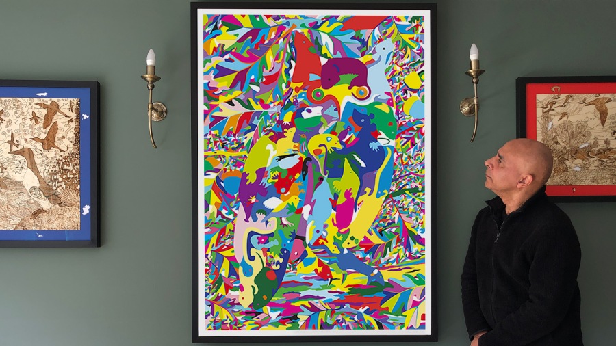


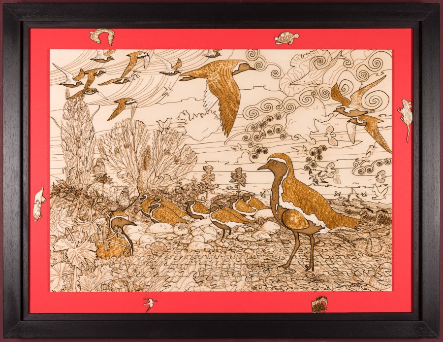


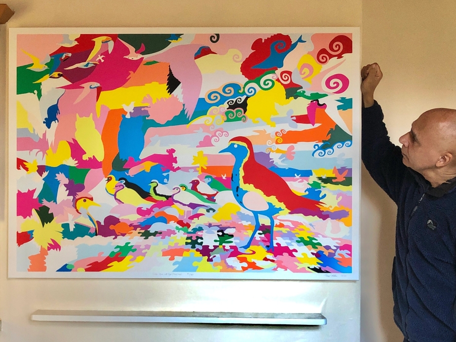


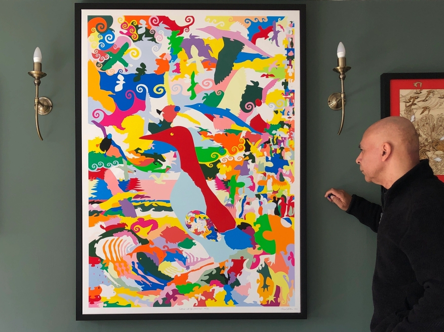


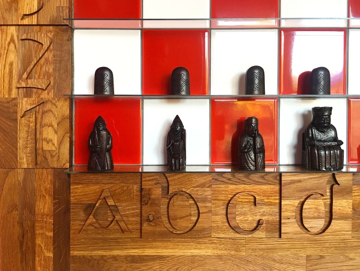

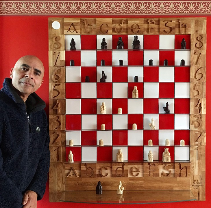
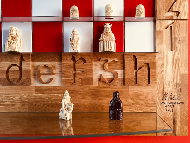


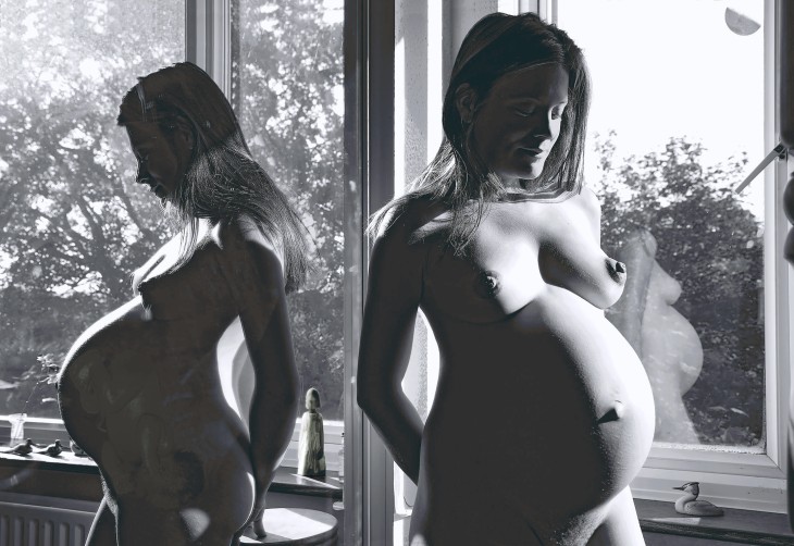


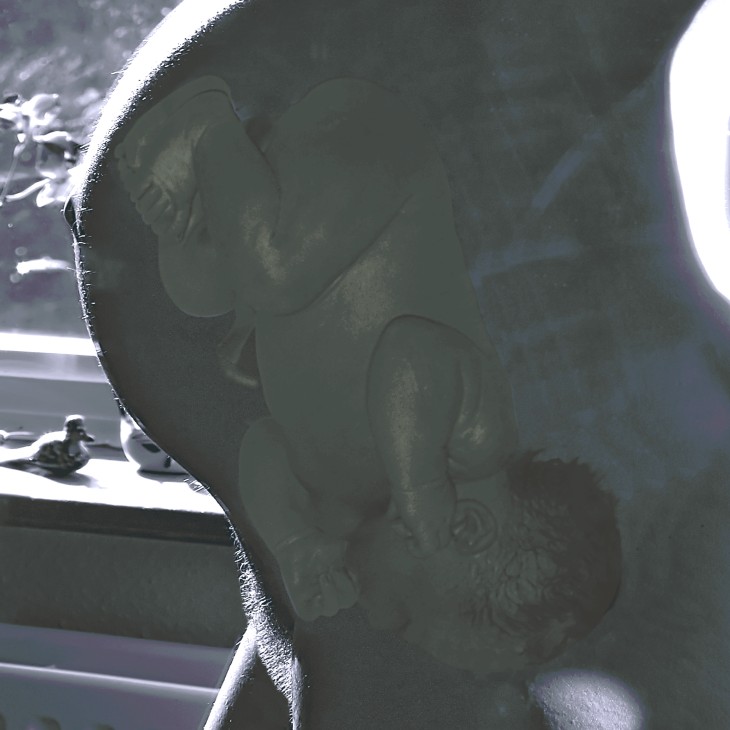


 That part of the image in the centre of our field of vision is in sharp focus (excepting for long- and short- sightedness), and the rest of the image gets progressively out of focus – the further away from the centre we go. But we are usually not aware of this. Anything we scan our eyes over becomes instantly sharp. The fact is we are constantly re-focusing as we scan a scene. If we are looking at one part of a scene it is in sharp focus. We may not even be aware that the rest is out of focus, because no sooner have we moved our eyes to something else, then that new part becomes immediately in focus.
 The photographer has to decide what he/she wants you to focus on – that is what he/she wants to focus on themselves, and they capture that in stone as it were. You are not free to focus on what you want. That is not necessarily a criticism – indeed it may well be the intention. But in this case my intention is that you should be free to look at any part of the picture in great detail – as I had the pleasure of doing.
 Was it the process of painting they enjoyed or were they trying to capture something they considered beautiful, captivating, worthy of putting on a pedestal…?
 I did actually see the hare and the deer running through the field – sadly they were fleeing from a near by gun shot blast – I don’t think it was their natural choice to be there. But it gave me an idea…

