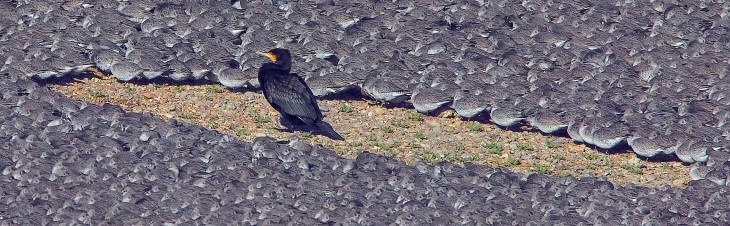
Long-eared Owl (Art Puzzle) (You Are What You Eat)

Title: “Guillemot with Egg (floral map)
Artist: Michael Autumn
Life-sized handmade solid oak jigsaw puzzle (Limited Edition of 7)

Long-eared Owl (Jigsaw Puzzle): Full image
20cm (W) x 30cm (H) x 4cm (depth) @ 1.5kg weight
Solid European Oak, hand-cut, hand-engraved, art puzzle.

Long-eared Owl

The story behind this art piece was to have a free-standing, tactile, life-sized long-eared owl, and to toy with the idea – “You are what you eat“. These birds are ferocious predators (as are all owls) – and will basically eat anything that moves that is smaller than them. They often swallow their prey whole, and regurgitate a large pellet of the undigestible parts – such as bones, teeth, hair, feathers. Indeed, examining their pellets is how ornithologists know so much about what they eat.

I often think about predator-prey relationships – perhaps being a veggie has something to do with this… All animals have to get their energy and material they are made of by consuming specific things – protiens, carbohydrates, and fats. Herbivores obviously get this material directly and indirectly from plants – which is often widely available (they don’t usually eat fats directly, but make them from carbohydrates). However, they usually have to eat a lot of plant material in relation to their size because it is a low concentrated source of food – requiring long, slow, complex digestion. Predators usually don’t eat plants – instead they prefer much more concentrated and complex food in the form of other animals.

I have designed the owl to show that it is literally made of many of the wide variety of creatures that it eats. From the moment of conception – where it starts as a single egg – it literally takes parts of smaller animals – and its amazing body chemistry converts them into material to make (and maintain) it’s growing body – and energy. I used the simple jigsaw-puzzle you-are-what-you-eat metaphor to illustrate this puzzling (pun intended!) transformation of lots of small animals making up an owl.

Owls typically eat 2-4 mice-sized animals per day – so about a thousand a year. Without owls, goodness know how many mice, moles, voles, rats, small birds, newts, etc. there would be…!

(I have to confess this was originally intended to be a tawny owl! I haven’t been lucky enough to actually see a wild long-eared owl, and as I got a long way into designing this piece I felt it would look better with ears – and, of course, a tawny owl doesn’t have visible “ears“… So I thought, okay, I’ll change it to a long-eared owl – they have great “ears” (well they look like ears, but they’re actually not – they’re just tufts of feathers!). The two species are quite similar in many respects – so the change was easy!)

“Jigsaw Puzzle” series

At the risk of stating the obvious, this work is part of my Jigsaw Puzzle series. For readers interested, further details can be found at the originating work’s post @ https://michaelautumn.wordpress.com/2020/03/01/guillemot-with-egg-jigsaw-puzzle/

Limited Edition” of 7

The phrase limited edition in this case is a bit of a misnomer. These are all individually handmade by me from my original design. I really wish there was, but there is no mechanical or chemical process I know of by which these can be reproduced – like screen printing, lithographs, card puzzles (using a die and jigsaw press), etc. (for more details please see the aforementioned post).

Working photos

Finished photos

Tawny Owl with Egg (Art Puzzle)

Title: “Tawny Owl with Egg (Art Puzzle)

Life-sized handmade solid oak art puzzle (Limited Edition of 7)

Tawny Owl with Egg (Art Puzzle): Full image
50cm (W) x 82cm (H) x 8cm (depth) @ 20kg weight
A single piece of European Oak, hand-cut, hand-engraved, jigsaw puzzle
with inset full-size replica tawny owl egg.

First and foremost I want to mention that the eggs used in my work are not real – for obvious ethical reasons (it is also illegal to take wild birds eggs). They are life-size replicas made of a plaster resin composite and hand-painted – not by me, but by a very reputable leading replica birds eggs maker.

Tawny Owl

Following on from Guillemot with Egg (Jigsaw Puzzle) (see https://michaelautumn.wordpress.com/2020/03/01/guillemot-with-egg-art-puzzle/), I thought I would pay homage to another favourite bird of mine – the Tawny Owl (Strix aluco). These, like all owls, are very mysterious – especially the noctornal ones (which tawnies are) – because they do things the opposite to us: they sleep/rest during the daylight, and come out – and hunt – at night. They are supremely designed and adapted to this lifestyle: they have excellent hearing and eyesight, they fly almost silently, and their hunting strategy is to hunt in the darkness – when other small nocturnal animals think it’s safe to come out…!

Mice, voles, shrews, moles – in fact any small rodent up to the size of a rat – are largely nocternal to avoid daylight predators – like kestrels, buzzards, merlin, sparrowhawks. But while rummaging for food and going about their normal lives – in what they think is the relative safety of darkness – a tawny owl – alerted to their presence by their quiet, but inevitable, sounds – can swoop undetected near to the unwitting little creatures. From close by the tawny can watch their prey’s every move – until they decide to pounce, crush and puncture them with their razor-sharp tallons – and then invariably swallow them whole…

Little birds could be roosting or sleeping in trees or bushes, but if they make any sounds in their sleep – even just quietly snooring or sleep-calling/singing – they are easy game for these owls… Frogs, toads, newts – in fact any small reptile – making any kind of sound at night – are likely to court the deadly attention of a tawny owl. Even fish splashing about at the water’s surface, or in the shallows, are fair game for these owls…

Suffice to say that if it is small and it makes a noise, it is on the menu…! So I thought I would play with this idea and illustrate as many of the small creatures tawny owls eat – as jumbled up jigsaw pieces surrounding the main protagonist. The whole design slightly resembles a huge regurgitated pellet of the tawny owl, and the small prey animals are all jumbled up – like fragments in a pellet.

I like art in the form of a jigsaw puzzle because it is interactive, and by careful design of the shapes and carving on the pieces, I can get the puzzle-solver to look at, and think very carefully about, them – in a way that is simply not possible with non-interactive art. Indeed, someone could look at a piece of art like this and not even notice the small creatures surrounding the main owl – let alone have any understanding why they are there – and why these particular animals. However, trying to solve a puzzle like this is a very different matter – they will definitely think more about what it is they are looking at…!

I have deliberately made the jigsaw puzzle very subtle because Nature is very subtle. These creatures are very difficult to see because of their camouflage and because they mainly come out at night – and it is precisely because they are so difficult to see that the owls rely on the noise they make to home in on them… The puzzle metaphor lets me toy with the idea that these small creatures think they are invisible – or out of harm’s way – but to a tawny owl, in the dead calm of night, their sounds makes them highly visible…

Owls typically eat 2-4 mice-sized animals per day – so about a thousand a year. Without owls, goodness know how many mice, moles, voles, rats, small birds, newts, etc. there would be…! If all the creatures a tawny own ate over the course of its lifetime were put into a 30cm diameter (about the width of this jigsaw puzzle) very tall clear tube – I wonder how high the pile of eaten animals would be…

Close-up of the life-sized tawny owl with replica egg

Some of the art puzzle pieces laid out

“Art Puzzle” series

At the risk of stating the obvious, this work is part of my Art Puzzle series. For readers interested, further details can be found at the originating work’s post @ https://michaelautumn.wordpress.com/2020/03/01/guillemot-with-egg-art-puzzle/

Limited Edition” of 7

The phrase limited edition in this case is a bit of a misnomer. These are all individually handmade by me from my original design. I really wish there was, but there is no mechanical or chemical process I know of by which these can be reproduced – like screen printing, lithographs, card puzzles (using a die and jigsaw press), etc. (for more details please see the aforementioned post).


Working-on photos


Finished photos

Oak Tree (Art Puzzle)

Title: “Oak Tree (Art Puzzle)

Life-sized handmade solid oak art puzzle (Limited Edition of 7) Full image.
60cm (H) x 61cm (W) x 4.4cm (depth) @ 11.8kg weight
Solid European Oak, hand-cut, hand-engraved, art puzzle.

It started out as a clock!

I can’t remember why, but this started out as a design for a clock! But after a short while I decided I should make a clock jigsaw puzzle and an oak tree jigsaw puzzle – as completely separate works.

My Favourite Tree

The oak (English Oak – Quercus robur) – is probably my favourite English tree, and I’ve wanted for many years to pay homage to them. I’ve travelled quite a bit over the UK, and often it has been to get somewhere lovely by sunrise – or close to it – and often I’ve driven home at sundown – because I don’t particularly like driving in the dark (for the simple reason I can’t see anything). So I have seen a lot of sun rises and sunsets (sometimes both in the same day) – and the visions that stand out most in my memory are oak trees with the sun rising or setting behind them. Many an oak I have seen with blood red skies, blazing yellow and orange skies, gloomy slate skies, fresh cold blue skies, stiflingly hot blue skies.

A great irony of the massive plunder we have done of the natural oak forests in the UK is that the very few trees that remain really stand out alone in the landscape. Often you will see a solitary great oak forming part of a hedge, or standing proud in the middle of a field. And so we can probably see and appreciate them much better now than if we were to go back a thousand years or more – when the country was blanketed in them – and you literally couldn’t see the tree for the forests.

I particularly like to see oak trees in winter – when you can see their gnarly cauliflower-shaped fractal trunks, branches, and twigs – and the great silhouettes formed by the trees and the ubiquitous chocking parasitic ivy.

How to capture the essence of an Oak Tree?

A 2D photograph doesn’t do an oak tree justice because there is so much to them. But as a starting point, what better way to depict an oak tree than by carving an oak tree from a big chunk oak…?

How to capture an oak tree in all of its many different guises? Among other things, I wanted to try to depict their status as a keystone species. So many species of mammals (like squirrels, mice, bats), insects (like moths, butterflies (and their caterpillars), and flies), most woodland birds (like owls, tree creepers, nuthatches, tits, finches, warblers, pigeons, doves) – depend on the oak as a place to live. Birds and bats live, rest, and/or nest in the branches, holes bored into the wood, or simply cracks in the bark. Insects shelter on, and in, the bark and leaves (often highly camouflaged). Many parasitic plants like ivy and mosses live on it, as do many species of lichens and fungi.

Many species depend on oak trees directly or indirectly for food: fungi have a symbiotic relationship with them, bees and wasps pollenate its flowers in spring, insects eat its leaves, bark, and wood. Moths prey on its flies, bats prey on its moths.

Birds eat the oak tree’s caterpillars (of the butterflies and moths) – indeed many, like tits, specifically time their breeding to coincide with the huge glut of the caterpillars in spring – and most warblers in the UK travel all the way from Africa in early spring specifically to do this. Jays, squirrels, and some wasps and bees feed on the acorns, but it is the Jays and squirrels that actually hugely benefit the oak tree by spreading its acorns (seeds) far from where they fall. Without these, the oak tree would depend on the very poor and unreliable mechanical dispersal of acorns rolling downhill or being washed by rain water away from its canopy – in order to spread far and away, and stand a good chance of survival (often there are no plants on the ground under an oak tree’s canopy because of its very dense leaf cover and the competition for nutrients – so this is a very hostile place for the oak tree’s own seedlings to grow).

The oak tree is a keystone species even when it is dead (or killed). Fungi, lichen, mosses, and insects will eat and/or digest them, many insects will lay their eggs in them (which in turn will eat the dead wood), and homo sapiens have built navies, buildings, used them as firewood and in the smelting of metal ores and in metals for thousands of years.

So in a very small way I have tried to capture some of this ecological complexity…

Fractals

I also wanted to capture something about the oak tree’s fractal appearance. Small branches resemble a whole tree, and so do large branches. If they are pollarded, what look like whole trees grow out of their stump.

Seasonality

I also wanted to capture something about the oak’s seasonal differences – specifically that they have two distinct personalities: one with leaves and one without leaves. Most of the leaf clumps (summer) in the work can be removed – leaving exposed branches (winter).

Oak’s Fruit

I wanted to capture something about the fruit of the tree – the humble acorn – and how that tiny thing can grow into a monster of a plant – with the chance of living five hundred years or more – and it’s dead body – timber – in the right conditions capable of surviving a thousand years or more.

Why a Jigsaw Puzzle?

A jigsaw puzzle seemed a very apt way to represent or capture some the complexity and interconnectedness of the oak tree – which is very interesting because this is proving to be a very fruitful visual communication medium phase I am going through at the moment (I have worked in many art mediums)…

A jigsaw puzzle is, among other things, a metaphor for my appreication of the wonder of Nature and its mysteries. It is my (very feeble) 2D representation of the 4D (3D + time = 4D) complexties and variaties of some of the huge number of spieces’ interconnectedness – where jigsaw pieces and carved lines are symbolic of some of Nature’s species, camouflage, and its mixed uses.

Naturally, with this jigsaw puzzle being made of quite chunky oak, the hard, heavy, wood directly communicates oakness to the viewer. So in some unique, and perhaps mysterious, way, the material and the original whole subject – the oak tree – express each other…

Texture

Finally I wanted to capture the texture of the tree – particularly its very rough bark. I’ve tried to do this by the tactile nature of the puzzle pieces and the engraving on the work.

Limited Edition” of 7

The phrase limited edition in this case is a bit of a misnomer. These are all individually handmade by me from my original design. I really wish there was, but there is no mechanical or chemical process I know of by which these can be reproduced – like screen printing, lithographs, card puzzles (using a die and jigsaw press), etc.

Golden Plover with Egg (Art Puzzle)

Title: “Golden Plover with Egg (Art Puzzle)

Life-sized handmade solid oak art puzzle (Limited Edition of 7)

Golden Plover with Egg (Art Puzzle): Full image
59cm (W) x 41.5cm (H) x 4.4cm (depth) @ 9kg weight
Solid European Oak, hand-cut, hand-engraved, jigsaw puzzle
with inset full-size replica golden plover egg.
Golden Plover in artist’s dining room (click on image to see artists’ home studio, workshop, and gallery).

First and foremost I want to mention that the eggs used in my work are not real – for obvious ethical reasons (it is also illegal to take wild birds eggs). They are life-size replicas made of a plaster resin composite and hand-painted – not by me, but by a very reputable leading replica birds eggs maker.

Golden Plover

Following on from Guillemot with Egg (Jigsaw Puzzle) (see https://michaelautumn.wordpress.com/2020/03/01/guillemot-with-egg-art-puzzle/), I thought I would pay homage to another favourite bird of mine – the Golden Plover (Pluvialis apricaria). In winter plumage these birds are lovely, but unremarkable. However, in summer plumage they are absolutely stunning. The males are slightly more outstanding than the females, however, both are very distinctive and eye-catching. The spring transformation of the Golden Plover from winter to summer plumage is one of the most extreme, and beautiful, I know of. The word “dandy” comes to mind. They become the most striking of all the waders I know of.

Golden Plover in summer plumage

In summer their coal black bellies and faces, fringed with a slim cotton white mantle or fringe, and their “golden” upper parts – are a bold, brilliant sight to behold. But golden they are not! They are “buff”, ochre, or sandy brown – like most wading birds – who feed predominantly on mudflats and shorelines – and thus gain good overhead camouflage – so as not to draw attention to predators such as peregrine falcons, marsh harriers, etc.

To highlight this golden misnomer I thought it would be fun to actually make them golden – 24 carat gold gilt to be precise! Gold is an incredibly beautiful and mysterious metal – mysterious both in terms of its physical properties and appearance, and its hold over us. Gold, with its density of 19.3 (over 19 times that of water), is the absolute nemesis of flight! Gold, with it strikingly bright, mirroring, shimmering sheen – is the nemesis of camouflage!

24 carat gold gilded Golden Plover

I hope the metallic gold of the Golden Plover in the above pictures is clear. Being metallic the light reflects differently according to the angle being viewed and the available light.

Migration

In summer Golden Plover breed in the tundra – countries such as Iceland, Greenland, Scandinavia, and northern Russia – where the days are very long indeed – and over-winter in warmer climes – and where there isn’t perpetual winter darkness – such as here in the UK (some go as far south as northern Africa). The migration to and from Iceland is no mean feat for such a small bird. The main bird in the picture is life-sized: they are approximately 20cm tall, and 28cm long. Many bird migrations follow land masses with hops over the shortest water expanses. For example many of our summer visitors, like the warblers, coocoos, hobbys, etc. come from Africa – where the largest stretch of water they have to fly continuously across is the English Channel – a mere 20-odd miles – less than a hour’s flight (the Straights of Gibraltar – the sea hop from Morocco to southern Spain is less than ten miles).

In contrast, the non-stop shortest bird flight distance from Iceland to the UK is 850 miles. Golden Plover can fly at speeds up to 60 mph, but for long distances they are more likely to cruise at speeds more like 40 mph. So the non-stop flight from Iceland to the UK would take them a minimum of 21 hours. To salute this feat I have added an Icelandic reference in the picture – see if you can find it…

“Art Puzzle” series

At the risk of stating the obvious, this work is part of my Art Puzzle series. For readers interested, further details can be found at the originating work’s post @ https://michaelautumn.wordpress.com/2020/03/01/guillemot-with-egg-art-puzzle/

Limited Edition” of 7

The phrase limited edition in this case is a bit of a misnomer. These are all individually handmade by me from my original design. I really wish there was, but there is no mechanical or chemical process I know of by which these can be reproduced – like screen printing, lithographs, card puzzles (using a die and jigsaw press), etc. (for more details please see the aforementioned post).

A New Way of Seeing?

Recorded music is ubiquitous and omnipresent: you can play it on a huge and growing number of devices, you can download it from millions of sites on the web, you can amplify it to play it as loud as you like, and you can choose the quality of the reproduction by the device you play it on (although quality of reproduction seems to be getting better all the time and at a more affordable price).Listening to music on the web in no way detracts from the quality of the reproduction or the pleasure you get from listening to it. Musicians and composers will generally not feel misrepresented if you listen to their creations via the web or on various players. There is something extra to be gained by going to a live performance or gig – which has much more to do with atmosphere and ambience – and this will probably always be the case. I would like art and photography to be as ubiquitous, omnipresent, and as accessible as music. Until now, to really appreciate art or photography (or any other two, three, four (video/animations) – dimensional images) you had to go and see them “in the flesh” as it were. This is very unsatisfactory for a number of reasons :-

  • It is severely limited by the number of people who can see the work.
  • It limits the times people can see the work (e.g. only during gallery opening times).
  • Access to close inspection is usually restricted for reasons of security or simply politeness (e.g. not wanted to get the the way of others!).
  • Lighting is generally difficult to control and so work may be viewed in less than idea conditions.
  • Some precious works may actually deteriorate by being exposed to light and uncontrolled atmospheric conditions.

I set myself the challenge of creating a new web application to display still images on the web in the best possible way and to be accessible to as wide an audience as possible :-

  • It should work on any web browser.
  • The web browser should automatically maximize to fill the whole screen (where the browser permits this).
  • The images should automatically fill the whole browser display area.
  • It should have the option to fill the whole screenwithout any browser clutter (e.g. toolbars, menus, scrollbars, status bars, address bars etc.) – so you can see the images as large as physically possible without any other distractions.
  • The image should “intelligently” fill the available space (initially – until you start zooming) in respect to its aspect ratio and the aspect ratio of the web browser or screen – without distortion.
  • There should be no limit on the size of the image – in terms of resolution (MBs/GBs) or physical size (H x W).
  • The image should be displayed at the highest possible quality or resolution for any given viewing scale.
  • There should be optional data about the image – i.e. you should be able to choose whether or not to display this information – easily and quickly. This should have the ability to display hyperlinks and other interactive web content.
  • There should be optional controls and navigation – i.e. you should be able to choose whether or not to display these.
  • To harness the full potential of the virtual gallery.

I have been working towards this solution for the last 2 years (with a background of 25 years in computer architecture and software design), and, with a really big push in the last few months (and a huge sigh of relief!) – I have finally achieved my goal. The web application/tool is called iz2u™, and all the images you see in my portfolio and blog (Blog) use it. I have also started a new blog devoted to its’ development iz2u and feedback. (Please do not leave feedback about it on this (MA) blog as this is devoted to art and photography). Viewing images on the web with this new technology could actually be better in some respects than seeing them “in the flesh” : –

  • You can spend as long as you like studying the work.
  • You can zoom in to any part of the work (try doing this to the Mona Lisa in the Louvre!).
  • In principle you can supply any amount of supporting multi-media information.
  • You have the convenience of seeing the work any time and from any location.
  • Lighting conditions can be better controlled (art work can be scanned or photographed in perfect conditions, digital images remain in their native format).
  • There is no limit to the size of the images (you are however restricted to looking at them through the window of your computer screen).
  • There is no limit to the number of viewable images.
  • You can gain access to artwork and manuscripts etc. that are too fragile or precious to make accessible to the general public – thereby increasing the number of works available to show.

There are some obvious drawbacks I can think of :-

  • There is nothing quite like seeing the image/artifact “in the flesh” – even though you may not be able to see it as well.
  • There is no replacement for the social experience and ambience of a gallery – similar to the real experience of going to a live performance or band.
  • The is no replacement for actually being inside a beautiful building and enjoying art in the context of architecture and history.
  • The role of the curator – in terms of juxtaposition, chronology, themes, aesthetics, etc. is missing. Having said that, there is a curatorial role in pure virtual galleries, for example, where the whole virtual space and experience has to be designed…

Having developed this solution, I can see that there are many uniquely web-technology-based art projects waiting to be born. Watch this space…

Gallery #1 didn’t have the decency to reply…

The gallery (which I shall refer to as Gallery #1 because there will be others) didn’t get back to me within a week so I decided to give them a call. I asked to speak to the owner (whom I named – I didn’t just say "may I speak with the owner" – the typical cold-calling approach!) but was told he was not in. I then started having a chat with the man who answered the phone. I said to him that I just wanted to make sure the owner had received my email – in this day-and-age of junk mail there was a good chance that he didn’t. The gentleman asked my name and said that the gallery receives maybe a dozen approaches from artists a day, that the owner generally checks all the mail, and if he hadn’t got back to me then the chances are he would not.

The gentleman said that the gallery doesn’t have enough time in their calendar or space in their gallery to show all the work of their existing artists – let alone taking on new ones. He apologised and said that that was just the reality of the situation. I thanked him and that was the end of the conversation.

I just feel that with a gallery owner making his living from hard-working artists – that at least he would have the decency to reply to a prospective artist who has approached him for representation. Suppose the situation was reversed: I was a famous artist, he was setting up a new gallery aiming for the big time, and he approached me… Did he ever stop to think how he might feel if I completely ignored him?

He may live to regret it – who knows? The search goes on…

I did not get into the RCA: is that a good or a bad thing?!

After all the trouble the applicants go through to apply, to put a portfolio together, the logistics of sending their portfolio in and collecting it (mine was very big: I had to make a portfolio case because you can’t buy them as big as I needed, and I had to hire a van) – if we are unsuccessful, is it asking too much to be informed why?

Was it that they felt they had no one in the department who knows enough about digital art, digital and analogue photography, and natural digital painting – the areas I am particularly interested in? Do they even recognize this as a valid art form? Do they appreciate the amount of effort and skill involved in this art form? Are they relatively new to computing, and is their perception of computing so naive thet they think anything done using computers is easy? Is it just too new for them and do they feel they couldn’t support me at a sufficiently advanced level?

Of course it could have been that the selection panel’s consensus of opinion of my work was simply that it wasn’t good enough and showed no potential or promise. Or it could have been that with only forty-five places available, they simply considered that there were at least forty-five other applicants who were better or more deserving than me? I have no idea.

One thing we were told at the Open Day was that they were looking for applicants who showed a certain “need” or incompleteness: students who weren’t entirely sure where they were going. As soon as I heard this I started to doubt my chances… I am not in the least unclear about the art I am creating. This selection policy is at odds with scientific and social science disciplines (and almost certainly the other arts) – where academic establishments select the best on merit – i.e. those with the most promise, the most talent, and the clearest vision. What is wrong with being clear?! Surely the best artists are clear about what they are trying to achieve?!

Now that the whole process is over and I am no longer trying to get a place at the RCA, I can speak my mind freely. First of all I am not in the least bitter about the rejection – a bit disappointed yes, but not bitter. In fact it takes a huge weight off my mind – the pressure of how to finance it. I confess I was hoping to go there mainly for the kudos, and to have the time to explore new things. I certainly don’t feel I need direction, and if the selection panel think someone else would benefit more from studying there than me – that is their prerogative.

However, it does answer a few questions that I had… I spoke to a number of students on the Open Day and not one of them seemed to know what they were doing – artistically. One second-year student was really quite stressed out by it, and I really felt for her. What do they expect if they select students who don’t know what they are striving for?!

It wasn’t all bad: on the Open Day some of the graduate illustration and animation work we were shown (via the internet) was excellent – but then it would be if you pick the best of the last few years?

The exhibition of work-in-progress was outstandingly bad. It is no exaggeration to say that the whole exhibition wouldn’t have looked out of place in a secondary, or even primary, school art display. There was no display of talent, care, or pride of work (with the exception of some of the textile work). My jaw dropped when I saw it. With utter disbelief I said to myself “Is this the best of the best…?”

If this is what is taught in art colleges, if this is the standard that art students are molded into producing and praised for – then that answers the fundamental question I have with modern art: why is the vast majority of it so bad, shoddy, poor in work-person-ship and professionalism, and almost irreverent? Are the lecturers so embroiled with theory and the quest for originality – almost at any cost – that they have lost sight of what art is about? Art is not about pandering to novelty-seeking academics – who are so caught up in art history and theory that they long for new ideas to muse and pontificate about. Art is for society, it is a public discipline, and as such is judged by the majority – by the public. If it doesn’t communicate with the public in a positive way at some level then it has failed. Period.

A word of advice to aspiring artists, and you can take it or leave it. Academics are not wealthy people. They will not buy your work, or if they do, you will not get much from them for it. Think about who your buyers might be, and consider them, not you tutors, when producing work… If you get a first class degree or some other qualification and nobody buys your work because it is so obscure and inaccessible…

In closing, I would say about the buildings themselves, that they in no way lend themselves to art. They would be better used as offices or a prison: totally uninspiring and with very poor natural lighting. I don’t think I could have spent much time there…

I am not sure why the RCA has the kudos it undoubtedly has. What does this say about “lesser” art colleges…?

Royal Academy of Art Summer Exhibition 2007 – here we go again!

The Royal Academy’s Summer Exhibition is the largest, and possibly oldest, open contemporary art exhibition in the world. Although it is meant to be only for living artists (established or unknown), last year one of its’ dozen or so gallery rooms was devoted entirely to a recently deceased Royal Academician – a tad unfair, you might think, for all the struggling living artists out there. Royal Academicians are not graduate students of the college – as you might expect – they are a self-elected, self-governing, board: new members by invitation only…

Without exception the Summer Exhibition has been held annually since the Royal Academy’s foundation in 1768. An essential part of the London art calendar, the show drew over 150,000 visitors in 2006 and over 1200 works were included (out of about 9000+ submissions). Following long Academy tradition, the exhibition is curated by an annually rotating committee – whose members are all practising artists.

The majority of works are for sale (with a commission going to the RA) and there are a few private viewing days before the exhibition opens properly to the general public – where private members – including the rich and famous, and art collectors (not necessarily mutually exclusive groups) get the best pickings…

There will be a BBC2 television programme about it that will be aired just before the opening (last year was the first time they did this in the Summer Exhibition’s entire history).

There are numerous prizes for different genres and one for the overall best-in-show – the value of which is £25,000. This is more than the Turner Prize, but not as prestigious. It’s all down to PR, and the RA is not as good as the Tate at this. It would be much more interesting if the prizes were decided by public vote (alas they are decided by the Academicians), because I think art ultimately has to stand up to public scrutiny. Indeed, I think it is exactly because so much art is not voted on or directly selected by the public that we get such a skewed selection of art in galleries these days – in favour of the new and out-landish – rather than what is good – in some democratic aesthetic

Royal Academicians have the right to exhibit up to six pieces – they do not have to go through a selection process – so in effect there are only about 600 slots available for about 8000+ submissions – quite competitive. Non-Academicians can submit up to three pieces each at a cost of £18 each.

This year entry forms have to be in by 23rd March, works have to be submitted by early April (glazed works have to be submitted on different days to non-glazed works – which can be annoying if you want to submit both – it means two trips; sculpture is a month later), and notifications of acceptance or rejection are sent out by 1st June. The Summer Exhibition itself this year is from 11th June until 19th August.

At this stage of my career I consider it essential to try to exhibit at the RA. Last year was my first attempt and I was fortunate enough to have one of my three submissions selected (Depth Of Tulip Field). This was no mean feat because despite what they say – the Royal Academy is quite a conventional art institution. Radicalism comes from the new – not the old… It was no mean feat because my work was a digital art print – quite a new thing for the Academy. It was hung in a gallery room devoted to contemporary art, alongside work by Damien Hirst, Tracey Emin, Grayson Perry – to name a few of the best known contemporary contemporary artists. I could complain about the fact it was hung too high to see all the detail in it (a very important aspect of the work), and about the fact it was tucked behind the exit boarding where you couldn’t see it when you entered the room – but I’m thankful it got exhibited at all – so I won’t :-)

This year’s theme is “Light” (there is a loose theme every year. Last year it was “From Life”). I have three pieces that I will probably submit which are broadly on that theme: Pregnant Reflections, Lindisfarne Walled Garden, and Times Square (all are featured on this blog site). I doubt very much if I will have time to finish any new work between now and then (now I am back doing computer consultancy to help pay for the RCA course which I hope to get accepted on…).

There is some tradition associated with the Summer Exhibition – as you can probably imagine of an old English institution (something we seem quite fond of) – not least of which is the Artist’s Hanging Day. All successful artists are invited to attend a day at the academy (the day before the official opening) – ostensibly to tend to their hung works and to make any last-minute adjustments. While this may have been a serious professional, competitive, artistic matter in years gone by – today is it really just a party and celebration for the artists.

On Hanging Day morning last year – and I think the format is the same every year – we gathered in the forecourt of Burlington House (home of the Royal Academy of Art since 1867), amid the joyful, smiley, sounds of calypso steel-drums (the music is possibly not the same every year!). At about 11-15 a.m. a senior-looking priest (in age and probably importance also) – with a big cross in hand – and his entourage – headed out of the forecourt, through the archway, and then turned left down Piccadilly. There was no announcement of what to do, and I for one didn’t really know what was happening. However, I followed all the other (presumed) artists – following the priest and his entourage.

Soon there was a long stream of us with television and still cameras tracking us, walking out of the forecourt, under the arch, and then left down the middle of Piccadilly – where the traffic had been blocked off – just for us! It was a great feeling to have that little special moment with the world looking on (probably wondering what the hell was going on, and as for the stopped drivers – I bet they had a few choice words…). All this was helped by the fact it was glorious sunny day!

It was just a short jaunt along Piccadilly before we turned right and headed into Wren’s favourite church – St. James’. I had never been in there before (much to my surprise) and therein gathered a colourful collection of happy, proud, fellow artists. The Service for Artists that followed, was, as you might have guessed, about art and artists – aimed at artists. There was a particularly eloquent sermon – more like a learned lecture – from the leader of the procession (who was also an eminent professor), on the subject of the meaning of art and how its’ meaning has changed over history. There was singing, poetry, and prayers. At the risk of sounding un-cool, in all honesty it was a very enjoyable and quite a poignant service – especially in such a beautiful setting.

Afterwards, Piccadilly restored to its normal hustle and bustle, we made our way back to Burlington House (along the pavement!), and then we headed for the gallery rooms. At the entrance we were handed an official exhibition catalogue and an artists’ pass. I anxiously thumbed through catalogue – which for me was the final proof that I had got in – looking for my name. I went to the artist index, and, low and behold: I saw my name! It was even spelt correctly! (I was a bit concerned to find it had my address on it – a bit worrying from security point of view.) I then looked up my work, and there it was: number 1013, Depth of Tulip Field. Wow!

In the gallery we were free to explore the exhibition and indulge in free drinks and quite tasty nibbles – which were being continually offered to us by Eastern-European looking and sounding men and women (mostly). It was a buzzing atmosphere – literally we were like bees in a beehive – with the anxiety and nerves and curiosity of findings one’s work. I didn’t just want to go off and rush to find my work: I wanted to stroll around the exhibition and stumble on it. I wanted it to find me, as it were. I was happy to take in the atmosphere, watch the other artists, chat with a few of them, drink, nibble – take my time…

Eventually, right at the very end of the exhibition, in a small room of no more than twenty works, rather disappointingly tucked behind the exit boarding and hung much too high – I found her. I looked at it from the few angles it could be seen and couldn’t suppress my disappointment. In just about all the other galleries the pictures were hung much lower – in fact as many works as possible were squeezed in (albeit tastefully). But not in this room: there was plenty of space beneath my piece, but someone in their wisdom decided it should be high up! I wandered around for quite a while trying to find an official to see if I could get the picture lowered. When I eventually found someone I was politely told that it was up to the hanging committee. As soon as I heard the word “committee” I knew I was wasting my time… In the room where my work was I was pleasantly surprised to discover I was in good company – Damien Hirst, Tracy Emin, Grayson Perry, and some Royal Academicians. It wasn’t all bad. I left with a mixture of elation and disappointment…

Art work: “Times Square”

(Catalogue # 021008-01-08)

Times Square
(Click on image to zoom in…)

I like to go to really famous, impressive, places to try and capture them, or create an impression of them, in an artistic and hopefully unique way. I don’t always succeed! I went to New York at the end of September 2002 on such an artistic trip. I love the hustle and bustle of Times Square and was staying only a block away from it – as I had done on a previous trip five years earlier. The image I came up with took many days of contemplation and for a long while I was pessimistic that I would fail in my quest…

The two main roads, 7th Avenue and Broadway, run roughly from north to south. There is only a short time window, around about noon, when the sun shines straight down both streets – rather than leaving one side in hard shadow. Time… Time… Moreover, the angle of the sun shining on the buildings is better in the Autumn and Spring – where it is neither too high nor too low at noon. Time… Time…

I was running out of time – nearing the end of my trip but with no inspiration about how to capture this place…

On my penultimate day at noon in Manhattan the light was terrific. The yellow cabs, the rivulets of multi-coloured people, the sheer rock faces of the buildings, the brilliantly lit signs… What is the shot? What is Times Square? I pondered and pondered. Time was running out… The light won’t last…

Hoards of random purposeful people, impatient busy cars, domineering buses, enticing alluring shops, mesmerizing ingenious signs, agitated horns, blinding glare, confusing reflections, killing fumes, incessant humming engines, occasional screeching breaks. I was being bombarded with Times Square but no ideas how to capture it. Then, all of a sudden, and quite by accident – I looked up – directly above me, and I saw this amazing sight: a beautiful tranquil azure blue sky, with brilliantly bright titanium white cloud slowly drifting northwards. I found a bare patch of pavement and lay down on the ground looking skywards. All of a sudden everything was perfectly serenely quiet, and I was transformed into a new timeless silent dimension.

What a transformation! Horizontally it was a torrid river of humanity: noise, zillions of people from everywhere – going everywhere, attention-grabbing economic gimmicks, control, dirt, pollution, unbelievable complexity. Here, in Times Square, it was as if three dimensions were squashed into two: everything happens on street level! Of course! The fourth dimension, time, is upwards… One minute I was in those rapids and the next I had broken free from the surface water tension – like a caddis fly emerging as an underwater grub and transformed into a free-flying insect…

The sun was nearly at the perfect angle – it had just a few minutes to go to catch both sides of the parallel buildings equally. This was central to the shot. I waited for the perfect moment, during which time a typically un-shy American asked “…Hey, what-ja doing?” (This was one of many exchanges I had with passers-by that day.) I told him and he looked up – at an angle he probably wasn’t used to. His expression was at first strained and squinting, and then an oh-I-see smile…

For me the picture works for a number of reasons – some of which I can take credit for and some is just good old-fashioned luck – and, believe me, the best shots need some luck. I love the azure blue of the sky and the cold Arctic white of the cloud – and what a deliciously bright glacial white it is! But I love that area in the middle where the blue intermingles softly with the white. This just seems to epitomize the cosmopolitan nature of what’s happening at street level – different races coming together…

I have rendered the buildings in a perfect square – which says something to me about time – how regular it is. All the vertical parallel lines of the buildings in their infinite perspective converge perfectly in the middle of the picture. The whole scene could be a clock face without hands. Time, like the hustle and bustle of the square, has momentarily paused.

Just think, if you will, how this landscape will have changed over time. Not so long ago the same shot could have had the same sky with trees receding in perspective in place of the buildings…

The time theme crops up in a number of unexpected ways. The clock on the building is very apt and very, very, lucky! The street lamp is off, because it is not time for it to be on. The position of the sun is very time critical – illuminating both sides of the street rather than casting one side into shadow. This is similar to the precise orientation of ancient megaliths like Stonehenge or the many amazing constructions in the Peruvian landscape and buildings – to cast light on to some sacred spot on just a few days at first or last light at the summer or winter solstices.

The shot is an antithesis of what Times Square is all about. I didn’t (and generally don’t) want to capture what most people do. Times Square is one of the busiest places in the world, and one of the most photographed. I wanted to do something completely different… This is possibly the least you could portray about Times Square and it still be recognizable… Less is sometimes more… Minimalism is sometime maximalism…

Cambridge, England 28/12/2002

Art work: “Identity”

identity_6

(Catalogue #100_1970-1982: 22” x 125”, edition of 100)

I’m intrigued, no spellbound, by Nature, and spend a lot of time watching, being mesmerised, and photographing it. Every once in a while I come across something even more amazing than normal and it gets me thinking…

This scene is exactly as I saw it. I have gone to great lengths to faithfully reproduce what I saw in all its detail. It was a very sharp, cold, blustery, early spring morning. The tide was high and these birds were roosting – unable to feed on the mudflats. They were waiting for the tide to go out.

Identity - Knot huddling together
Identity – Knot huddling together

Some species like the knot (the predominant grey birds in the 8-10,000 strong flock) huddle together to keep warm, whereas others don’t. Huddling together to keep warm is perfectly understandable, so why don’t the other species in the picture do it? It’s not just down to body size – the smaller something is in relation to its mass, the harder it is for it to keep warm – because there are smaller species that don’t huddle – the turnstone (smallest, short-legged black and white birds) for example.

Identity - Bar-Tailed Godwit
Identity – Bar-Tailed Godwit engulfed by hundreds of Knot

The few individuals of a different species engulfed in the sea of knot – the few lone oystercatchers (big black and white birds with bright red beaks) and the bar-tailed godwits (the long-legged buff-coloured birds with long straight beaks) – almost certainly didn’t land in the middle of all the knot. Instead, they were probably slowly engulfed by them as the numbers of knot coming off the mudflats to roost gradually swelled.

The knot don’t go around in one huge flock like this, rather they normally gather in flocks – of anywhere between a handful to a few hundred. While the tide was out and they were feeding, they would have been in these smaller groups. In the last hour or so as the sea slowly rose and covered their feeding grounds, the scattered flocks would have gradually given up the feeding frenzy and come in to roost. Flying over the shingle bank and into this sheltered hollow on the edge of the gravel pit lagoon, they would have seen some of their own already there and joined them – huddling together. The lone birds of other species would have been on their own initially, but as the mass of knot numbers swelled the “loners” would have been slowly engulfed.

Identity - Cormorant island
Identity – Cormorant island – the Knot keep their distance…

For me this image raises lots of questions. Why did the knot feel comfortable getting that close – literally touching – some of those other species – even some that are significantly bigger than them – and not the cormorant (the big black bird in the middle of the big flock)? Does the cormorant look dangerous to them? Did the cormorant try to attack them? I doubt that very much – since they are fish eaters and are not known to be aggressive to other birds. Is it just the look of the cormorant that makes them feel uneasy? Predators have a knack of looking nasty. So do the knot – and other species for that matter – have an instinct for what-looks-nasty-probably-is-nasty?

Identity - lone Cormorant
Identity – Cormorant – on its’ own

And what does nasty look like? Two piercing, forward-looking, eyes; a certain stare-you-down-I’d-like-to-eat-you attitude; a big mouth with a sharp beak or teeth? It is utterly amazing to me how such instincts can be carried in DNA…

What did the cormorant feel – being completely surrounded by a sea of small grey birds that would not get close to it? What did the surrounding knot feel – especially those on the inner edge closest to the cormorant? How did they decide what a safe distance from the cormorant would be?

Identity - flying Black-Headed Gull
Identity – flying Black-Headed Gull

Does the black-headed gull flying over the huge flock think “bloody hell – that’s a lot of birds!”? Does it even realise that they are birds at all – and not something like stones that it could land on? How did the “loners” feel as they were being slowly surrounded by the knot? How do animals identify themselves? Why are some “outsiders” allowed to get close and not others…?

Going back to the smaller flocks on the mudflats: if there were 8-10,000 individuals in the main roost, and the average size of smaller flocks was 200, then out on the mudflats there must have been somewhere in the region of 40-50 separate flocks of knot. I am interested to know what defines these flocks; how does an individual know it is part of a flock? Is there a leader of each flock? Imagine 200 individual birds foraging in the sand and mud for food: they can’t all spontaneously decide to fly off in the same direction to a roost like the one in the picture – surely one takes the lead? Is it that any one of them can take the lead and all the rest follow? Or is there a flock leader?

Do the members of the flock recognise each other, or is there just some general sense of belonging and not wanting to be left on their own? I’m not sure it can be the latter because when the main roost broke up, it broke up gradually. A succession of small flocks flew off – back to the mud-flats. There wasn’t one almighty exodus. This implies that while other birds were flying off, something kept the others where they were. Was it that no member of their group had taken flight, or did they have a leader who hadn’t taken flight? This behaviour suggests a high level of small flock individuality. If there was a perceived threat like a fox or human getting too close, then I’m sure the whole roost – all 8-10,000 – would have taken flight; but in the normal calm of the roost each small flock seemed to act autonomously – just temporarily taking advantage of the warmth afforded by bigger numbers. I’m not sure we can ever know what is going on in the mind of one of these little birds, but that would be incredibly fascinating to discover…

The parallels between birds and us humans are quite striking. We have our little groups – friends, family, work colleagues, team members, etc. Sometimes we come together in huge crowds – such as sports events, coronations, concerts, evacuations, etc. And when we are in these huge gatherings we are acutely aware of our group and make special effort to keep in contact and move around together – to arrive and depart together. Something may trigger us all to move off together – like the end of an event, or a fire, but we still keep to our personal group wherever possible. There is usually a leader…

I am also interested in how comfortable we are for different people to get close to us. Speaking for myself, generally I am happy for strangers to get within a couple of feet from me (unless they look nasty or threatening); I generally don’t like men to touch me at all, but for male friends it’s okay; I’m happy for women and children to get very close and even touch me; and it is very special and highly desirable for a woman I’m attracted to to get close and touch me. Indeed, such a woman could trigger off an adrenalin rush – where my whole mind and body would become fixated, excited, and physiologically charged… I’ve no reason to suppose this is abnormal human behaviour…

As for the closeness we will allow other species to get to us, this very much depends on our familiarity with the species, knowledge of their likely behaviour, and our knowledge of specific individuals and their moods. Generally we are comfortable with cats and dogs (the species depends on the cultural norm – so it might be different species in different cultures), but some people are allergic to them, or allergic to specific ones; some people have had bad experiences with them and won’t go near them. Suffice it is to say, familiarity and affection draw us together; unfamiliarity and fear push us apart. It is interesting to note that the young of most species are very cute – giving us the innate feeling of warmth and affection towards them, and wanting to touch them and give them everything they need… It is interesting that many species are programmed to respond in similar ways to cuteness and nastiness…

There is a semi-autobiographical aspect to the picture as well. At the time of writing this and through no fault of my own, I have no family and very few friends, and I spend a great deal of time on my own (most of the time that is through choice as I am very focused on what I want to achieve in life). I often find myself in groups or crowds feeling quite alone – so I can relate to the cormorant… Which of the birds do you relate to…?

Cambridge, England 28/10/2004

Art work: “Pregnant Reflections”

Pregnant Reflections, 2006, 36” x 52”

Pregnant Reflections, 2006, 36” x 52”

(Catalogue _C8L2984_24-01-06: 36″ x 53 1/2″, edition of 100)

Pregnancy is the most magical and mysterious process that can happen to a woman, her partner, and existing children. As a father-to-be I felt so unnecessary but constantly strived to be involved.

Father-to-be feeling outside, uninvolved

I felt impudent, irrelevant, distant, curious, useless, confused, ignorant. I might as well have been on the moon looking back at the earth – watching as a bystander…

I was outside of this on-going, and soon-to-climax, marvel.

Pregnant Reflections - Male contribution
Pregnant Reflections – Male contribution

My role in all this magic was the use of my appendage for a few minutes several month previous – all but a faint memory now…

If that is how I felt with no changes happening to me physically or mentally, I can’t begin to imaging what effect it had on my dear wife who was undergoing all those changes… What was going on in her mind? What was going on in her body? What did she feel and see when she looked in the mirror?

How would I feel if I experienced such transformations in myself? What is it like to have a new small human being growing inside you: feeding off you, moving around and kicking you?

Pregnant Reflections - baby growing inside mother
Pregnant Reflections – baby growing inside mother

Answers to these questions are meaningless because I cannot possibly relate to them in any way. Answers are foreign and can never be translated. There is no male vocabulary to translate into. It is as meaningless as asking a caterpillar what it is like to turn into a butterfly.

Pregnant Reflections - Sister
Pregnant Reflections – Sister

And what of our little princess – who was the centre of our universe? What did she make of it all? What was her comprehension and anticipation of it? She was too young to give any coherent articulation. Did she even really understand what was happening and what was going to happen? She was – and at the time of writing this, still is – more or less a completely emotional being. I sensed in her a growing anxiety but never quite understanding…

Will it be healthy? Will it be a boy or a girl? What will it look like? How will the delivery be?

On an artistic note, the transformation of my wife was very inspiring. Women are delightfully curvy anyway, but they enter another curved dimension when with child! It is as if they are three dimensional normally, then they become five dimensional for a few months. Concave, convex, soft, taught, primal. I think the thing I enjoyed most about her being pregnant was the expression of contentment, peace, fulfilment, contemplation, wonderment on her face…

Cambridge, England Jan. 2006

 Pregnant Reflections in artist’s dining room (click on image to see artists’ home studio, workshop, and gallery).

Art work: “Depth of Tulip Field”

Depth Of Tulip Field F Brochure Whole

(Catalogue #100_5644-5730: 44” x 66” – edition of 100)

The human eye is an amazing gift, tool, and experience. The power of the brain behind it takes seeing to mesmerizing capabilities. Take focusing for example. My Left Eye 100_0002cThat part of the image in the centre of our field of vision is in sharp focus (excepting for long- and short- sightedness), and the rest of the image gets progressively out of focus – the further away from the centre we go. But we are usually not aware of this. Anything we scan our eyes over becomes instantly sharp. The fact is we are constantly re-focusing as we scan a scene. If we are looking at one part of a scene it is in sharp focus. We may not even be aware that the rest is out of focus, because no sooner have we moved our eyes to something else, then that new part becomes immediately in focus.

Focus has a few noteworthy properties. The closer we try to focus, the shallower the depth of focus is. If you hold your hand in front of your face and focus on it, even things just in front of it (try placing a finger of your other hand in front of your hand without looking directly at it), and things immediately behind it will be out of focus – i.e. blurred. This is a “shallow” depth of focus – or depth of field as it is more commonly known in photography. The further away the subject is the greater is the focus depth – the region from the nearest to the furthest part in focus. The focus range is invariably perpendicular to our eye view.

The camera acts like a static eye in that it can capture one static scene and its inherent depth of field. It is unlike the eye in one important respect: we focus on a narrow zone where our two eyes converge, and outside this area – left, right, up or down – but at the same distance from our eyes – things become progressively more out of focus the further away from the centre of our gaze they are. The camera on the other hand focuses on planes. Think of double glazing: the zone between the two pieces of glass is in focus, everything in front and behind are out of focus. As always with focus, there are no sharp boundaries between in and out of focus – just very sharp to progressively less sharp. However, there is a general area where most people would agree is an acceptable level of sharpness – enough to say it’s in focus.

Depth of field can be controlled by the diameter of the iris or aperture: the smaller the aperture the greater is the depth of field. But the aperture can only affect depth of field to a small degree. What also applies to the camera is the phenomenon that the closer the subject is, the shallower the depth of field. There are special cameras/lenses that offer a tilting mechanism that allow you to literally tilt the plane of focus, but these are only effective with flat surfaces – like a road or a lake. Anything in the foreground sticking up or down – rising above or below the narrow horizontal plane of focus – like my tulips – would appear out of focus.

Why am I rambling on about depth of field? When you are confronted with a real life scene you can survey it at your leisure, and it is something we all seem to enjoy. We seem to love being able to see a long way, and climbing/driving to the top of a hill or mountain to see a great view is a common goal we nearly all like to do. Taking a static image of such a scene – from our toes to the horizon – is virtually impossible, especially if there is fast movement in the scene as well.

What has all this got to do with art? If art is about enhancing the viewer’s experience of life, getting the viewer to think about their surroundings, and their perceptions and pre-conceptions of it, then “Depth Of Tulip Field” is very much art.

I use photography a great deal because I’m so moved by reality, and a lot of what I want to convey about my perceptions, pre-conceptions, and ideas about reality I feel are best expressed by being as realistic as possible. I’m completely in awe of vision – it is the most amazing gift. When I see a beautiful scene I’m frustrated as an artist that I cannot transport you there to see it also. So much art is about non-reality, disfiguring reality, or making attempts at copying reality – with varying degrees of success. But reality cannot be faithfully copied – it has near and far properties, and we can interact with it in almost an infinite number of ways – moving to different parts of it, zooming in to any level of detail. And reality’s main quality is, I feel, the freedom we have to look at it in any way we choose.

At a scene we can scan and focus on anything we please, and that is the real delight I want to capture. Conventional photography pre-focuses for you on a static focal plane. Depth Of Tulip Field F Bruchure Flying BeeThe photographer has to decide what he/she wants you to focus on – that is what he/she wants to focus on themselves, and they capture that in stone as it were. You are not free to focus on what you want. That is not necessarily a criticism – indeed it may well be the intention. But in this case my intention is that you should be free to look at any part of the picture in great detail – as I had the pleasure of doing.

The conventional artist – oil painter for example – is severely limited by the materials she uses, and by time. Whilst she doesn’t have the same limitations of depth of field, close up daubs of paint look like daubs of paint. And what would the point of meticulously copy reality anyway in this day and age of photography? The best you’ll ever achieve is a photograph. If Vermeer or Ingres (two of the best detailed artist I know of) were around today, would they reject photography and paint? Depth Of Tulip Field Brochure ButterflyWas it the process of painting they enjoyed or were they trying to capture something they considered beautiful, captivating, worthy of putting on a pedestal…?

In Depth Of Tulip Field I have gone to enormous lengths to share the freedom of focus I enjoyed on a fateful trip in Norfolk, England. It was early morning, the date was spring 2004, I was driving along and suddenly this amazing field of tulips appeared. The field was huge and the rows ran perpendicular to the road. A striking feature was the bands of brilliant colours. The sun was not out fully (it was burning up the morning mist), and it was at the wrong angle anyway (aesthetically) – so I decided to come back later in the afternoon (the forecast was for sun).

When I returned I went to the far end of the field with the sun shining at me – I love the sun shinning through plants – it really brings out their colour. I spent quite a while admiring the scene and wondering how best to shoot it – how to do it justice. I had all the main types of cameras, numerous lenses, and other equipment with me – so I had very few technical limitations on what I could do. The field was wonderfully long. I didn’t want to crop it. I didn’t want to focus on one part of it. I wanted it all. Eventually I came up with an idea and proceeded to execute it…

There are a lot of different types of birds, insects, and other animals in this picture, but that is only to draw your attention to the fact that there were none! This field – due to modern chemically assisted intensive farming methods – was a veritable desert of life! Everything was either dead (killed by “pesticides” – implying they are pests – probably a propaganda ploy by the agrichemical companies) or the wildlife stays away – perhaps because there is no natural food there and/or because it is such an alien landscape to them and they have no natural cover. Depth Of Tulip Field Brochure DeerI did actually see the hare and the deer running through the field – sadly they were fleeing from a near by gun shot blast – I don’t think it was their natural choice to be there. But it gave me an idea…

Most landscape paintings don’t depict this level of detail, and many animals in the wild are very elusive – indeed a lot of the time their survival depends on them not being seen. So often they are there but you just don’t see them. But for me this is what is fascinating about Nature: it is everywhere. The more you look, the more you see. And the closer you look the more detail you see. You can start with looking at a whole landscape (even my depiction of the tulip field is a small section of the whole), and you can zoom in on a field, then a flower in the field, then an insect on a flower in the field, and see the amazing detail of it. Zooming in still further, you can see the hairs on its body, its compound eye, the structure of its wings. Zooming in on the eye reveals its conical hexagonal lens structure. You can go on to see the structure of the cones, the cells that make it, the internal structure of the cells, the structure of its proteins, the atoms that make up the molecules, the structure of the atom – its subatomic particles. And who knows where this journey ends in ever smaller worlds…?

I have kept the detail in the picture to what you could see with the naked eye, but I hope I’ve got my point across about the detail in Nature.

Sometimes we come across a scene so beautiful that we stop what we’re doing. We stop and stare, remain silent, and enter into a trance-like state. It’s fascinating that our mind should respond so strongly to what are after all just images. It is also fascinating that the vast majority of us will respond in a similar way to the same scenes… I, as a contemporary artist, feel just the same (possibly more?) about such scenes – but I want to respond to them in a very personal and unique way, and to sometimes use them as a vehicle to express certain ideas I’m interested in.

Really this is many photographs (circa 80) combined into one, with a great deal of digital editing – including much freehand work. But it is essentially what I saw. I have spent more time on this “photograph” than I have ever spent on a real painting or drawing. (No, I haven’t attempted to break any world records – some artists will have spent longer on their paintings.) My goal was to try to break the limits of photography, to highlight our wonderful, amazing, delighting, gift of vision; to produce something beautiful – or something I consider beautiful. The result is not perfect, but I’m happy it goes a long way to depicting what I saw and the ideas I wanted to convey. It gives me immense pleasure to be able to share that experience.

Nature is not always what it seems, and in Nature reproduction is a vital force…

16/05/2004


Exhibited at Royal Academy Summer Exhibition 2006

2006-06-07-Getty-Images-RA-Summer-Exhibition-press-view

Art work: “Lindisfarne Walled Garden”

Lindisfarne Walled Garden, 2007
(Catalogue #030525-01-05: 40” x 40”, diamond – edition of 100)

This is another study in perception. Unlike most photography – a snapshot in time – I created this image as an idealized scene that shows the best of what did happen over a short of time in this space. The flying fulmars (sea-gulls in the picture) – who came up close to check me out, the pied wagtail (black and white bird) foraging for flies among the bedded plants,

Lindisfarne Walled Garden - Pied Wagtail the sunbathing red admiral (red-wing-tipped butterfly), the flying ringlet (brown butterfly), and all the insect and arthropod activity – all this happened in front of me over a period of about half an hour. Conventional photography could capture such a scene in one shot using an ideal camera (which doesn’t exist!), a very fast shutter speed, and a very great deal of luck. I had to resort to less miraculous and time-consuming creative techniques to create this image…

This is also part of my “Diamond Series”. I wanted to make the white tulips the centre of the picture – almost as if the castle was being held up by them. The natural way our perception follows the lines across the corners of a diamond to locate the centre helps draw you to the tulips. We “know” that the castle isn’t being held up by the tulips, and that the castle is much bigger than them. But this is based on what we know rather than what we can see…

I like the geometry of half sky, half land. I like the textural difference between the top and the bottom half. Standard photography can’t discriminate texture at its finest, pixel, level of detail. I have worked a great deal on the image to achieve this effect.

We can’t produce anything more beautiful than nature – despite our huge numbers, all our technology, and time. We merely re-arrange it for a while. How can this be? We are led to believe that Nature is merely a quirk of chances – trillions of chances. Out of nothing came all this… The lovely castle in the picture doesn’t compare to a single tulip – for beauty and complexity. In gardens we merely rearrange Nature…

Lindisfarne Walled Garden - Red Admiral

Nature is a complex set of forces, among many other amazing things: there are many systems and programs running, sometimes they collide and the programs survive or die. But we never make anything new – we merely convert something that is already there into something else – for a short while. Anything that we re-arrange in Nature is only temporary. All we can do is put a tiny piece of Nature out of equilibrium. The soil, climate, aspect, cover, surroundings, herbivorous predators – all affect what will grow and survive in the longer term. We can fight this, but only temporarily. We are temporary…

Cambridge, England 12/09/2004

Art work: “Le Louvre”

(Catalogue #031018-02-07: 59” x 59” diamond)

Le Louvre
(Click on image to zoom in…)

Having an interest in art, it was natural that I would eventually pay a visit to the Louvre in Paris. My first visit to Paris was in November 1998. What struck me most about the Louvre was not its wonderful art collection, but the buildings themselves. I was particularly interested in the glass pyramid (square-based right regular tetrahedron), cutting up through the ground in the Cour Napoleon and its juxtaposition with the magnificent Louis XIII/IV courtyard architecture. It seemed like an ice fissure or glass crystal had been forced up through the ground by some colossal subterranean tectonic force. The weather was appalling but I knew I had to come back and shoot it “properly”…

I returned to Paris on a photo shoot in October 2003. I specifically wanted to do something with the pyramid. As is so often the case, my challenge was how to do a very well know place justice and yet be different or original? I love maths and geometry and so the tetrahedron had extra appeal to me…

I had already experimented with diamonds (squares turned on their sizes – through 45% – so they are “resting” on a corner) on some earlier compositions that year. The appeal being that conventional rectangular shaped pictures are passé, don’t lend themselves naturally to any specific horizontal or vertical alignment, and the centre is not clearly defined. This is not a “problem” for many images but there are a few times when this is a distinct disadvantage, and simply not aesthetically “right” – for me at least.

A diamond on the other hand has clear horizontal and vertical lines that the eye naturally follows (the lines through opposite corners), and the intersection of these imaginary lines is the centre. Our eyes seem trained or are sensitive to vertical and horizontal lines. This may have some biological/physiological significance. For example, our sense of balance is closely tied in with the horizon – to the extent that we can feel sick if the horizon keeps moving around – as it does on a boat in a choppy sea. Any liquid in a container – from the ocean to a cup of water – will level out. Most things fall in straight lines and most plants grow in straight lines. The vast majority of our buildings are built perfectly straight or vertical – I suspect because we would feel uncomfortable working in them otherwise. We are very familiar with vertical and horizontal lines and can tell if they are only slightly out of “true”. We can’t do this with slopes because there is no absolute or “normal” slope. If we see a hill at 40% it is a hill at 40% – so what? It doesn’t particularly register or matter. The fact that we have specific words for two angles – 0 and 90 (horizontal and vertical) – is testimony to their importance to us – we don’t have names for any other angles…
This year (2003) marked the birth of my Diamond Series, where I felt the geometric properties of a perfect square on its side – my diamond – was aesthetically the most natural, flattering, and interesting for certain compositions. It was/is important for me to take the shots in this diamond formation – it’s not a case of cutting up prints afterwards! I have to feel the diamond and go to the extra effort of composing the shot as a diamond (using my square format camera and tilting it – not easy believe you me – especially when the image is back-to-front!).

So I had this idea in mind before going back to the Louvre and its pyramid. The pyramid itself is actually half a diamond – the top half. It didn’t take me long to decide that the best composition I could think of was to use the diamond shape to accentuate the pyramid – whose top angle is very close to 90. Perfect symmetry was an absolute must for such a geometrical composition. The pyramid from a certain angle looks like half a diamond – an isosceles triangle. I wanted to make its base the central line of the diamond.

Why did I shoot this in black and white? Because the shot is about shape and texture – colour would be a distraction. I wanted to contrast the old and the new buildings and their materials: rough stone with intricate carvings, alongside metal and glass – smooth, simple, prefabricated. The original pyramids were made of stone with intricate carvings, friezes, and paintings. The modern has gone the other way – showing it has no real value. If it is destroyed it can quickly be rebuilt. It says something about the wealth and power of the past rulers compared with today’s…

The whole idea of the modern geometrical form in this historical setting, with the light as it was, and the majority of people walking towards the pyramid – conjured up a scene of an alien spacecraft and people mesmerically be drawn towards it – to be taken away to another planet… I decided not to deliberately accentuate this theme…

Cambridge, England 08/06/2004